Yummygum
Client: Yummygum
Work done: Logo-type design, custom lettering
Custom Logo-type
Custom typography logotype design for Yummygum, a small design company based in Amsterdam. Founded by Leon and Vince, Yummygum create user interfaces and icons, focusing on design that is beautiful, simple and usable. Their previous logo used an existing script typeface combined with a bubble icon, so the goal was to create a fully custom replacement for the wordmark, while Yummygum updated the bubble design.
Talking about the company values and background, we wanted to convey the fact that Yummygum is small and dedicated, with an honest, no nonsense approach. It was important to reflect the fun, youthful nature of the studio as well as a sense of professionalism and high quality. We also had to make sure the name was correctly read as one word and that the typographic style was suited to the name length, avoiding an excessively long logo.
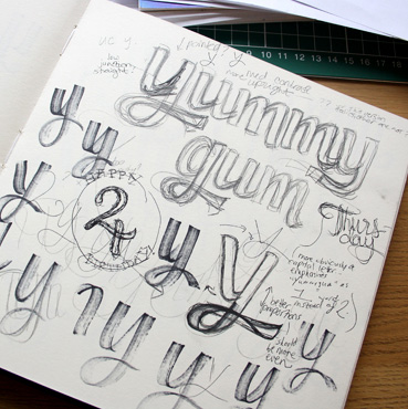
Above: Briefing notes, some early individual letterforms and rough pencil drafts.
Concept #1
While discussing how to approach the brief, we agreed that two initial concept sketches would be ideal to explore different possible solutions. For this first one, I drew a script with a relatively prominent brush-like feel to immediately introduce an approachable and friendly impression. At the same time, the letterforms are sturdy with quite subtle curves to retain a strong sense of professionalism and reliability.
The letters are quite condensed to compensate for the length and the large x-height aids legibility, especially at smaller sizes. The distinctive 'Y' resembles the classic uppercase form with the pointed V-like top, but adapted to the curvier script aesthetic. Similarly, the design uses a double story 'g', something not often seen in script lettering. The 'g-u' ligature adds memorable detail whilst remaining discreet. There is also some natural baseline variation (particularly in the 'm's) to break up the visual repetition created by the vertical letter shapes.
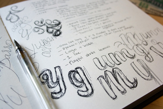
Above: An early version (top) is scanned and adjusted digitally before being printed and re-drawn more neatly.
Concept #2
The second approach features a script that is looser overall and slightly softer than the first concept. The main stems are all lightly curved as well as quietly italicised — this emphasises rhythm and natural fluidity, as well as bringing in a gestural, dynamic quality. To address the repeated vertical stems, the thin junctions inside the letters themselves are shaped and angled differently than the connections between the letter pairs. This results in a more marked distinction between the individual characters, improving quick and easy legibility.
The initial 'Y' is more conventional in this version, with a shape that is then mirrored in the lowercase one. The little hook on the left serves to lead the eye into the logotype and is echoed in the last 'm'. This creates a solid sense of continuity from start to finish, accentuating the name as a composed and very 'together' visual image.
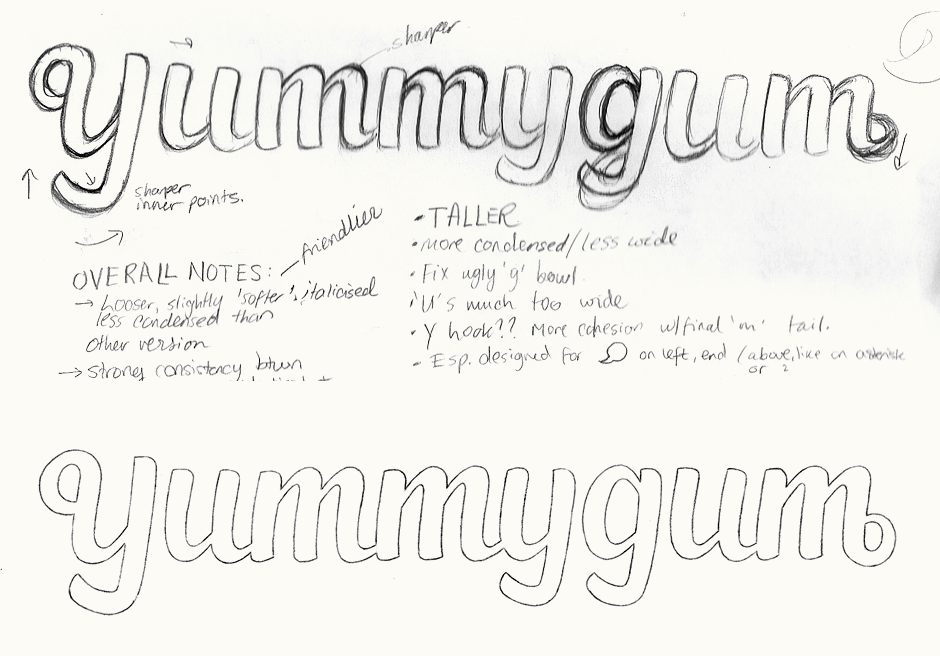
Above: As the rough draft for this concept was significantly less defined, it required much more work in the final sketch.
Development
The first concept was a clear favourite as it felt like a well suited match for the company, with its organic variety between the characters, breaks in the baseline and playful additions. The fact that second concept was more even made it feel a little too calm and comfortable, as if it'd be for a bigger and less dynamic company.
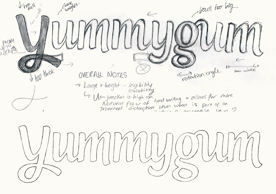
We did want to look an alternative design for the 'Y' since in the sketch, the upper part felt quite angular and sharp. While vectoring, the first version I created was based on the sketch, but revised to have diagonal strokes more consistent with the curves and overall feel of the rest of the characters. The second version has a rounded upper half, following the shape of the lowercase.
Above: First vector versions with the different 'Y's and other small changes that were then revised, such as a more subdued final 'm' stroke.
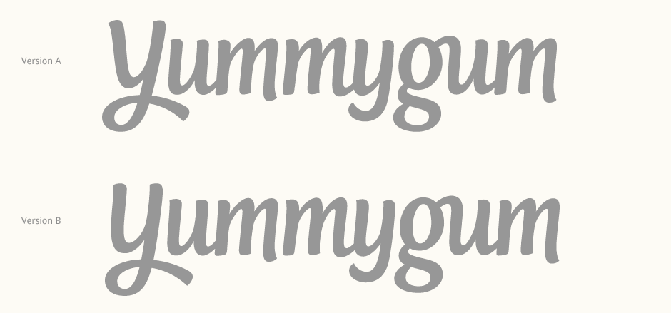
Initial Letter
Reviewing both 'Y' options, version A comes across more daring and distinctive, while version B feels warmer and more inviting. Visually, the diagonals in version A also create a welcome departure from the largely vertical strokes, otherwise the 'g' alone becomes the only character to not primarily feature upright stems. Since both these versions addressed equally important characteristics, we looked at creating a hybrid version of the two.
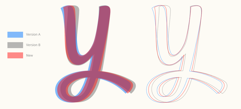
Above: Close up look at the progression of the 'Y'.
Modifications & Colours
Along with the 'Y', further development also included improving how the logotype would sit next to the bubble. The 'm' tail was modified to comprise a more pronounced curvature which would not only end the design in a more decisive way, but also fit the outer curve of a bubble.
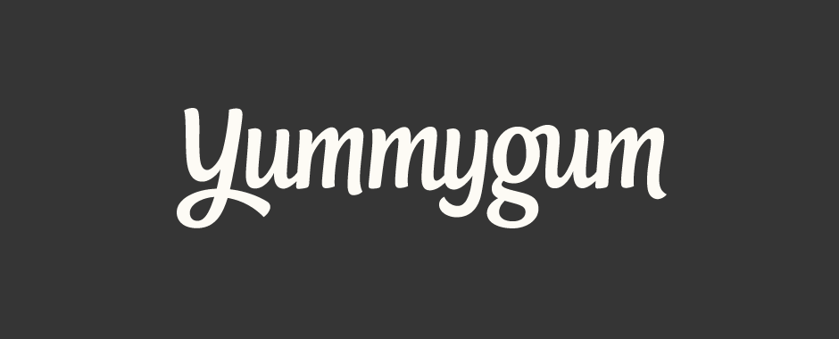
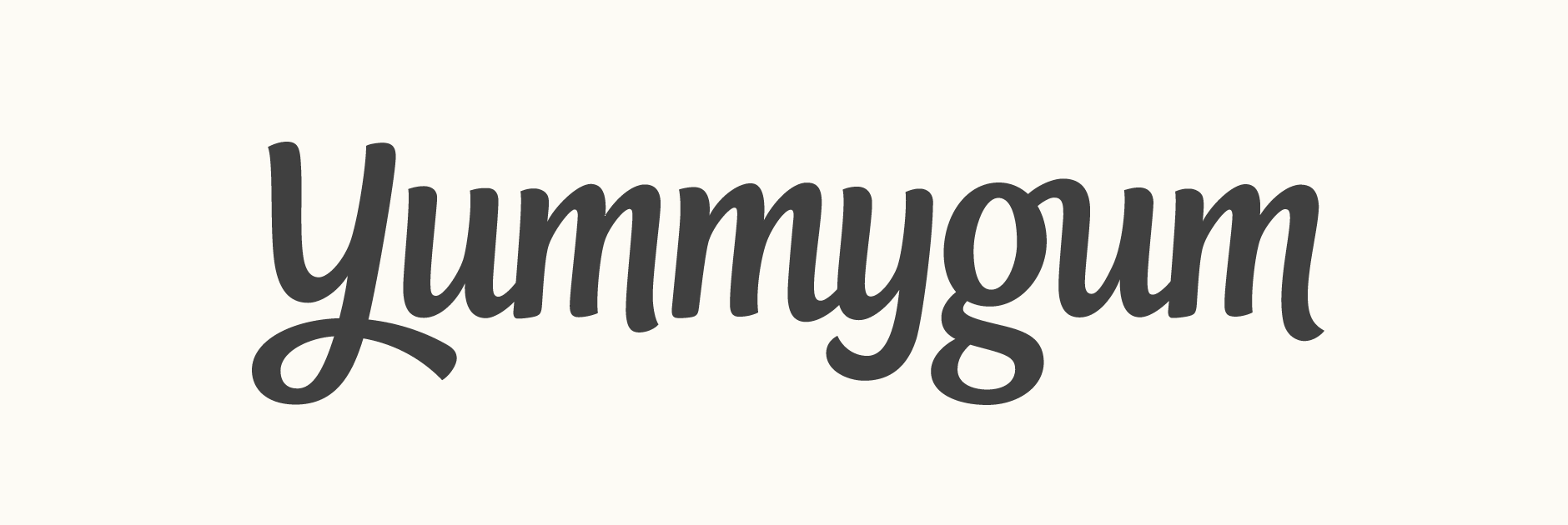
During the process, I also tested some colour palettes to explore how the logo could work with different treatments. Ultimately, it is used in a dark grey on a white background as this best suits the overall brand aesthetic.
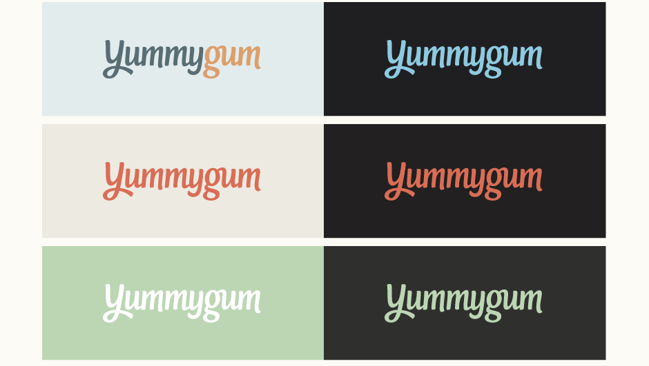
Above: Testing out 2- and 3-colour combinations.
Final Design & Context
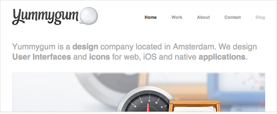
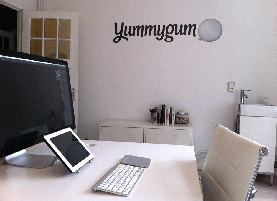
The final logotype exists alongside a new bubble mark designed by Yummygum. See the logo in use on the also recently updated Yummygum website (screenshot shown below). Studio photograph courtesy of Yummygum.
Yummygum, Leon and Vince:
When we first saw Claire's portfolio we instantly fell in love with the personality that showed in her work. We had been looking for someone to take a fresh look at our original logotype for some time and Claire's style seemed to match what we envisioned. We mailed and she immediately could relate to the reasons we wanted a new logotype. The iterations she presented made it clear she sincerely understood our feedback and knew how to polish it till perfection. Claire got to the bottom of our brand identity and created a beautiful logotype that is a true visual extension of who we are as a company. It was really fun working with her and we'd recommend her to anyone looking for a new logo.