Vurb
Client: Verbify, Inc
Work done: Logo-type design, custom lettering
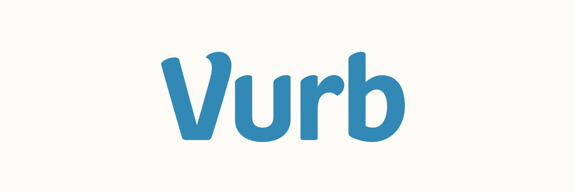
Custom Logo-type
Vurb is an upcoming platform will allow users to collect and organise content from their favourite websites in a seamless, coherent way. The team were looking for a typographic logo that would strike a balance between fun and practical, reflecting the product itself. Having discussed different approaches and lettering styles, we agreed that staying away from something too decorative was important considering the brief and the legibility and usage requirements.
When considering a balance between certain characteristics, I like trying varying extremes as it works well to fully explore as many angles as possible. Since were were focusing on a clean, un-connected lettering style, testing variations such as weight, proportions, stroke terminals and inclination from very early on was really useful to evaluate how the overall look could change.
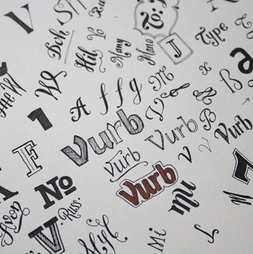
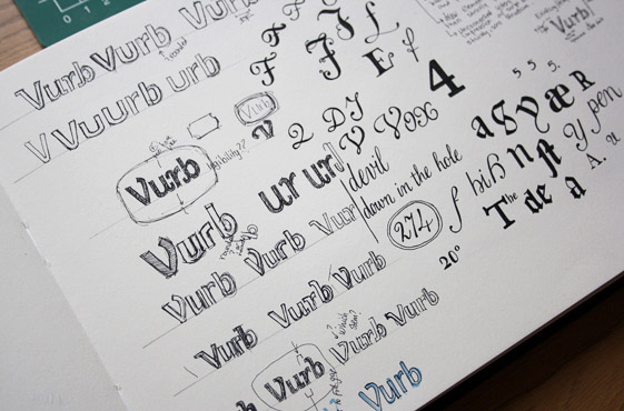
Above: First quick drawings (amongst miscellaneous doodles) and idea development.
Concept Development
With a custom logo-type, the individual letters that spell out the name play a big role in the idea development, as there are natural constraints due to their shapes. I often find a lowercase non-cursive 'r' can be quite a difficult letter to work with, particularly in a relatively short name. Its natural shape has a tendency to force quite a big gap with the letter following it, especially when this next letter starts with a vertical stem (as does the 'b' in this case).
Keeping this in mind from the beginning, I considered how to create a balanced sense of spacing and rhythm between all four letters. For instance, using an 'r' arch that is quite open and angled upwards helps to lead the eye into the next letter, as opposed to one that is more closed up and consequently enhances and isolates the big space left underneath.
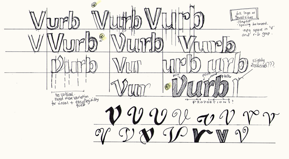
Having identified the strongest directions that were emerging, I then brought these rough drafts to the computer. I adjusted them digitally, doing approximate adjustments to things like kerning and stroke weight, often using translucent rectangles as measuring blocks. Working off a print-out, I then further built on the outlines in pen before progressing to neater pencil strokes.
Above: Slowly working from multiple early ideas to building rough draft options.
Sketch Refining
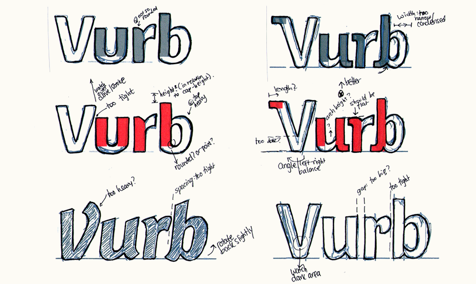
Our discussions of these early drafts led us to somewhere in between concepts A and C above. The roundness of A has a good sense of friendliness and the simple, clean lines are good for legibility at small sizes. However, it also doesn't stand out as much as it could and it doesn't have any particularly unique attributes. C on the other hand is much more unique and we liked how the 'V' and 'u' looked alongside each other. The angular features are a little harsh though and detract from the natural flow.
The first sketch below was closer to the initial C version, while aiming to soften the angles, thicken the weight and make everything upright. The following revised idea drew more from the first A design, but with some rounded, slanted top stems and subtle brush-like features. The lighter weight also avoids any clunkiness.
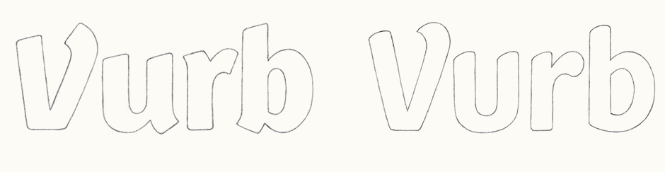
Above: First main proposal (left) and subsequent revised version.
Initial Vectoring & Variations
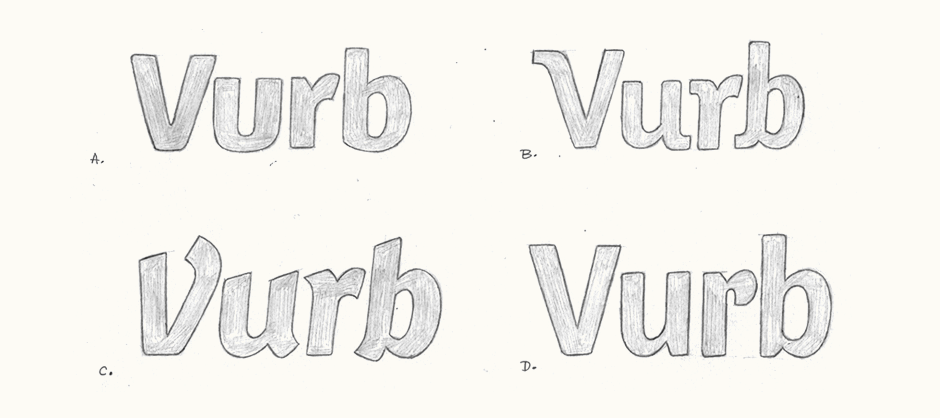
During the early digital development, we discussed possibilities for the 'r' and decided to look at two alternatives: one with a fully rounded terminal as in the initial sketch and the other, with a pointed tip to mirror the 'V'. Ultimately, somewhere in between proved to be the most effective solution as it's more subtle than the clearly defined point, but more graceful and light than the completely round shape.
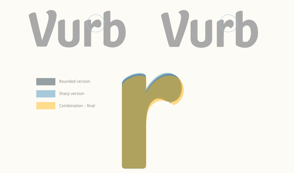
Above: Early digital development and individual character variations.
Revisions & Alternate Versions
Progressive adjustments were made to various aspects of the lettering, not just looking at the logo alone but also reviewing in-context trials. The proportions were flattened so it looked a little less condensed and the kerning was tested, revised and then optimised for the main intended size. The 'V' also needed revising to make sure it could work as a stand-alone element and we also explored possibilities for an enclosure shape.
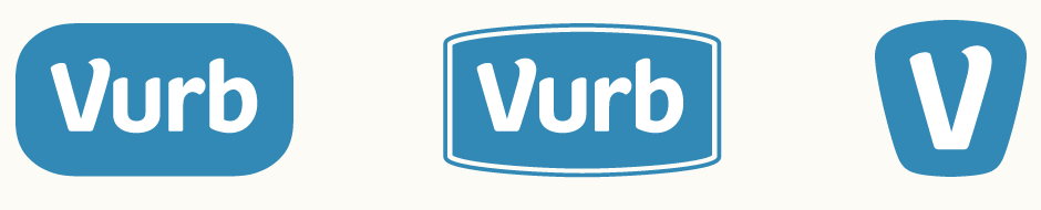
Above: The end product uses the 'V' alone within a rounded shape that loosely follows the contours of the letter itself.
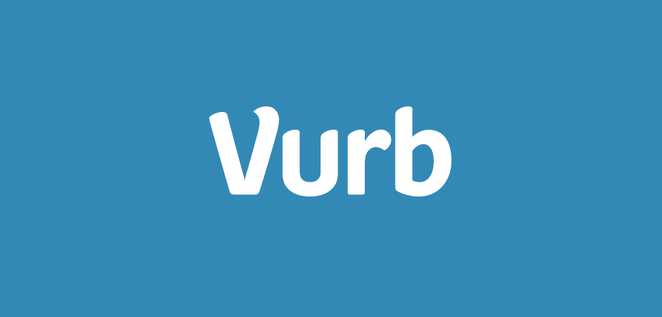
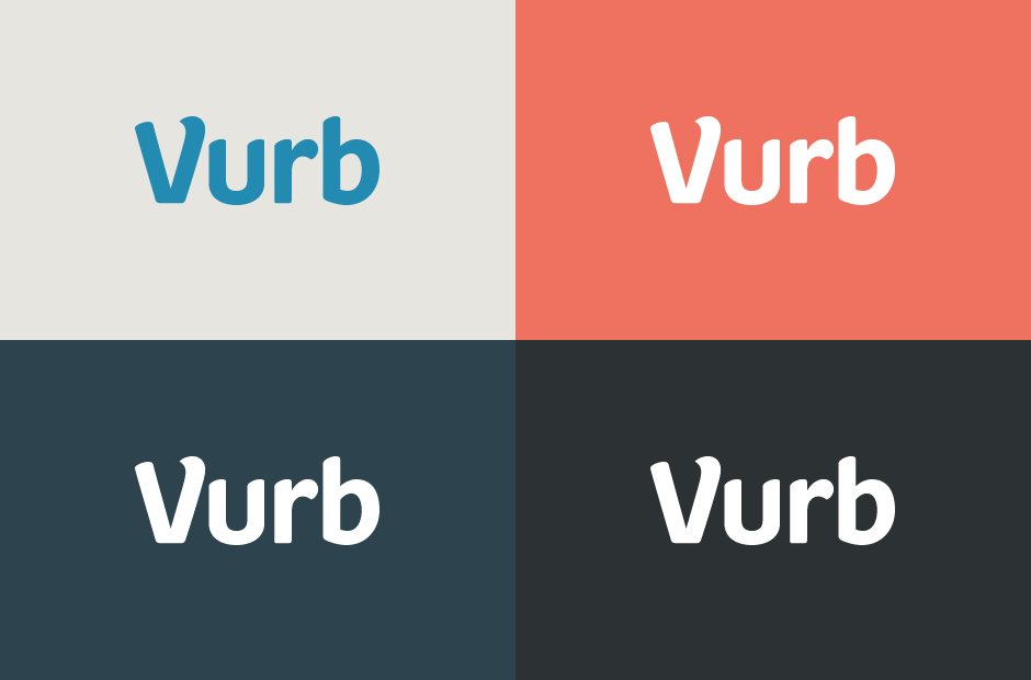
Vurb Colour Swatch
While working on the digitisation, the logo was also tested in the Vurb colour palette which was being refined separately at the same time.
Final Work
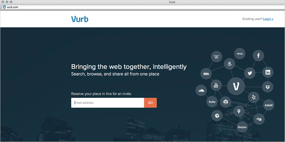
The final logo-type and 'V' icon are now implemented on the Vurb website and can also be seen featured on TechCrunch. All website work by the Vurb team.