Torád
Client: Torád
Work done: Logo-type design, custom lettering, colour exploration
Custom Logo-type
Torád is an a Prague-based venture designed for food lovers. At its base, the website will offer special recipes every week which come with a box of ingredients required to prepare each meal. The aim is to provide something new and different from what is available on the traditional market.
The team were looking for a typographic logo using custom lettering. It had to be unique, distinctive and reflect the playfulness of the name, whilst remaining clean and simple. It was also important that the logo could be used as a stand-alone graphic on packaging designs. Following the company vision and goals, my initial ideas focused on blend of a heavy-weight sans serif with a hand painted logo. I wanted something quite bold with a lot of impact as well as a playful touch.
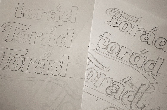
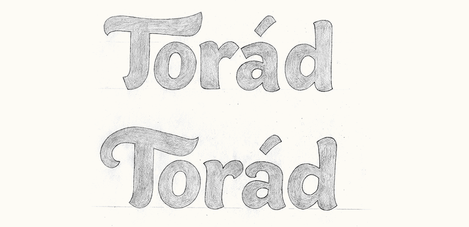
Above: Development sketches (left) and final presentation drawings with annotations.
Development
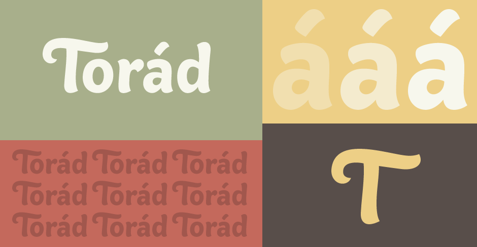
Working within one main concept, I developed three variations that looked at different extremes between relatively restrained sans serif types and more decorative brush scripts. The two with uppercase letters were the preferred designs (below). The top one has some straight lines and elements from a more conventional sans serif while the bottom one has more accentuated curves, closer to a brush script.
Above: Each capital 'T' version had certain aspects that we liked best.
Revisions & Adjustments
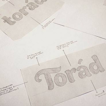
Upon discussion, we decided to go somewhere in between both versions. Having the letters more flared gives a more distinctive look with stronger personality. While creating the digital version, I explored a variety options for characters such as the 'T', the 'a' and the accent - stems pointing in different directions, various degrees of curvature, different angles, etc.
I narrowed the logo down to two versions with different forms for the 'T' (below). The top one has a much straighter stem and the end points outwards, a nod towards cursive and calligraphic lettering. The stem of the bottom one flares slightly and points the other way - the idea being that it mirrors the shape at the top of the 'd' to create continuity, both pointing inwards towards the rest of the word.
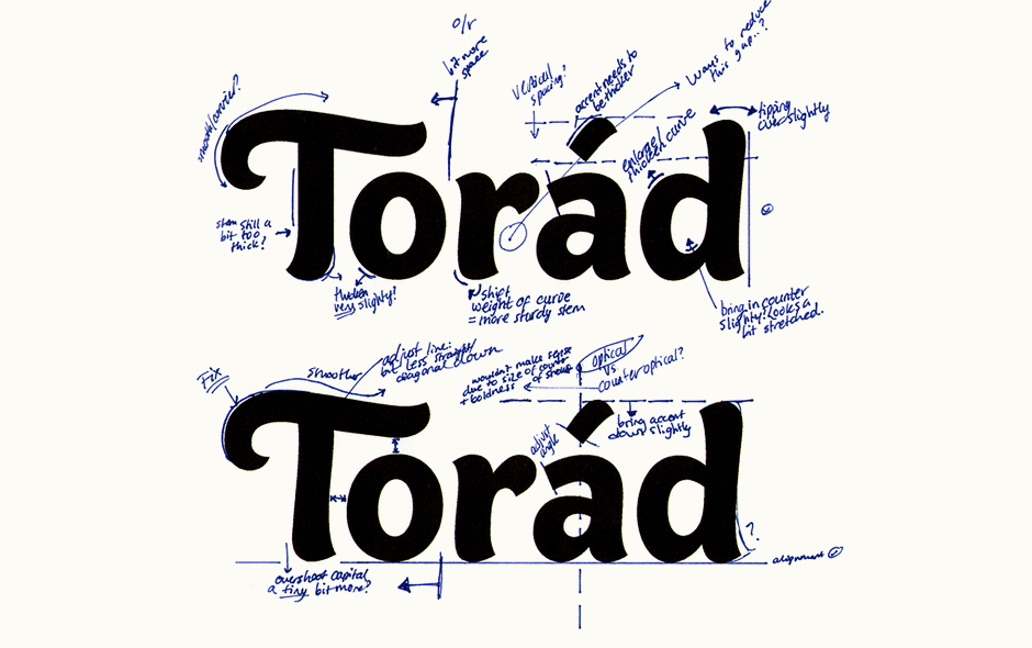
Above: Printing trials noting various details needing review.
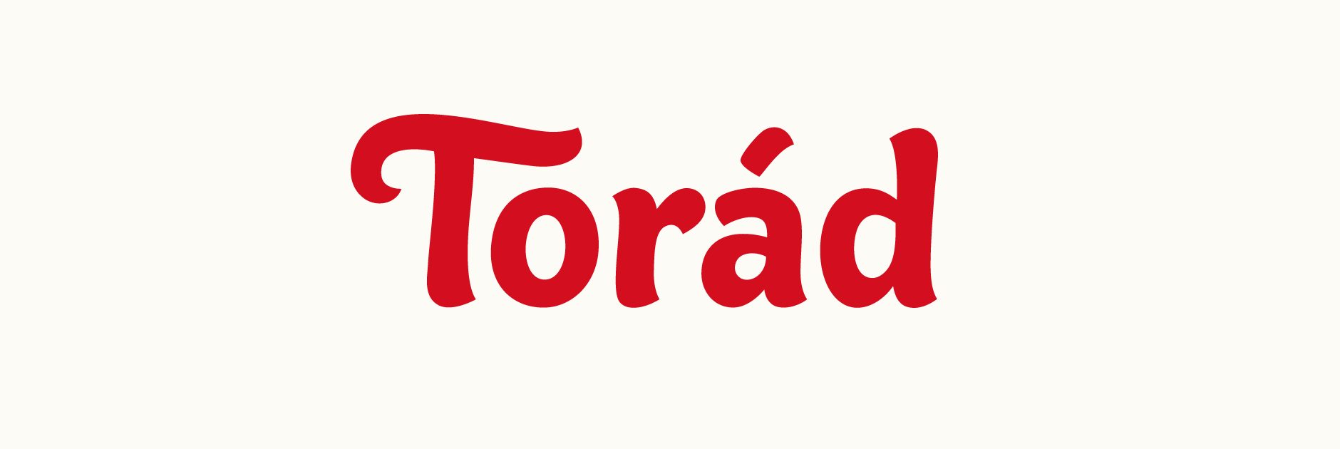
Final Logo
For the final design, I went with the more flared 'T' pointing inwards to lead into the lettering as the straight vertical stem of the other didn't fit the style of the remaining letters as well. I also revised the 'a' as its straight edged top curve was too sharp and abrupt compared to the other shapes (see the discussion on Dribbble). The accent was also carefully refined to be better integrated with the letters.