Telly
Client: Telly
Work done: Logo-type design, custom lettering, colour exploration
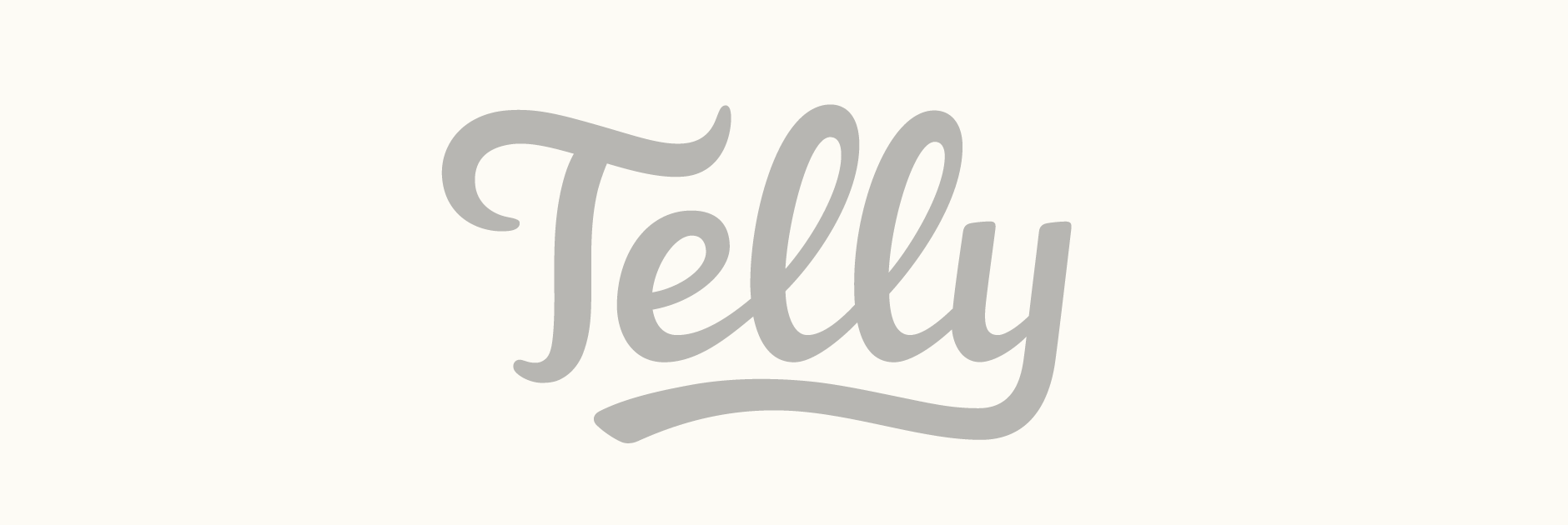
Custom Logo-type
Custom typography logo as part of the re-branding of TwitVid as Telly. The team were exclusively looking for a custom drawn script that was specially designed to be very versatile: function at very small sizes, in different container shapes, in limited space, etc. Stylistically, it was important to get the overall weight right. It needed to be heavy enough for a solid, sturdy impression but not so much that it was bulky or detracted from an overall elegant, high-quality feel.
Having discussed particular characteristics, specific objectives, the target audience, references etc. I started with some quick preliminary drawings to explore the rough shapes and how the letters worked visually.
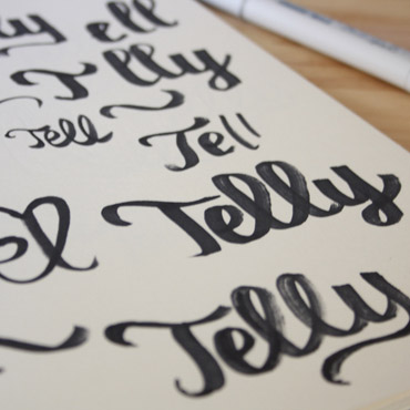
Above: A few sketchbook pages with some early rough drawings.
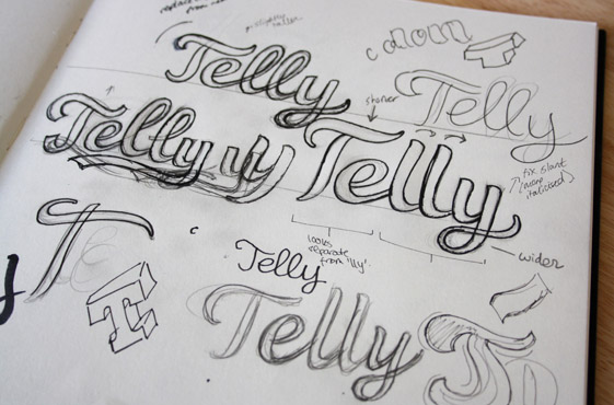
First Sketches
Three variations were developed from the first batch of ideas. While the stroke contrast is quite prominent to emphasise an elegant quality, the thinner strokes are still somewhat bold and sturdy, preventing them from appearing too narrow or hard to see when scaled down. In each case, I focused on continuity throughout the word, with the initial 'T' strokes mirrored in the end of the 'y'.
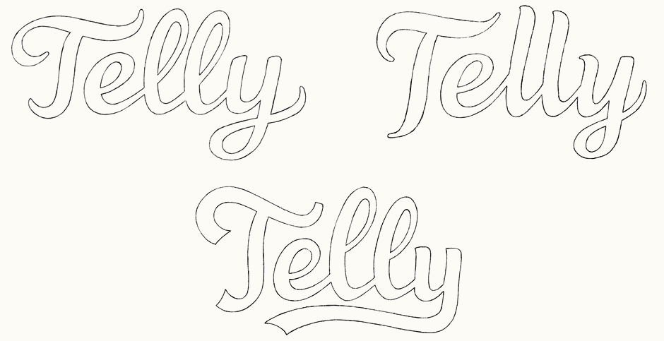
Above: Narrowing down the rough sketches to three main versions.
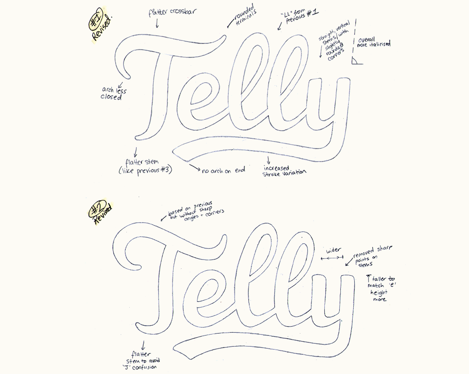
Sketch Revisions
The next development focused on improving the legibility of the 'T', bringing in softly rounded corners and combining both double 'L' loop styles with the distinctive 'y' swash of the third version.
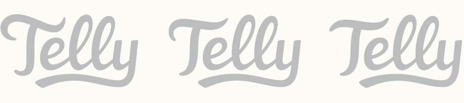
Vector Development
Going forward with the first double 'L' for its smoother, more flowing look, I moved onto the first vector drafts. Here, we continued looking at straighter, more discreet options for the 'T', including an adaptation of the second one from the first sketches.
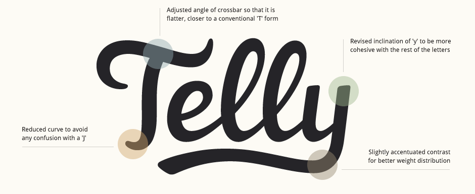
Refining
It was useful to explore alternative forms for the 'T' as it helped established that the first one was most cohesive with the rest of the letters and visually, the most distinctive one. I focused particularly on making adjustments to the lower curve and the crossbar to accentuate its shape as a 'T'.
Final Logo
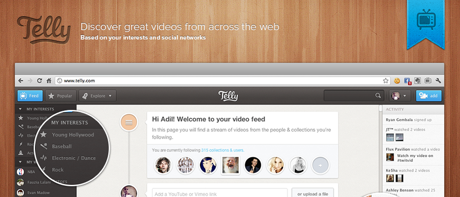
Telly was launched on the 13th June with the logo incorporated into the Telly team's website design. See the logo live on the Telly website as well as the LA Times and TechCrunch press articles.