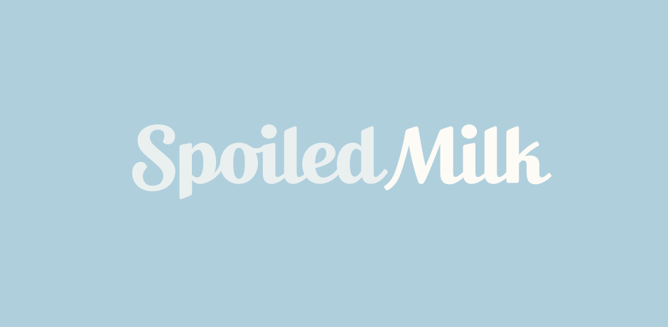
Spoiled Milk
Client: Spoiled Milk
Work done: Logo-type design, custom lettering, colour exploration
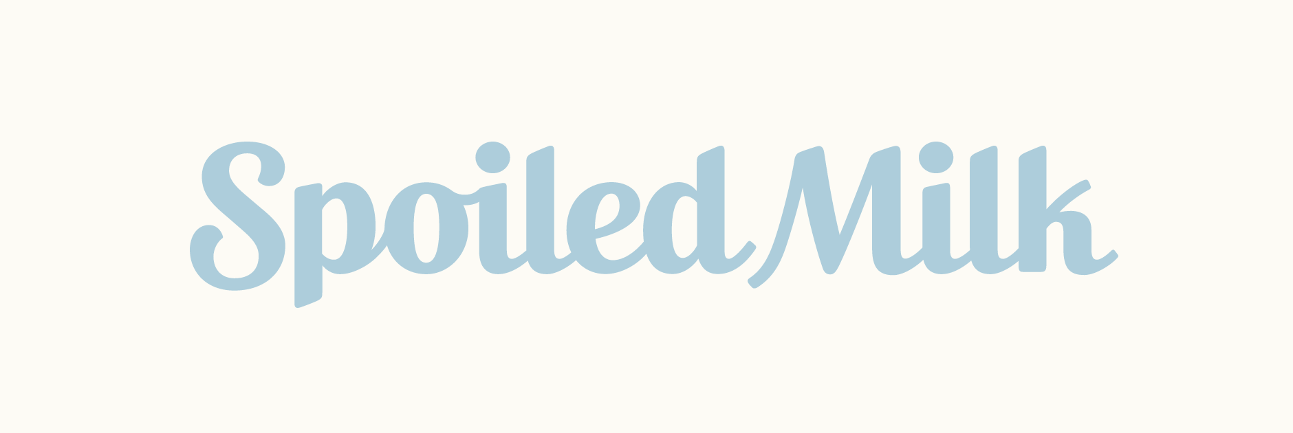
Custom Logo-type
Logo re-design for Spoiled Milk, an international digital agency with offices located throughout Europe and in the USA. The team were working on brand re-positioning to reflect the company growth and were interested in a update to the existing script logo-type. It was essential to maintain the brand's own personality strongly rooted in innovation, creativity, curiosity and thinking big, while also reflecting its more established, serious and solid position.
While reviewing the existing logo and the new objectives, we talked about following through with a bold, upright script and maintaing a hand-crafted approach, but emphasising solidity and legibility. Finding the right balance between quirky and conservative was also one of the key issues and we discussed how features such as baseline variation, weight, stroke terminals and case setting contribute to this.
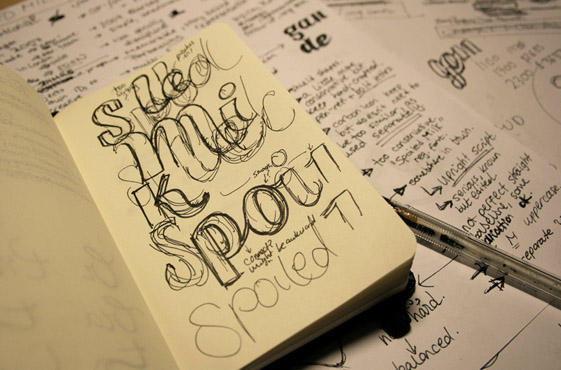
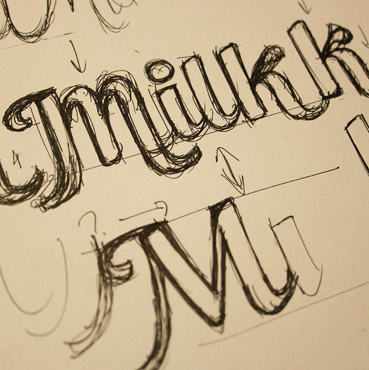
Above: Starting off with sketchbook notes and style development.
Sketch Development
I often like to start drawing really rough outlines with my favourite pen which has an ultra fine line (Pilot G-Tec-C4). The really thin, no-nonsense pen stroke has a really smooth flow which I find really encourages movement. From scribbles, I keep building on top of the same strokes until a clearer direction starts emerging.
Above: Building the letterforms with quick, repeated pen strokes.
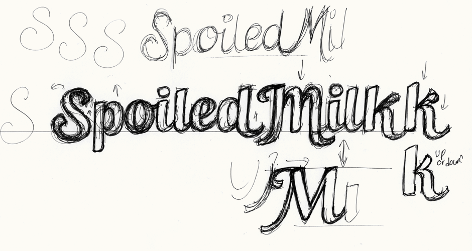
Paying particular attention to the 'M' was important here as it's one of the more defining letters of the logo-type. The first 'M' is quite organic and features a right stem that mirrors the 'k' leg. The second version draws from a more conventional letter shape and uses diagonals to visually break up the vertical repetition of the rest of the word.
Above: Final pencil sketches also showing how the different 'M's affect how the words interact.
Vectoring & Alternate
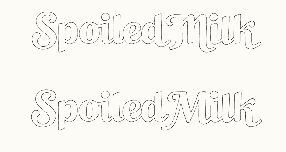
After having reviewed the sketches, I moved onto the digital version of the second version, keeping in mind some overall changes to make. Overall, one of the goals was to achieve a slightly stronger look, reducing any elements that were a little too curly (such as the top left 'M' stroke and the 'k' arm).
Making the baseline more consistent was another consideration that would contribute to a more sturdy impression. I tried two variations: one where only the 'S' and part of the 'M' depart from the baseline and a second where both the 'M' and 'k' protrude. It's only a small difference but this comparison allowed us to clearly define the desired balance between solidity and playfulness.
Above: A closer look at the alternate design and its alignment differences.
Adjustments
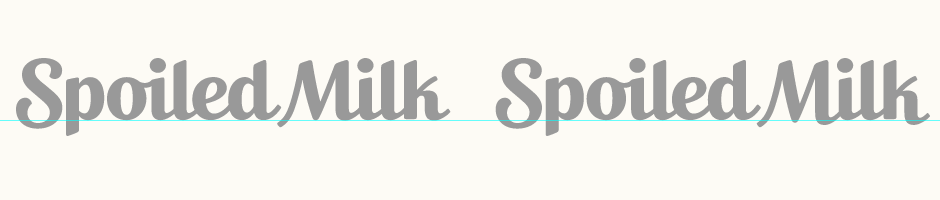
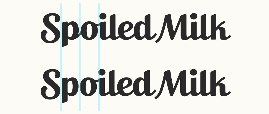
Working from the first version with the mostly constant baseline, another thing we reviewed was the way in which the 'Spo' seemed a little isolated from the rest of the otherwise connected letters. I addressed this by first reducing the 'S' width and testing a new connecting stroke between 'p-o'.
A second option then used modified letter widths (narrower 'p' and 'o') and tighter kerning to visually suggest a more compact shape. The blue areas below highlight these differences in spacing and character widths.
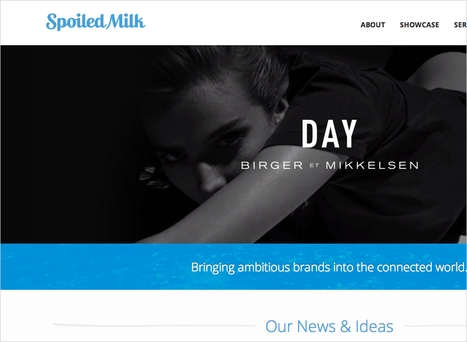
Final Logo
The final design can be seen on the Spoiled Milk website, screenshot shown below. All website work done by the Spoiled Milk team.