Save the Date
Client: Save the Date
Work done: Logo-type design, custom lettering pieces, branding, supporting visual assets, website layouts and graphics
Logo & Branding
Branding for Save the Date, an upcoming Czech start-up company offering primarily the rental of wedding decorations in a variety of different styles. It's a unique project in that it offers different alternatives to the traditional Czech wedding style in an accessible, affordable way. The goal was to build an inviting, attractive place where customers will find inspiration for their wedding, chose the perfect styling, get advice and guidance, etc. Personal relationships are at the heart of the company vision: warmth, memories, personality, feeling, individuality as well as the professional and personal experience of its founder.
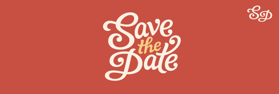
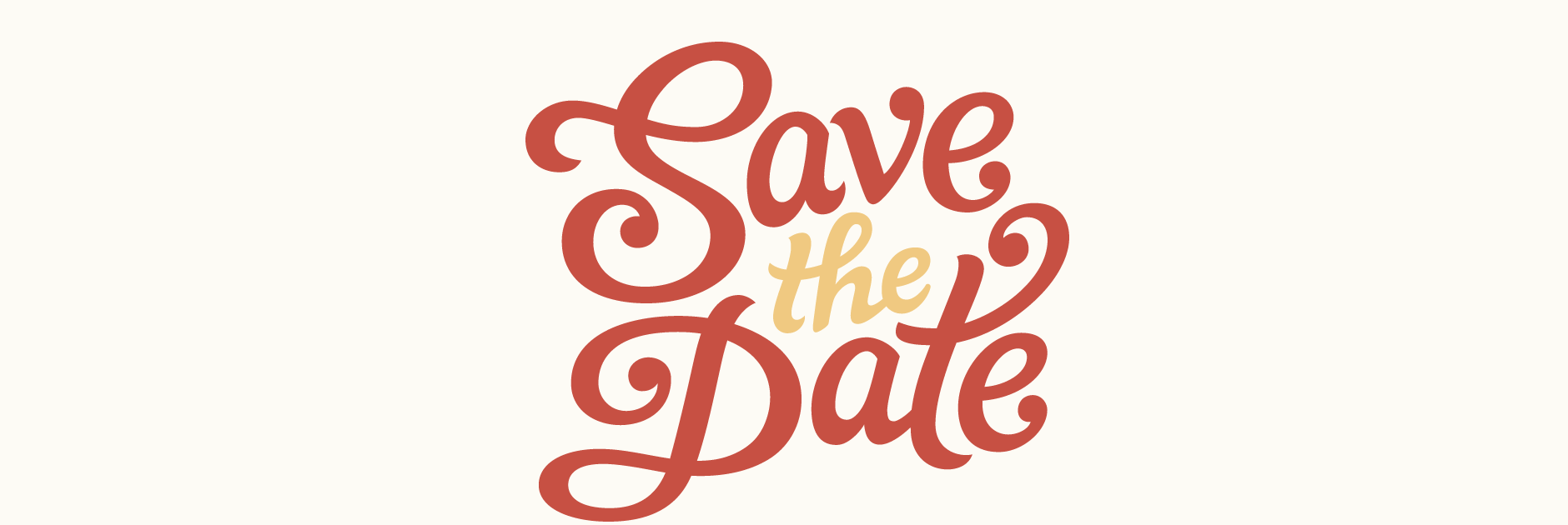
The main starting point was a custom typographic logo, followed by colour schemes, visual style guides, direction for photography, printed materials, additional graphics and layout ideas for the website design. The visual design needed to be emotive, elegant, eye-catching and feminine to appeal to the target audience. We also agreed that a vintage touch would be relevant to reflect the green, eco-friendly aspect of the company (renting, re-using, etc.).
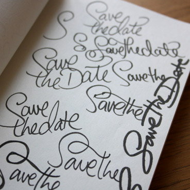
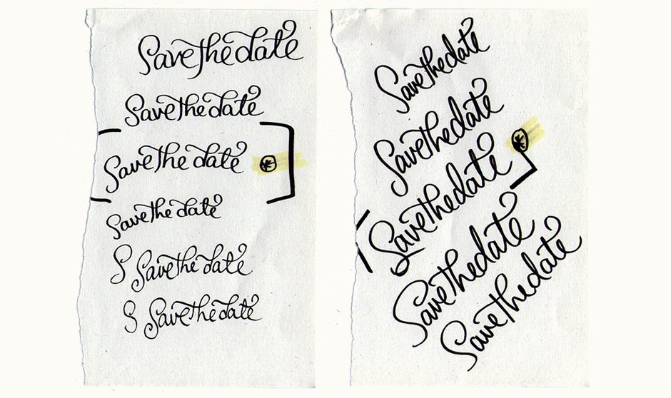
Above: Writing out the name using a few different pens for an initial sense of the letters and how they interact.
Rough Ideas
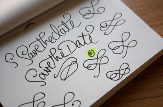
Once we'd discussed the project, proposal and overall direction, I started with some rough sketches exploring a range of variations within the brief: more decorative vs. restrained, elegant vs. casual, etc. Considering the three part name, I also played around with ideas for the composition and how the words could fit together.
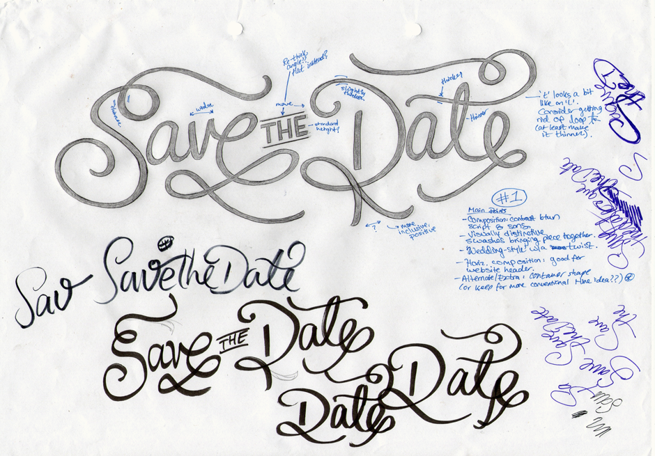
Sketch Concepts
I ended up with five concepts, some which were more suggestive of classic wedding typography, others which were less formal. There were many variations for features like swashes, composition, baseline variation, stroke terminals, etc.
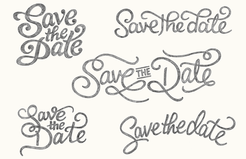
Above: The designs were presented all in the same size/manner on A4 card for an evenly judged decision.
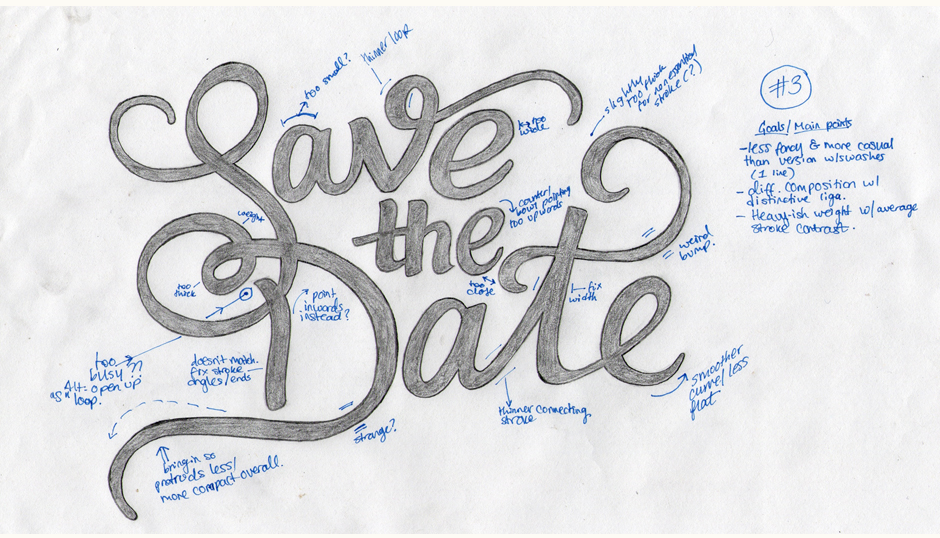
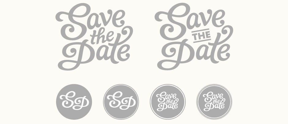
Initial Vectoring & Alternates
Subsequent review and discussion mostly focused on the top left version, with the one in the center a close second. Ultimately, the fact that the latter was quite long and mainly suited to centered positioning made it a little restrictive. We did however explore the use of the setting for "The" and its divider lines, as it had a lot of potential for further extension across the brand (website headers, article titles, etc.)
I also tried a range of possibilities for circular and/or shortened versions, something that could be used over a photographic background, as an icon, etc.
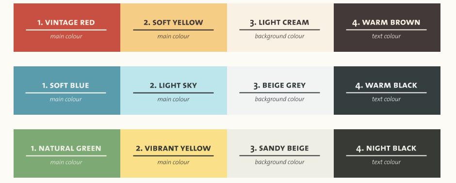
Colour Palette Exploration
At the same time, I developed four possible colour palettes that would fit the overall intended aesthetic: tones that felt warm (even with colder colours like blue) and natural. Complementary shades for each would then ensure versatility in use.
Print Designs
To help visualise the logo in the wider context of the brand, I did some sample print designs for materials like business cards and product tags. Here, I focused on the use of a circle as this something we had talked about as an ideal shape to use across different applications. Playing on the company name, we also explored the idea of having an interactive business card (below right) where one could fill out a wedding date, for example.
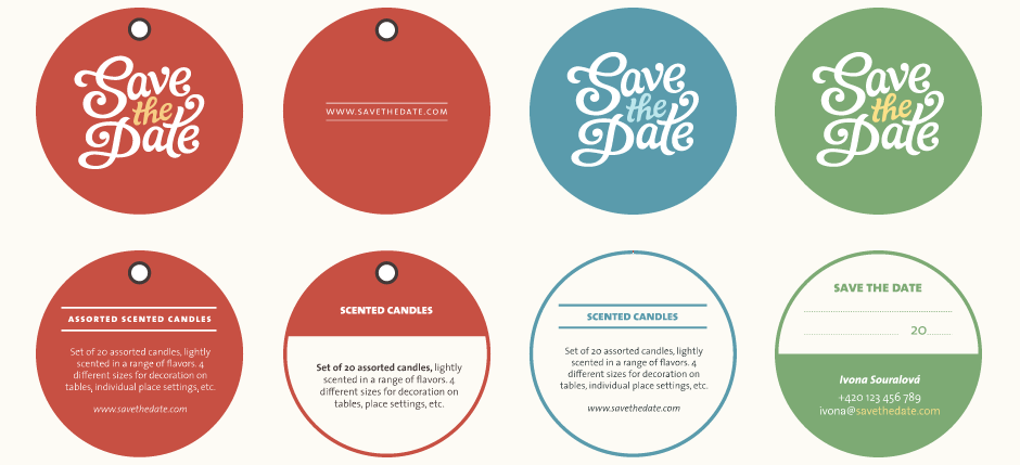
Above: Collateral design mock-ups focusing on a circular format and how this would apply across various touch points.
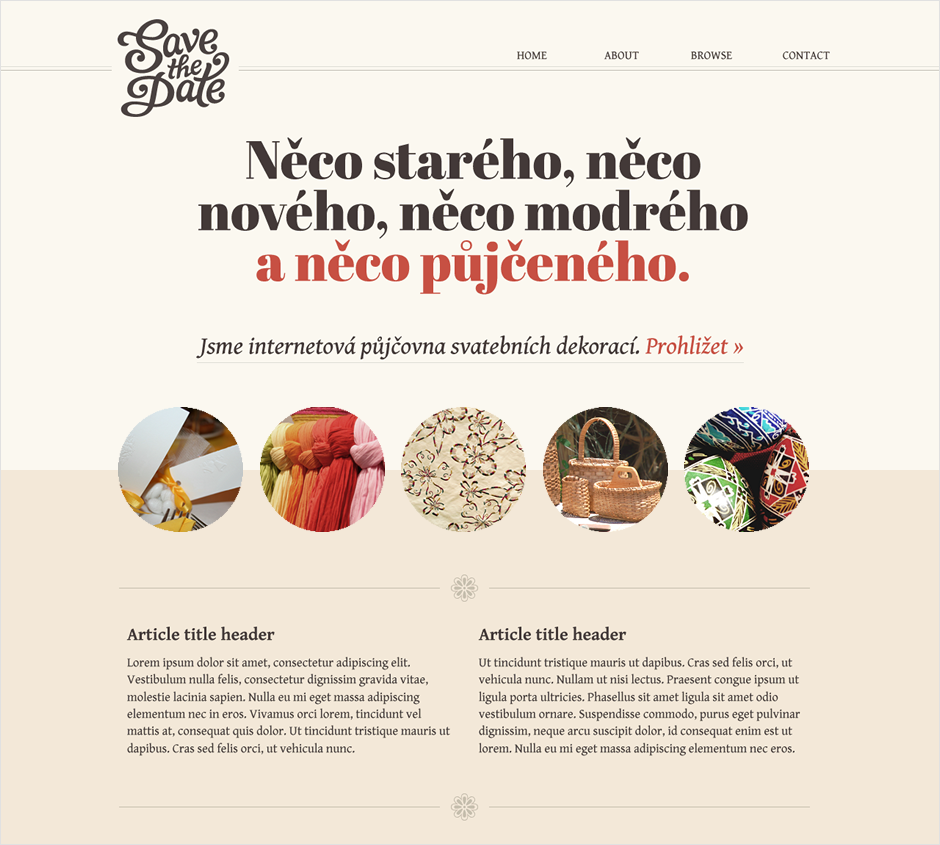
Website Graphics
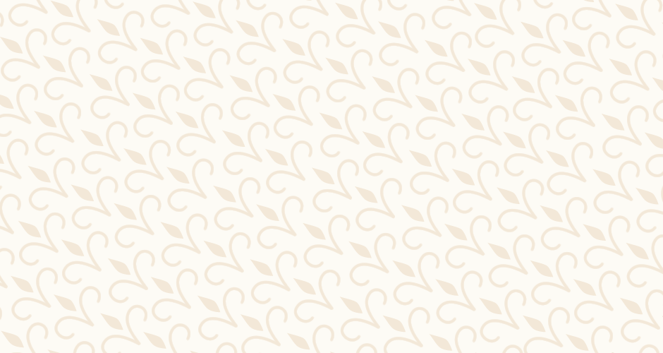
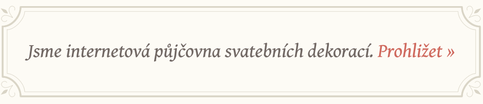
After having put together some reference examples, visual guides for the overall brand style and recommended direction for the product photography, I then worked on some website graphics. This involved full layout ideas and other accompanying materials such as ornaments drawn in a style to match the logo lettering, patterns, decorative text container shapes. Here, we were looking at different typefaces too, as the one used in the first ideas was a little too clean.
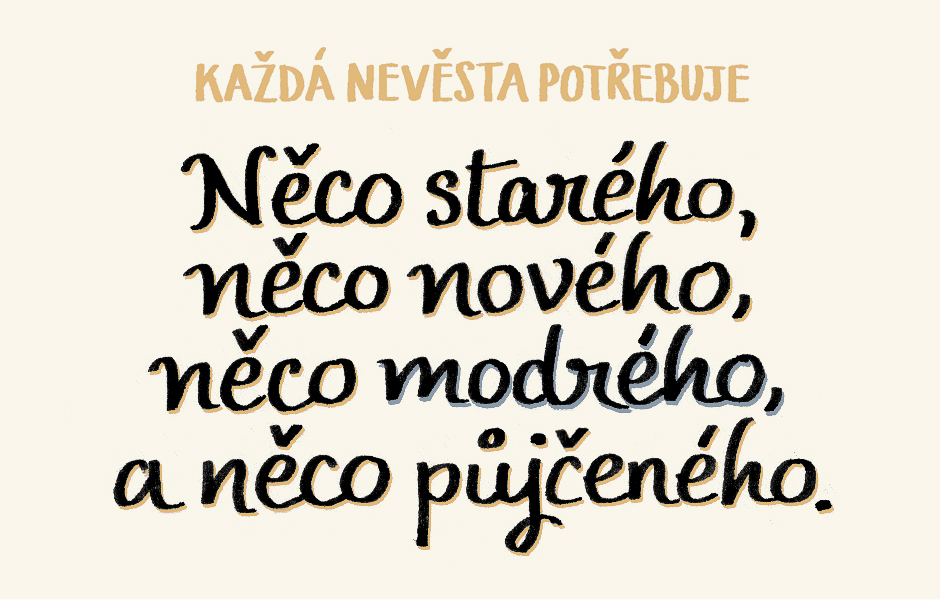
The preference for the website was to have a large typographic design in central prominence using the phrase, "Something old, something new, something blue and something borrowed" with an emphasis on the last part. After exploring some designs using different typefaces, I drew a hand lettered piece for a more personal touch (second image below).
With the benefit of a break away from working on it, the logo was then finalised with some corrections to improve the proportions and shapes of some of the letters.