Roundtable
Client: Groupsite Inc
Work done: Logo-type design, custom lettering, colour exploration
Custom Logo-type
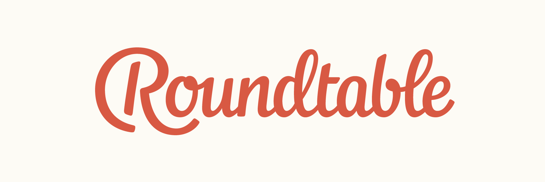
Custom lettering logo and colour palette for Roundtable, an upcoming collaboration product, followed by a subsequent extension for its parent company Groupsite. The goal was a script design to call attention to the personal, interactive and collaborative nature of the service, while at the same time look clean, professional and highly legible. The initial letter in particular needed to carry a unique personality and also function equally well as a stand alone character.
After having discussed the project and its user interface in development, I started by doing many, many very rough sketches, drawing out the name using different styles and pens. I kept in mind the name length and how to make sure the logo didn't end up too long, as well as ways to give the 'R' an original shape that would also relate to the name and subject itself.
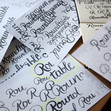
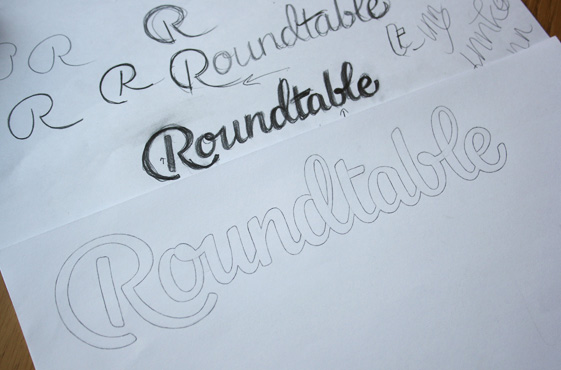
Above: A set of early rough sketches and the progression that led to the final concept.
Concept Sketch
The concept I developed uses a large curve on the 'R' that is drawn following the exact shape of a circle, referencing a round table in a way that feels natural and well integrated within the characters themselves. The lettering is slightly italicised for a sense of movement, but not so much so that it's too cursive or difficult to read. It's also slightly condensed, taking into account the fact that the name is quite long (so that it doesn't take up too much space in context). To compensate, the x-height is quite tall which facilitates legibility.

Above: Scan of the finalised sketch, used as the basis for vectoring.
Vector Development & Colours
The vector version followed the initial sketch quite closely, with adjustments mainly made to the stroke width, smoothness of curves and spacing. I payed particular attention to emphasising continuity through similar elements across the word; for example, the rounded connecting shapes in 'o' & 'b' and the loops in 'd' & 'l'. The tail on the final 'e' is also in a similar style to the lower swash of the 'R' to create a good balance between start and end.
We looked at three main possibilities for the colour palette, each using a main bright colour that could work either on white or as a background colour. These tones are then also suitable for use on a dark black, each with slightly varying tones to match.
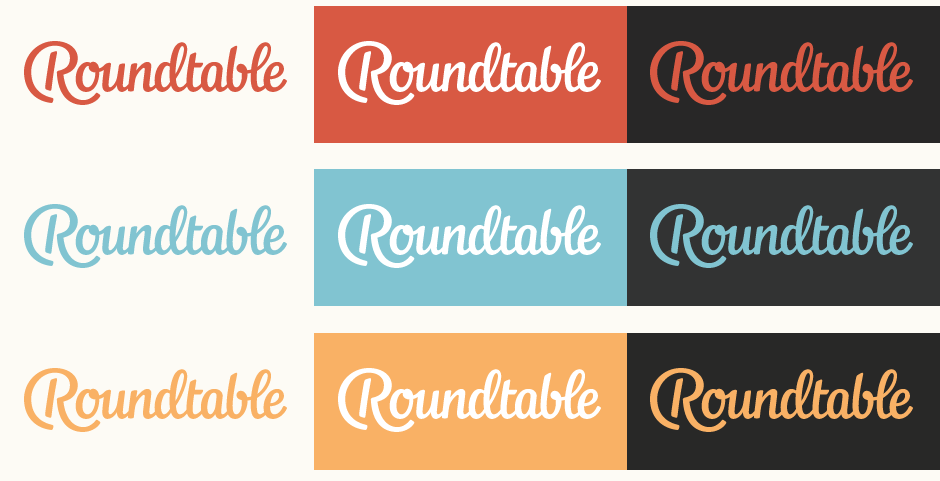
Above: Summary of the colour palette alternatives.
Tagline & Icons
The placement of the 'R' and overall composition allows for the integration of the company tagline in a way that feels natural and cohesive as part of the design as a whole. I looked at typefaces in different styles to see which combination best suited the logo script. Ultimately, the aim was something to create a nice contrast to bring out the personality of the script, but without clashing or detracting from it.
Final Logo
Below is the finalised design using the red/orange colour palette and circular icon variant.
Groupsite Extension
In February 2013, I was commissioned to create a logo-type for Groupsite, the parent company, in the same script style as the Roundtable design. Since the objective was to use the same letterforms for repeating characters, I started with rough pencil letters for the missing ones.
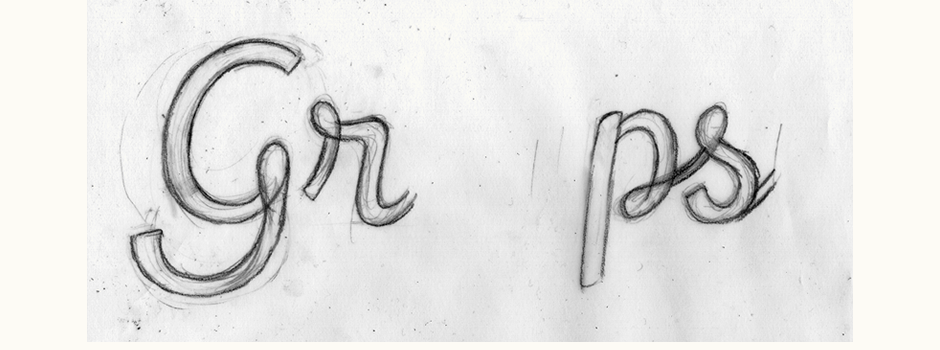
Above: Rough sketch drawn over the already existing letters for consistent guidelines and proportions.
Initial Development
The new letters are designed to act as a continuation of the first logo, with distinctive elements carried through to maintain a similar sense of character and recognisability. For example, the rounded elements seen in the ‘u’ and ‘b’ from Roundtable are now also present in the ‘r’, the ‘p’ and the ‘s’. The ‘p’ in particular mirrors Roundtable’s ‘b’ with its open counter.
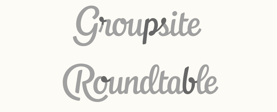
Above: Without being an actual copy, the new letterforms feature similar characteristics.
Revisions
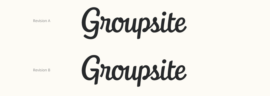
With the initial design, I tested unique ‘G’ form with a spacious, rounded feel much like the Roundtable ‘R’. A little bit awkward in the context of the full logo-type, it was subsequently revised to feature a more conventional shape: one with a curved descender and the other, a straight stem to echo the 'p'.
Finalising
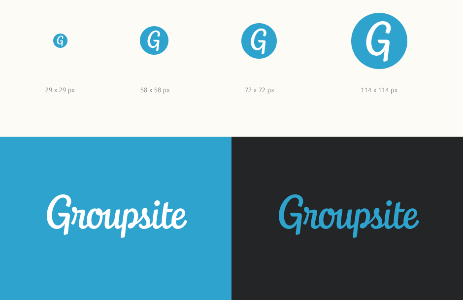
The final design uses the version with the straight stem 'G', also used for the stand-alone icon. For continuity with the existing branding, the logo uses the Groupsite company blue.
