RightHere
Client: RightHere LLC
Work done: Logo-type design, custom lettering, colour exploration
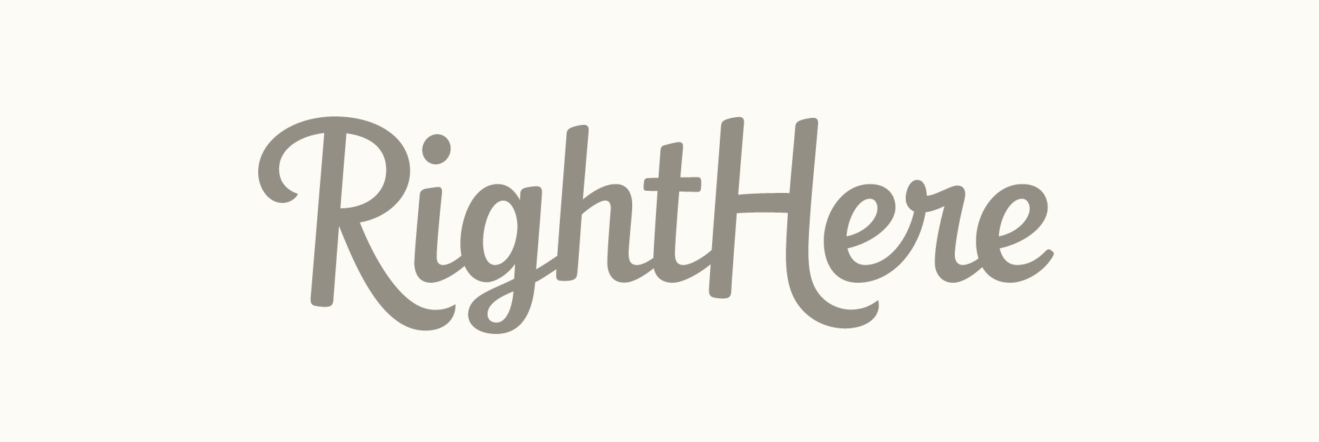
Custom Logo-type
Custom typography logo design for RightHere LLC, a small US-based company who develop affiliate programs and premium WordPress plugins. With long term experience and an established background, they were looking for a typographic re-design of their logo. The idea was to have a wordmark that would be strong and distinctive enough to stand alone, but also work with the existing graphic and/or a tagline in certain situations. One particular issue that stood out was to ensure the name would always easily be read correctly as when written in all lower case, there's a potential for confusion with "here/there".
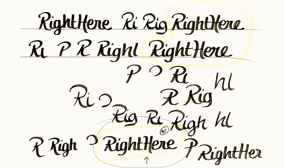
I first drew out the words over and over at different speeds and with different pens without worrying about strictly following guidelines. This helps me plan different directions and possible solutions for the various elements; not just the general style, but the relation of the letters to each other, weight, dynamics, overall shape, etc.
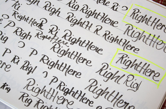
Above: Multiple rough copies of the name, getting a feel for the letters.
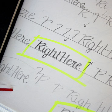
Rough Drafts
Based on this early exploration, I started forming three main concepts, each angled at different approaches within the brief. The first one started off as a rough drawing done with a thick nib Pilot lettering pen while the other two were done directly in pencil, but based on shapes that would be created by a brush.
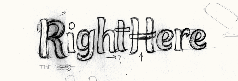
Above: Progression of the ideas to loose, very rough rough drafts.
Concept Sketches
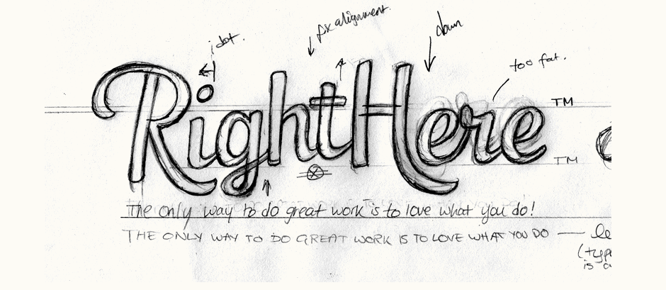
After having fixed up the rough drafts, I re-worked some new drawings on top of them to better develop details and visualise more accurately how they would work as full pieces. The first design has quite short ascenders and descenders, giving the overall logo quite a compact visual shape, facilitating its possible use in context. At the same time, the main body of the letters is quite tall to ensure clear legibility. Whilst not directly connected, continuity is created between both words through the reflection of the 't' tail in the upper left 'H' stroke.
The second concept focuses on creating a sense of movement through the naturally varying baseline and distinctive style. As the letterforms themselves are quite varied, the 'R' and 'H' keep relatively classic shapes to maintain a sense of cohesion. With a slightly quieter overall style, the more upright script style of the third proposal aims to suggest a flowing, natural look. The uppercase letters create memorable details and also ensure the name is read correctly.
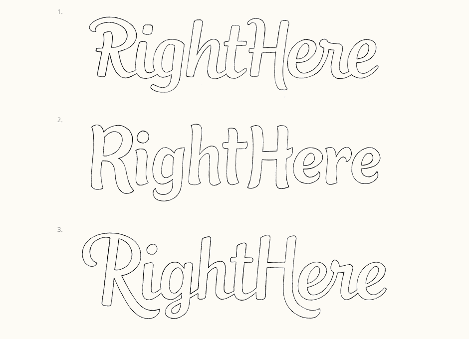
Above: The three concept sketches in clean, pencil outline form.
Developing & Refining
We went ahead with the third concept for its generally sturdy feel and the prominent shape and style of the uppercase letters. The 'g' was the main element that was focused on for refining. As the logo would need to work alongside an optional tagline, it was important that the protruding elements still allowed for text immediately underneath. The 'R' and 'H' swashes extend to same guideline, ensuring a tagline can be set below without look awkward. However, this does result in a quite distinctive 'g' loop as it has less space available. Consequently, we also looked at some alternatives with simpler forms and ways in which to emphasise continuity through the stroke terminals.
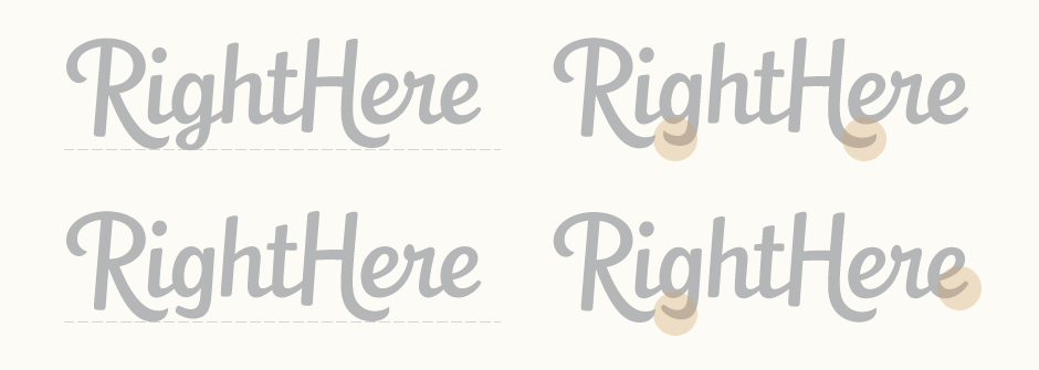
Above: Baseline, descender and stroke terminal variations.
Tagline & Colours
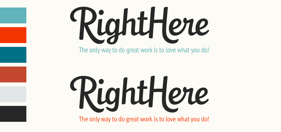
When considering the tagline, the primary considerations were to find a way to account for the relatively long phrase as well as choosing a typographic style that didn't compete with the quite strong script of the name but felt cohesive at the same time. The first alternate (below top) is set in the lighter weight of PT Sans Narrow as its condensed forms are suited to the long tagline and allow to remain set in a relatively large point size. The second version is set in Meta Condensed for its large x-height which gives the type an impression of space and encourages legibility.
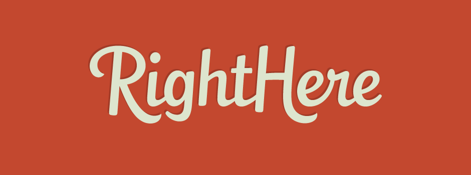
Final Logo
The final design uses a thin, softly rounded terminal on the 'g' descender that is based on the shape and weight of the 'e' tail.