Rally
Client: Rally
Work done: Logo-type design, custom lettering, branding development
Logo & Branding Work
Rally is a intended as promotional tool for information, events and people through the use of smartphone technology. Key characteristics to convey were fun, energy, action, youth, adventure and excitement, with a bit of a vintage touch for a playful, distinctive contrast. The logo would need to work on stickers and posters that would often be posted in low light, so solid lines and legibility were particularly important issues.
Conceptually, the client was interested in visualising the driving technology behind the project within the lettering itself. I explored ways to incorporate the idea of the connection between devices by referencing the concept as a whole, rather than a literal representation. This reflects a comprehensive attitude that directly relates to the fact that the project deals in various areas. It also anticipates the growth of the brand as it encompasses a wider, holistic approach that can carry more weight in the long-term.
During the early idea development stages, I drew out some fast, rough ideas that integrated this idea of connection and sharing into the shapes/style of the letters. For instance, start and end letters that have a prominent direction can give the impression of a connection between the start of the word and the end, which can then be further accentuated by the uses of swashes, underlines, etc.
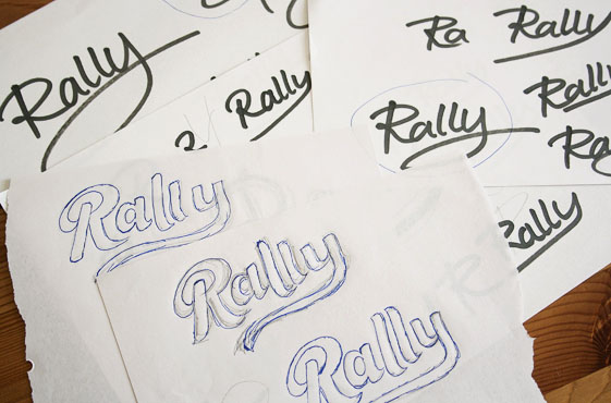
Above: Exploratory sketches and rough style development.
Concept #1
Loosely based on the shape of handwriting, this design aims to convey energy and movement in a natural, flowing way. The large, open counter of the 'R' directly draws the eye into the word, then turning into an underline. This is turn continued in the descender of the 'y', suggesting the idea of a connection, one element making contact with another, etc; characteristics which are at the heart of the technologies in question.
Inspired by lettering on vintage car brands, cameras, appliances, etc. the straight, diagonal stroke of the underline and slight geometric feel serve to contrast the loops and curves of the other letters. The slight upwards slant of the composition along with the angle of the letters creates a positive, dynamic feel. The low stroke contrast allows the line weight to remain relatively consistent without any thin strokes that could potentially get lost at smaller sizes and in tougher printing or reading conditions.
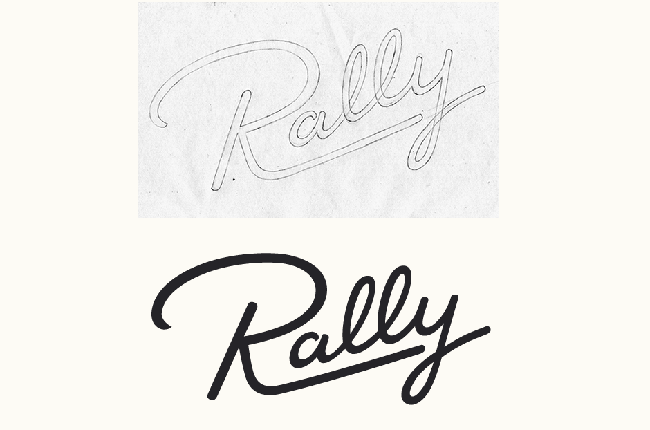
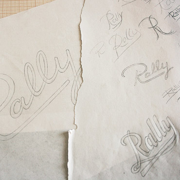
Above: Loose pencil sketch before moving onto the vector version.
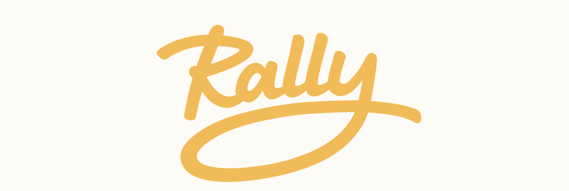
Concept #2
Inspired by the strokes of thick markers and brushes, this second design gives off a dynamic, spontaneous and adventurous feel. Details such as the ends of strokes slightly curving outwards, as if caused by the pressure of pen on paper, accentuate a sense of activity and speed. The letters are quite rounded and vary in size for a fun, natural and friendly look.
The whole word is on a subtle curve in order to emphasis the sense of movement. One of the main focal points, the large loop of the 'y', also follows this curve. The concept behind this feature is to suggest the idea of one element reaching out to another (in this case, the 'y' literally reaching out to the rest of the letters) and then back. Visually, this also helps the design to stand out as a unique logotype, rather than a word simply written out.
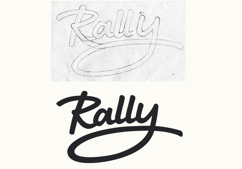
Above: Here, the sketch serves primarily as an approximate guideline for vectoring.
Development & Colours
Colours and applications of the logo in context were explored from the very early stages in order to test the potential of both concepts. As there was to be two slogans, the designs needed to work equally well with these different length phrases. The client was also looking at the potential of the brand name as a verb, so one of my objectives was to give the logo possibilities to expand along with the growth of the brand.
For the first concept, I used a heavy font with wide letters to act as a dynamic contrast to the thin strokes of the lettering. To ensure the different typographic styles didn't clash, the low modulation of the sans serif matches the uniform line width of the logotype. As the second concept features bold, chunky lettering, the typeface is light and loosely tracked, adding a sense of space. The letters themselves remain relatively narrow to prevent the composition from spreading out too much.
I explored a number of colour options, focusing primarily on warm tones and striking combinations in order to accentuate the energetic, adventurous qualities central to the brand. It was also important to develop a colour scheme that would appeal to a wide target audience, both masculine and feminine.
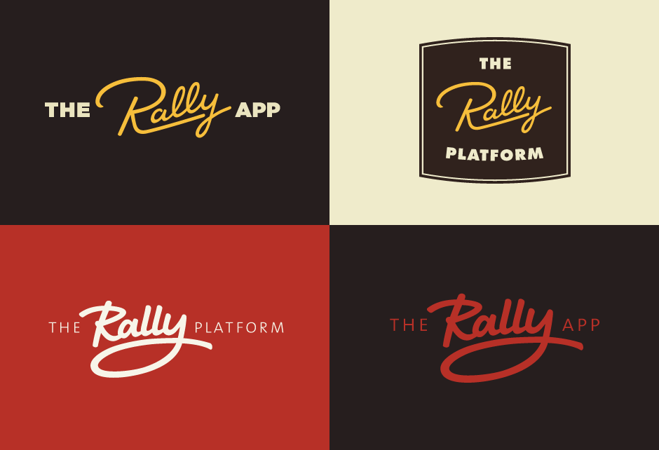
Above: Colour and compositional variations.
Revisions & Styling
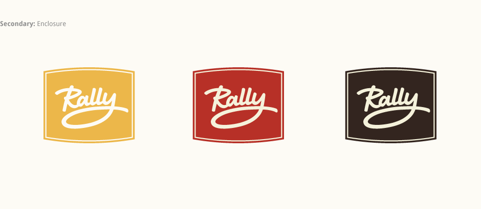
The second concept was chosen for its contemporary, dynamic and casual feel. To make it stand out even more, it was revised to be a little bolder and I also adjusted the height of the 'L's to better match the angle and slope of the baseline. Looking at ways to vary the styling of the logo depending on particular applications, we also did some rough drafts of a few visual effects including different shadow/background styles and subtle gradient overlap/shadows.
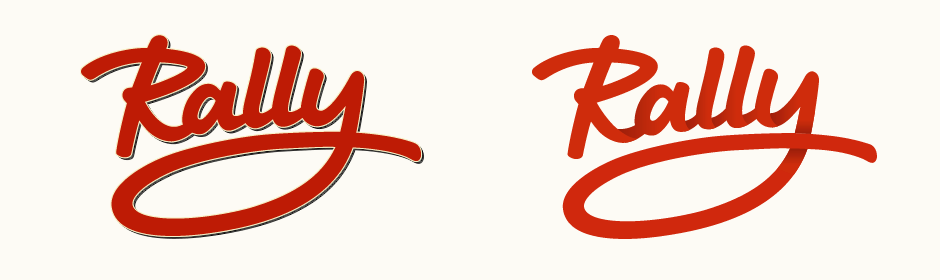
Above: Testing different stylising effects.
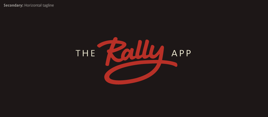
Final Work
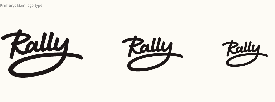
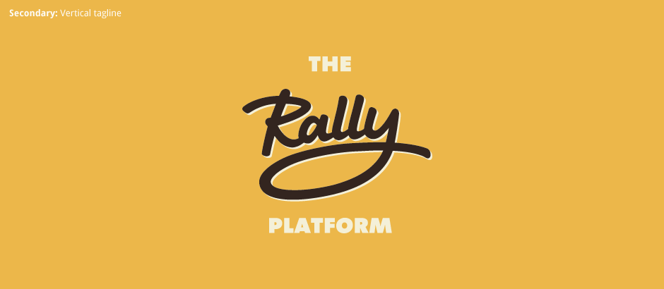
In the end, the logo variations focus on on colour, composition and use of a simple solid shadow. More versatile, this approach is better suited to a range of potential applications and ensures a more consistent look throughout. The final logo is accompanied by two lock-ups for the alternate accompanying text versions. The vertically stacked composition of the longer phrase allows for different setting of the same typeface (weight, spacing, etc.) adding variety and giving the brand more versatility with plenty of room to extend.