Perigee
Client: Perigee
Work done: Logo-type design, custom lettering, colour exploration
Custom Logo-type
Perigee is a new company focusing on creating useful and desirable applications that are not only fun and easy to use, but can also enrich people's lives. They were looking for a typography based logo that would reflect the high quality craftsmanship of their products in an humanist, contemporary way.
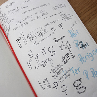
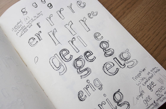
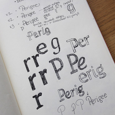
Above: Brainstorming, planning and letterform studies.
Sketch Development
A few distinct directions started emerging from the initial research and discovery stages. Keeping in mind both overall styles and specific characteristics for each, I built up the rough drafts both in pen and then digitally. With a clear idea of where these were going, I then re-drew them as more refined pencil sketches so we could review them more clearly.
We discussed what each style evokes, how the varying typographic features affect the overall look (different letter shapes, proportions, weights, contrast, terminals, roundness, angle...), which details are more or less effective, and what approach fits best with the design style of the company products.
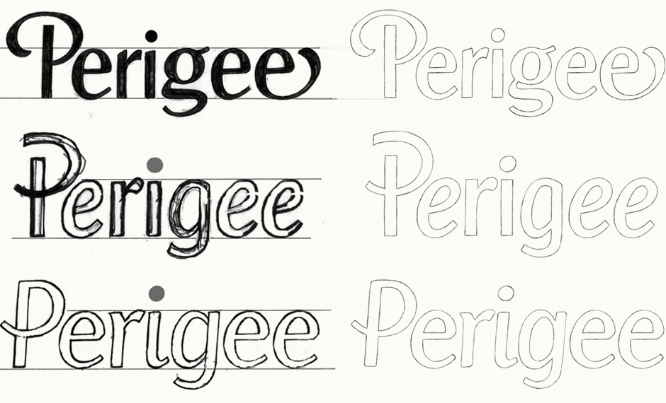
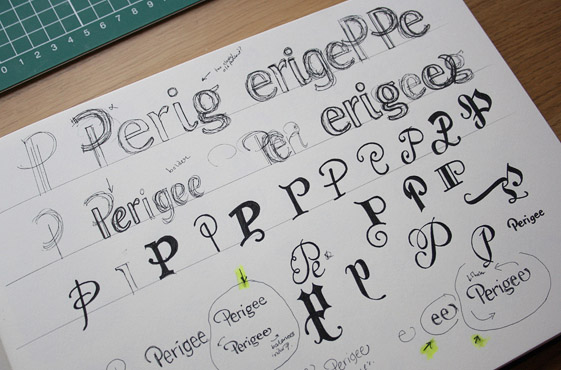
Above: Ideas narrowed down to 3 concept drafts and then refined.
Final Sketch
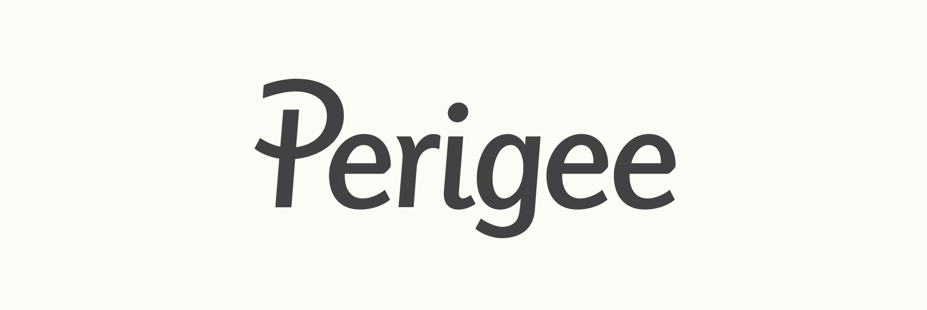
Working primarily from the third initial concept, the idea was revised to incorporate the most appropriate and compelling attributes of the other versions. The primary aims were to make it more memorable and more crisp, with a cleaner and stronger overall feel. The weight is now also more constant and there is less variance between thick and thin strokes, a change which draws inspiration from sans-serif faces such as Avenir and Helvetica in order to complement the look of Perigee interfaces.
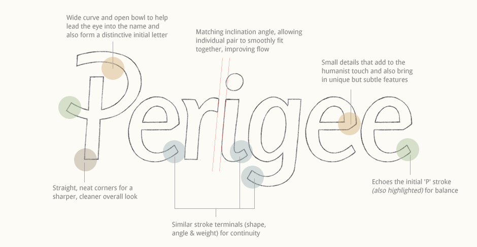
Above: Reviewing the details from early on ensures a considered, careful final piece.
Digital Version
Below is a screenshot of the final sketch with its initial guidelines and the vector lettering on top, after a few rounds of adjustments. The finished logo has a slightly reduced x-height compared to the drawing because in context, it was looking a little too tall/vertically stretched. Other aspects such as inclination, kerning and stroke width were also heavily refined digitally.
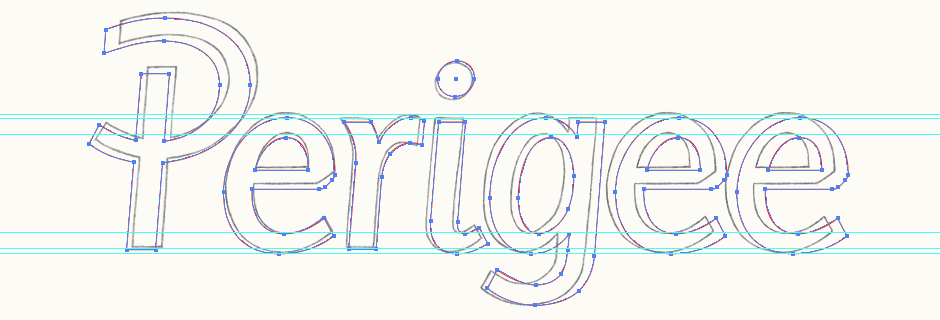
Above: Overlay of the final vector construction on top of the original sketch.
Context & Recommendations
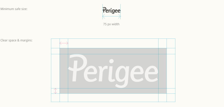
From the beginning of the digital process, we were lucky to be able to test the logo in context which helps to ensure a final design that is perfectly adapted to its specific use. Kerning in particular was carefully adjusted to allow for a recommended minimum size that is quite small. Setting clear space around the logo (taking into account the tall capital 'P' and the 'g' descender) also ensures that the logo will always look comfortable and effective in different contexts.
Colour Exploration
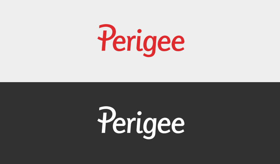
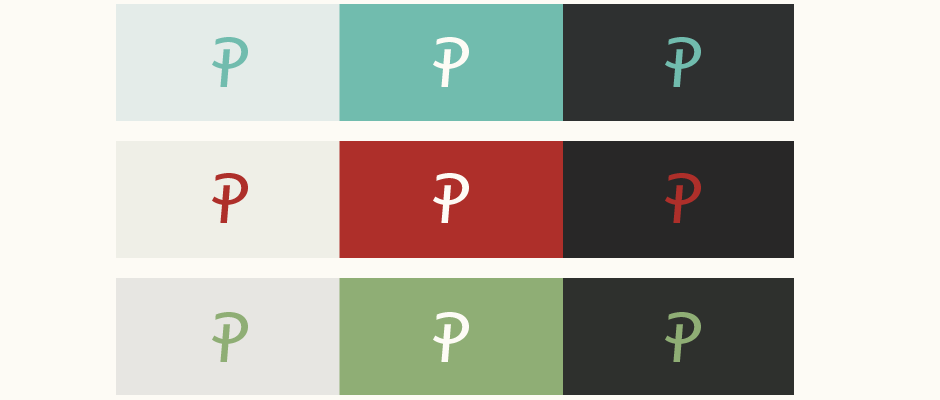
While finalising the design, I also explored a few possible colour palettes to complement the logotype and its objectives. The goal was to look at tones that felt fresh, contemporary, approachable and also quite natural. Reviewing the projected use of the logo-type and the design approach of the website, we ultimately decided to use minimal colouring for the logo itself and instead, let the colour come through in the applications themselves.
Final Logo
The logotype is mostly used in black, greys and white with red as a possible alternative for secondary uses. The final design can be seen in use on the Perigee website.