Olive & Twist
Client: Olive & Twist
Work done: Logo-type design, custom lettering, colour exploration, print design
January 2011
A newly launched small web design company based in Belgium, Olive & Twist was after a unique and memorable logo to reflect their company characteristics and objectives. Interested in custom typography, they wanted something modern, fun and simple to communicate their friendly, trustworthy and professional approach.
I started off by experimenting with different lettering and how to incorporate the key elements in an appropriate overall style. Very rough writing with a thick Chinese calligraphy brush led to a thick, casual script that felt quite sturdy. Pencil sketches were then created based on these rough ink drawings, allowing for better control and refining of details like individual strokes and terminals. I also explored the idea of combining a sans serif with a custom drawn script but quickly felt that it didn't address the personal and friendly nature of the company as well as a fully drawn script.
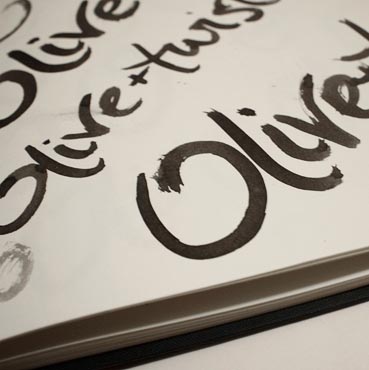
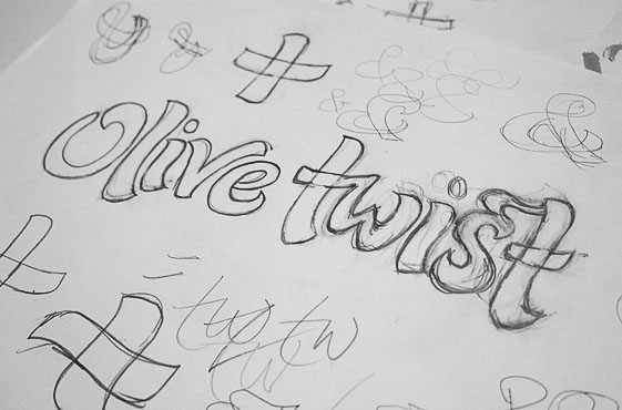
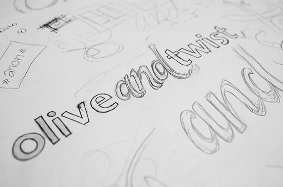
Above: Initial lettering experimentation, sketches and unused concept drafts.
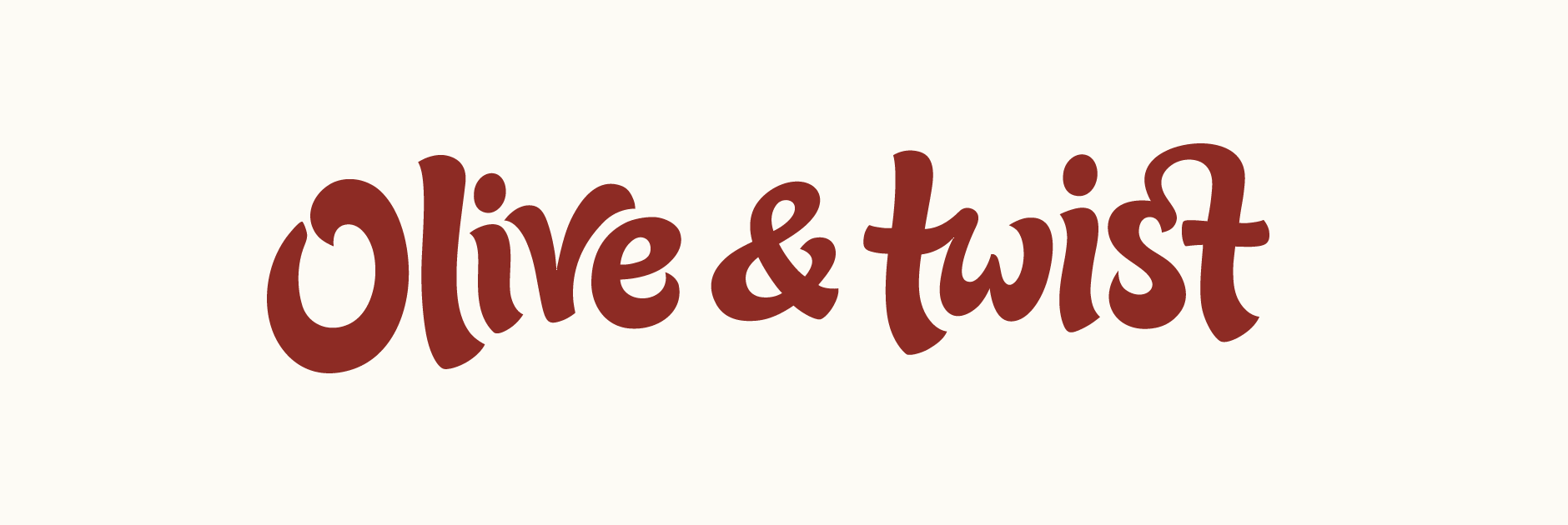
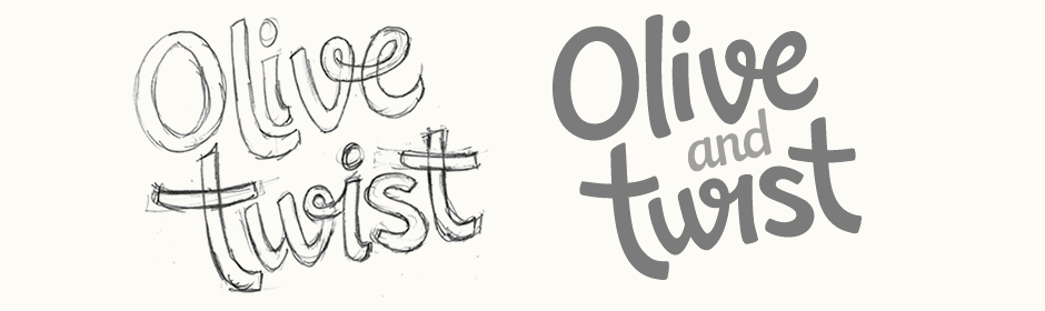
Concept #1
The brush script style sketch was vectored with a focus on keeping the varying stroke contrast, natural letter curves and subtle waviness of the baseline. Having the letters not strictly on a straight line highlights the visual aspect of the words and helps them to stand out as a unique logotype, rather than a phrase simply written out.
Ligatures, such as the 't-w', were born out of the natural form of the letters when drawn and this flow is carried through to the digital version. These subtle typographic elements reference the quality and attention to detail that embodies Olive & Twist's work. For the 's-t' ligature, I ended up with two slightly different forms; one quite unusual with a twisted curve (A) and the other, slightly more conventional with a subtle heart shape in its negative space (B).
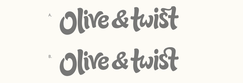
Above: Testing two 's-t' ligature variations.
Concept #2
The second concept focused on creating a friendly, personal and casual impression. The overall style is closer to handwriting in order to relate to the personal relationships and care central to Olive & Twist. As the initial sketches centered on the interaction of the letters and ensuring they fit together, I made sure this was maintained throughout the development in order to create an overall fluid and cohesive piece. Elements such as the 'v-e' and 'w-i' twisting into each other serve to add distinctive and memorable characteristics.
Above: Original rough sketch next to its digital counterpart.
Final Logo
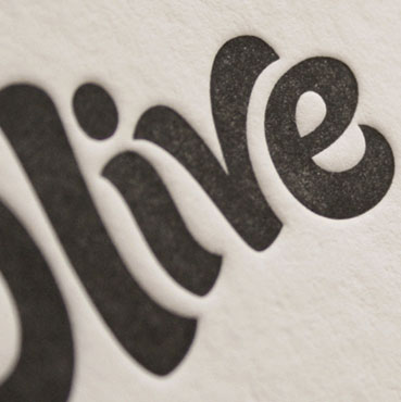
After much deliberation, the chosen version was the first concept with the alternative ligature. Its simpler curve and lines was more suited to the letterforms themselves and the heart brought in a fun extra element that would also allow the 's-t' to stand alone nicely. Finishing touches then included tweaking and finalising the details and consistency throughout, notably stroke width and letterspacing. See the project and discussion on Dribbble and the logo in use on the Olive & Twist website.
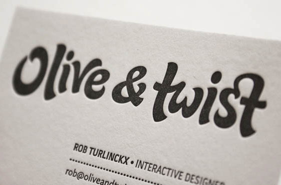
I also helped Olive & Twist with a business card design, letterpress printed on Crane’s Lettra 110 by Mama's Sauce print shop in the USA. The aim was a clean and minimalist design with the logo as the focal point.