Kiubi
Client: Kiubi
Work done: Logo-type redesign, custom lettering, colour exploration
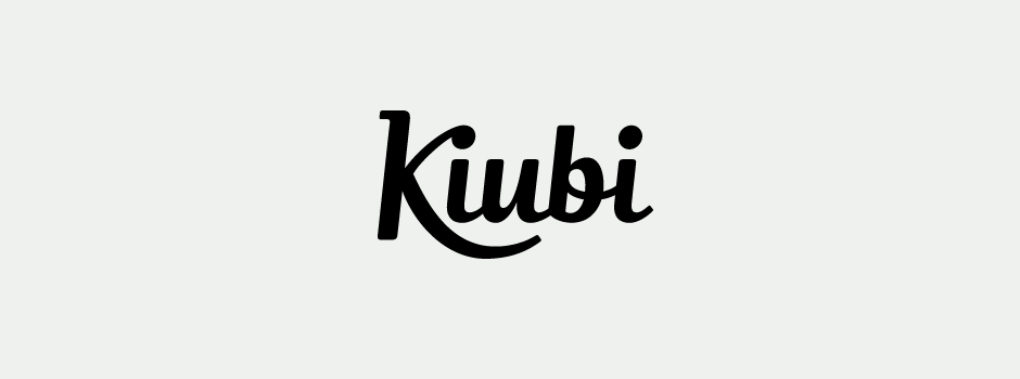
Custom Logo-type
Logo re-design for Kiubi, a CMS and e-commerce platform based in France. Specifically created for web designers, Kiubi was hand built and custom designed for its audience, so custom drawn lettering was an ideal approach. Being a high quality, sturdy and efficient product, its logo therefore needed to have a controlled and steady side with a contemporary feel. It also had to mark some continuity with the existing logo which had been in use for a couple of years. The team were also keen to avoid anything too bold in order to reflect the fact that Kiubi is a light platform that is really transparent to its user.
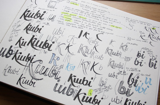
Above: Some initial sketchbooks with notes, first brainstorms and rough concepts.
Concept Development
Within the desired script approach, I developed more specific styling that would visually represent both Kiubi as a product and its overall aims. We also studied the existing logo to consider what its most memorable aspects were and how these could be translated into a new identity. Continuing the use of a prominent 'K' with its little serif was something we felt had a lot of potential as it's quite a unique letter. The possible integration of a ligature was another feature that emerged quite early on as a way to add a distinctive but subtle detail.
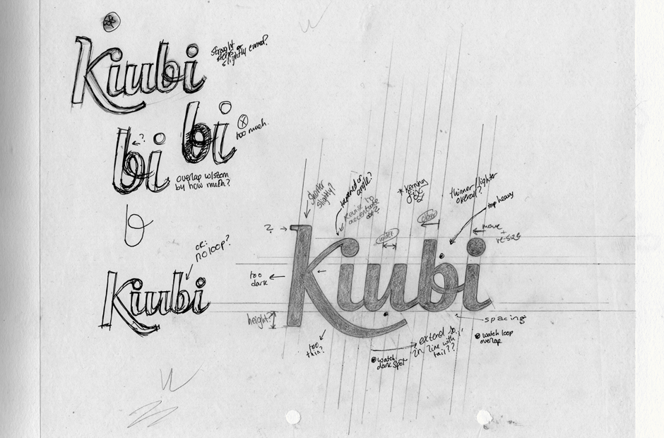
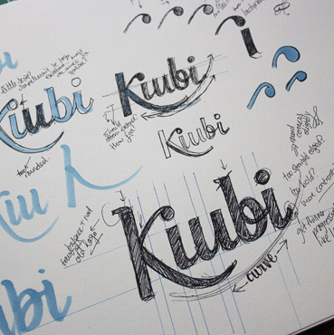
Above: Scans of sketchbook pages with the last rough draft and the final sketch, with annotations for areas to correct.
Vectoring & Refining
The medium-weight lettering with consistent alignment and letter inclination immediately suggests a solid and reliable feel. The 'K' swash extending below the baseline brings in positive movement and draws the eye along the length of the name. Its angle and shape is also mimicked in the final 'i' tail, improving the coherence of the logo as a whole. The 'K-i' ligature serves as a memorable touch that improves the kerning of the letter pair, without hindering legibility.
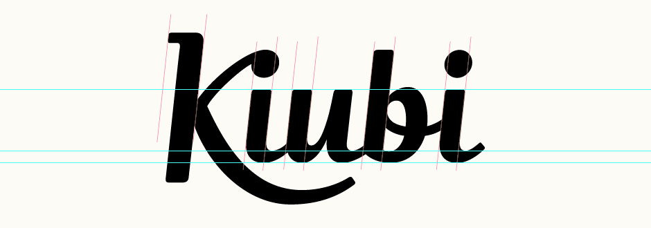
Above: Creation of the vector version using guidelines to ensure consistency.
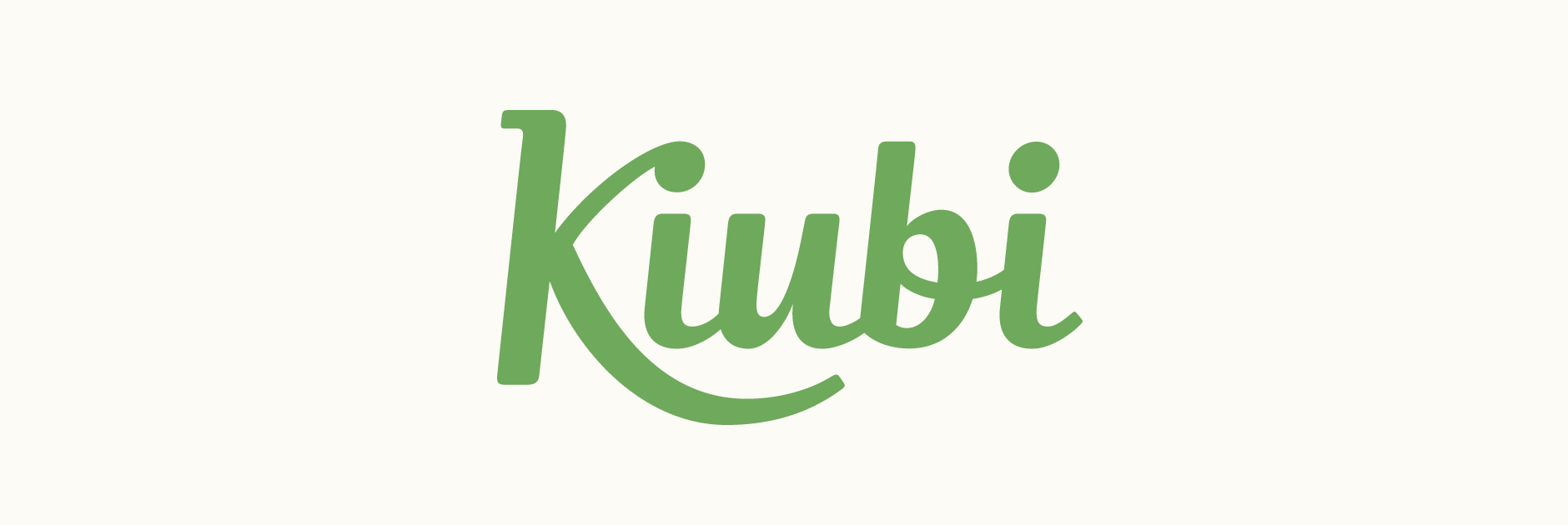
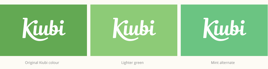
Colours
Staying within the company's current use of green as the main colour, I also explored a few alternate options for an updated look that would still maintain a similar, familiar feel. Ultimately, we went with the original Kiubi green, for which I suggested some accompanying lighter and darker colours.
Variations
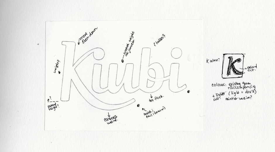
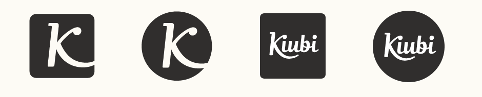
As well as the main logo-type, Kiubi were also interested in seeing some reduced versions that could be used in situations such as the website footer, social media icons, etc. Initially looking at the 'K' as a stand-alone character, we then considered the full logo within certain container shapes as being quite a short name, it was well suited for use at the much smaller sizes required for icons.
Final Logo
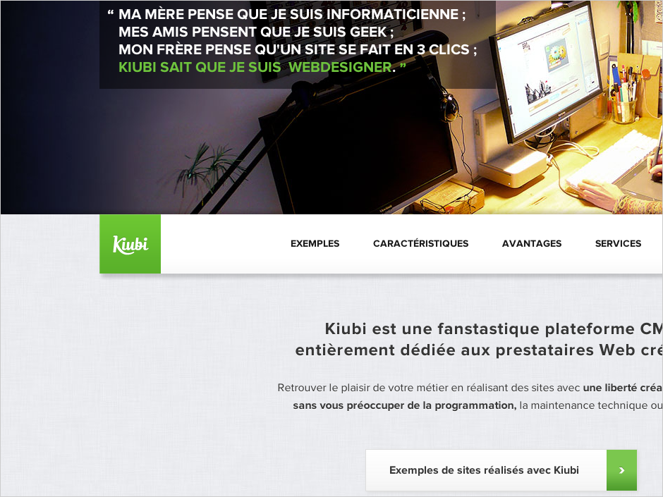
The final logo can be seen on the Kiubi website. Shown at actual size on part of the homepage page below and also integrated within various graphics and illustrations – screenshots below. Website design and all artwork done by Kiubi and its creators, Troll d'idées.