Just Hype

Client: Just Hype
Work done: Logotype design, custom lettering, consultancy
Custom Logotype
Custom logotype design for Just Hype, the USA branch of the fashion label Hype. The goal was to create a script logotype that would have the same kind of look and feel as the original Hype logo, whilst being it's own unique design.
I started by studying the original Hype logo and outlining its overall style, distinctive features and what could be improved. I used this as a guide for planning 3 new concepts and proposing how we could use various typographic characteristics to address the brief.
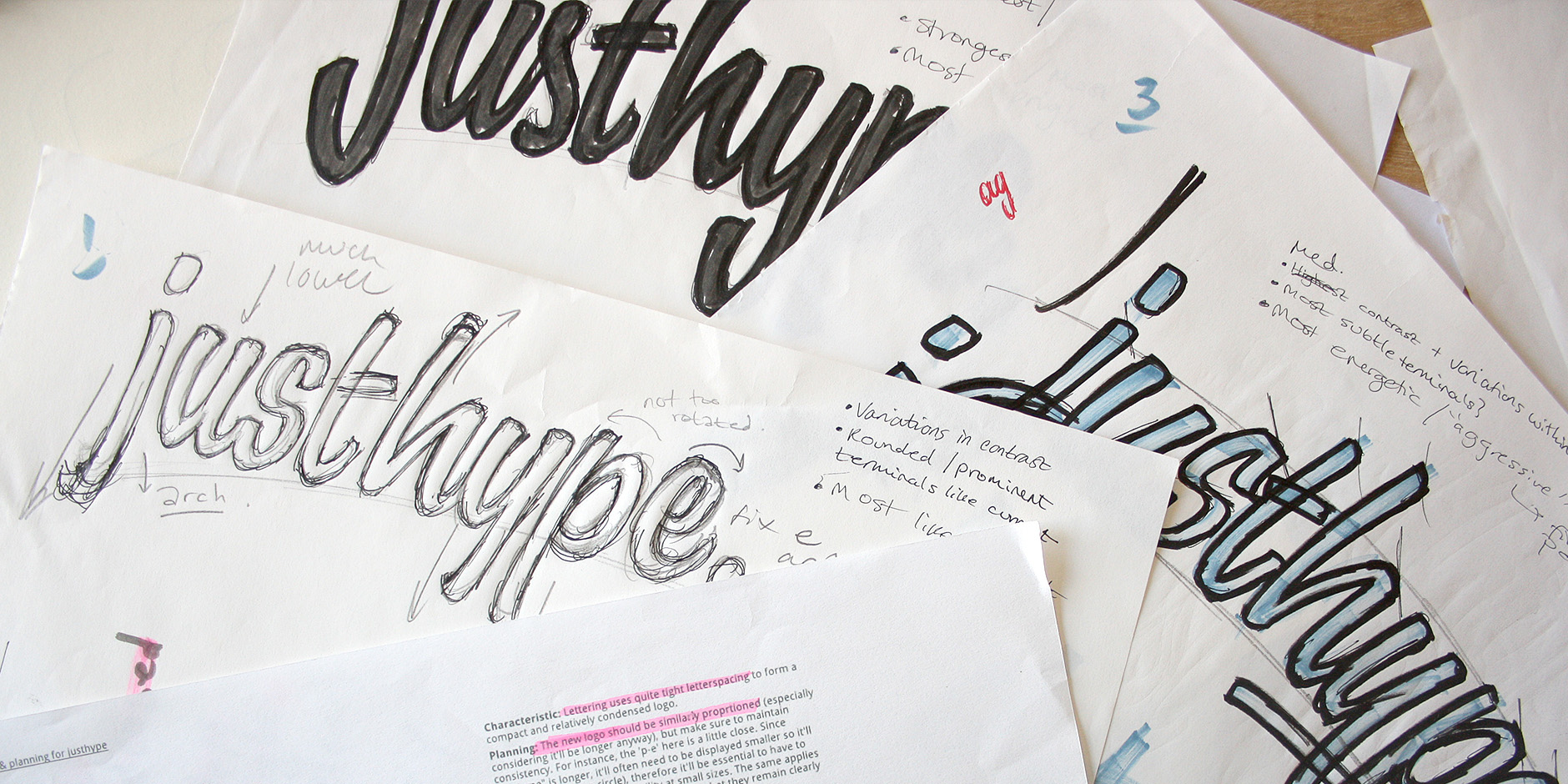
Above: Notes on the brief and bullet-point summaries for each concept.
Sketch Development
Using what we'd discussed in the planning, I had a loose outline for each concept which covered some of the basic characteristics to explore, like the overall proportions and treatment of the stroke terminals. I then narrowed down each concept to a rough version (below left) that I neatened up in Photoshop and used as base for the final sketch (below right).
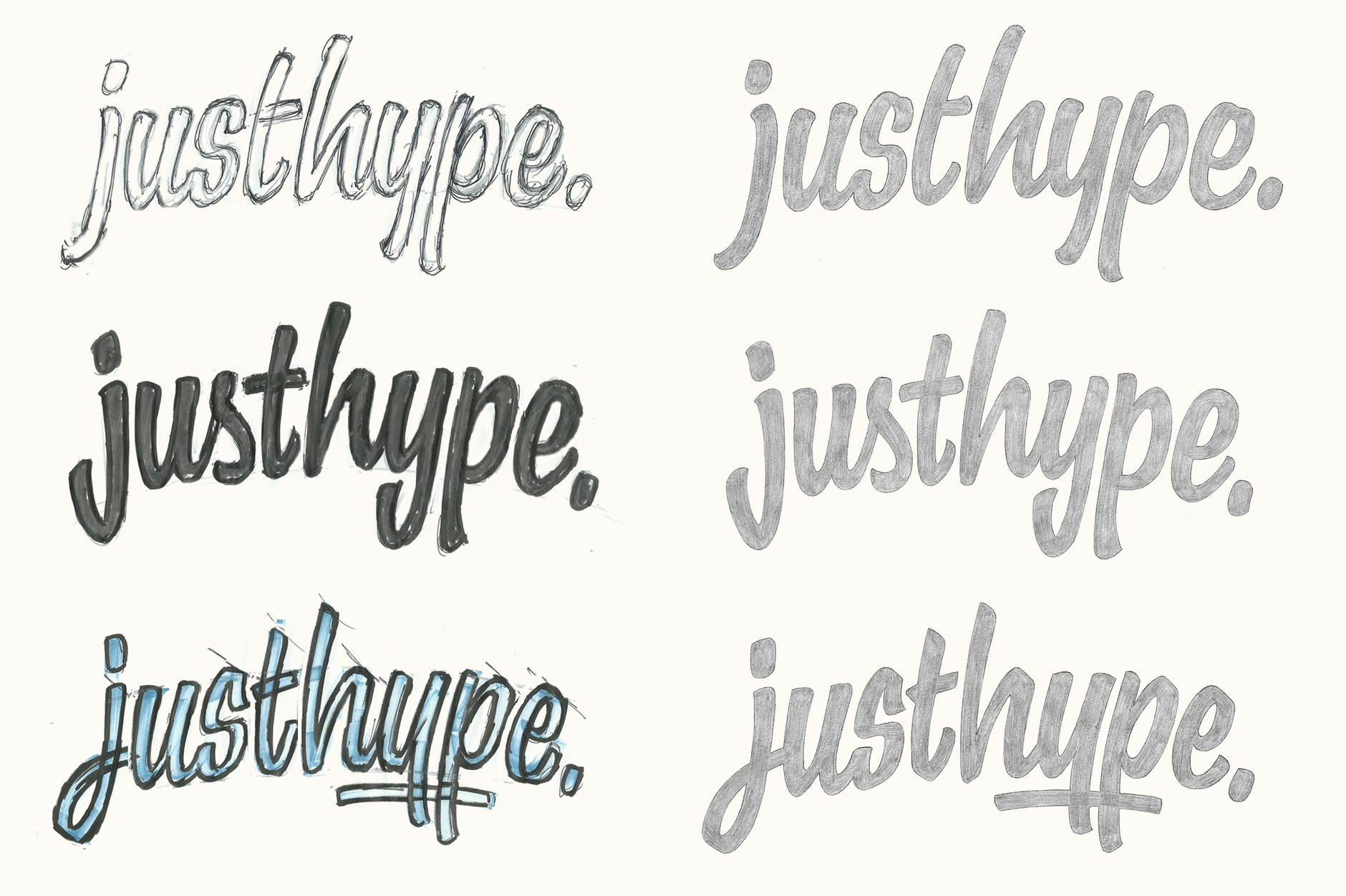
Above: Progression of the 3 initial concept sketches.
Revisions & Vector
From a review of the initial sketches, we felt confident about moving onto vector using a roughly edited revised sketch as we were essentially going for the third concept with some features of the other two (ie. 's' and 'e' from the first sketch with the 'j' from the second concept). This approach worked well here because, since we were using the current hype logo as reference, the three concepts had a similar overall style and it was about finding the right details.
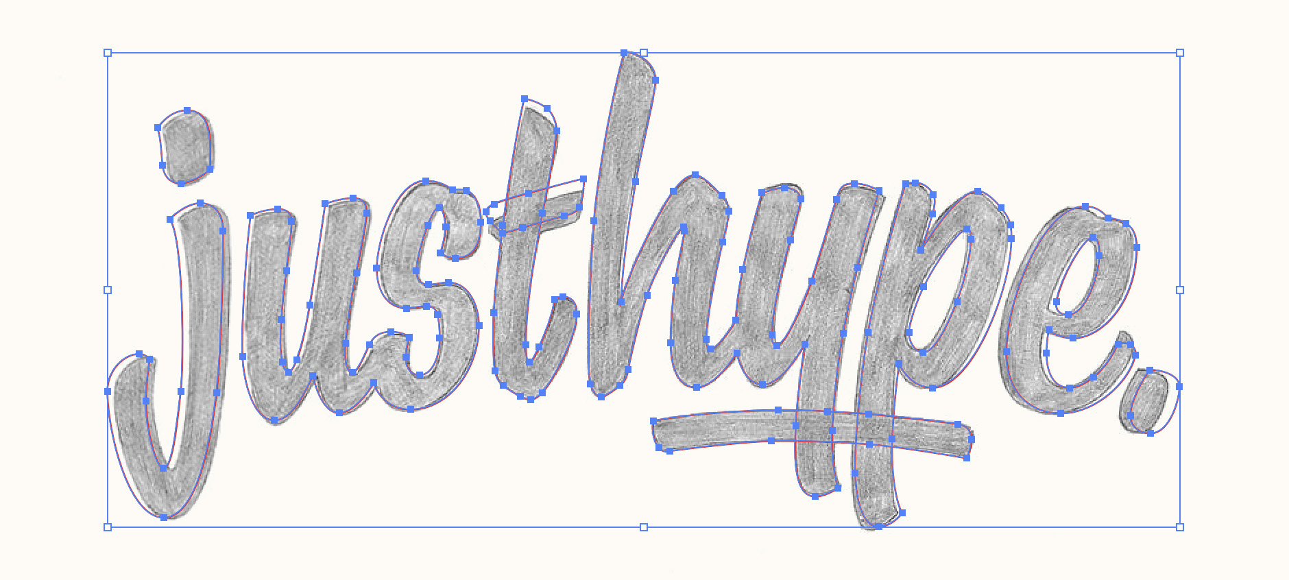
Above: Vectoring over a digitally edited sketch.
Final Logo
Since the logotype would often be used embroidered at smaller sizes, I did a lot of testing and refining of details like the counters and tighter spaces (for instance, watching how much the left side of the 't' crossbar protrudes into the space around the 's'). It was also helpful to use the condensed nature of the lettering to really maximise the size of the main body of the letters, without having overly long extremities.
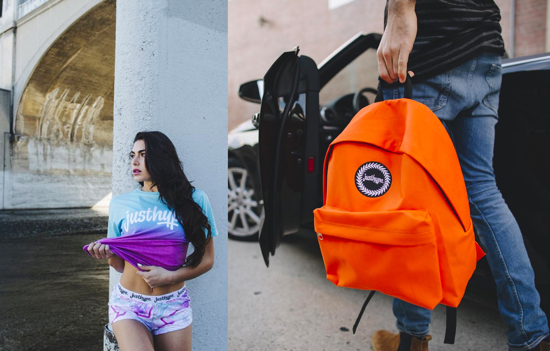
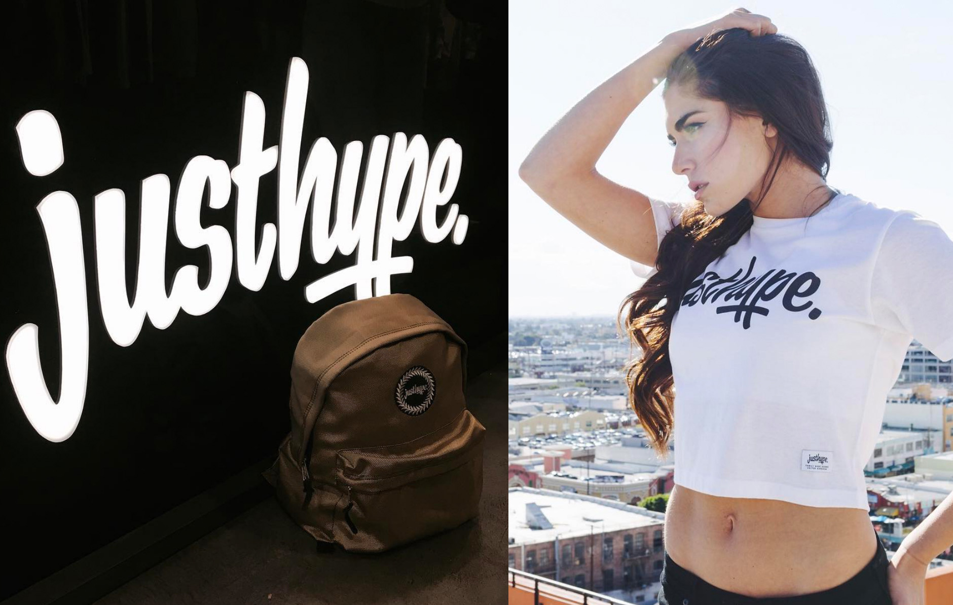
Product photography below courtesy of the Just Hype USA Instagram page.