Jam

Client: Jam
Work done: Logotype design, custom typography
Custom Logotype
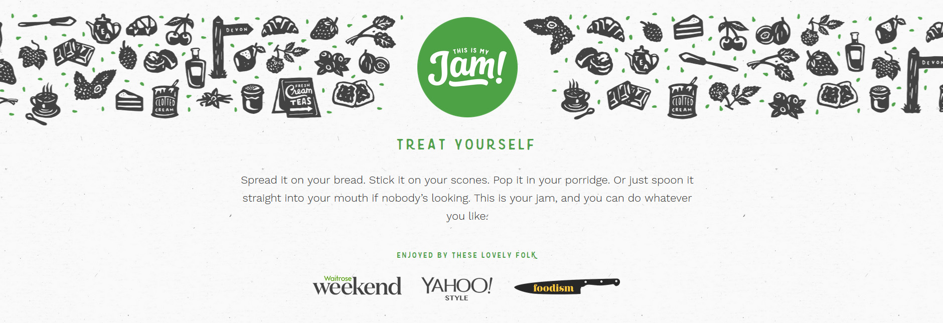
Jam! is a London-based brand that produces a unique and fun range of different fruit jams, including some infused with gin, amaretto, and even Earl Grey. They contacted me in need of a new logo to help to bring their brand together.
We decided to explore a bold modern brush script to best reflect Jam!'s playful, modern and unashamedly indulgent character.
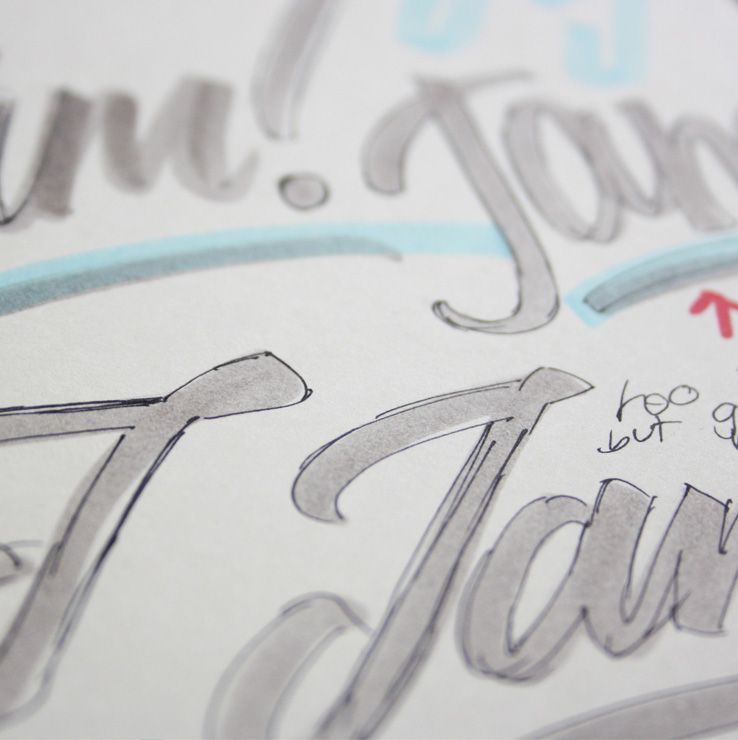
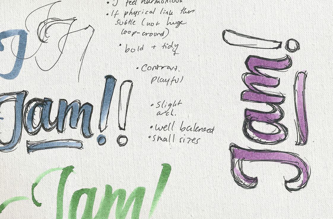
Above: My early draft scribbles and planning.
Digital Version
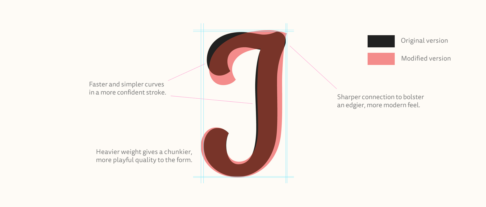
Jam! opted for a simpler, less work-intensive process which bypassed the sketch and sketch revision phases and moved directly to digital. Early versions of the Jam! logo were slimmer than the final outcome, and the upper horizontal stroke of the initial 'J' was revised to simplify the overall form and to steer further away from any hints of traditionalism or calligraphy with a faster and more confident line.
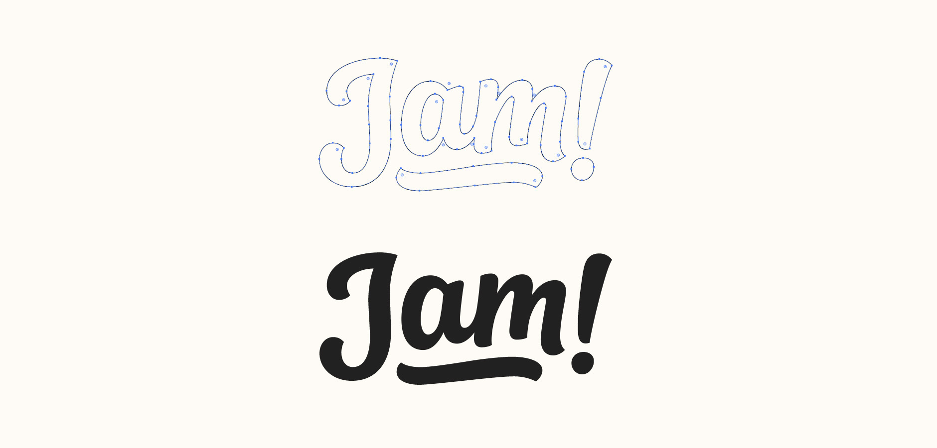
Above: Screenshot of the vector points in progress. Beneath: solid fill.
Final Logo
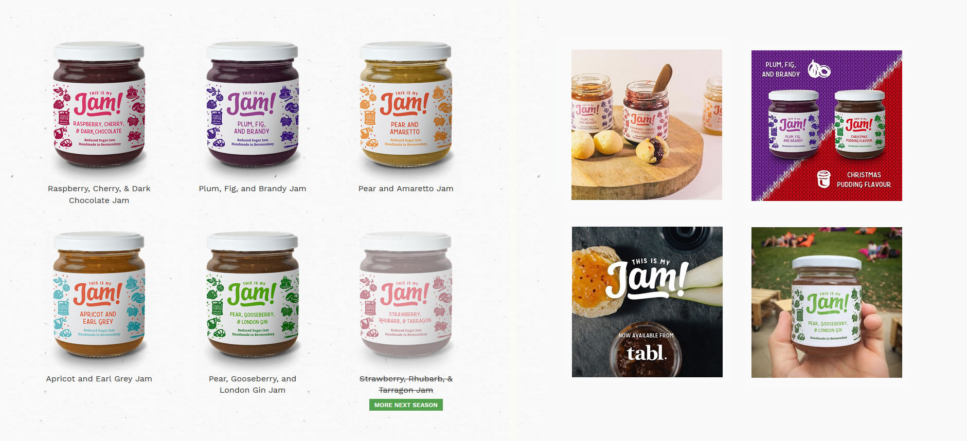
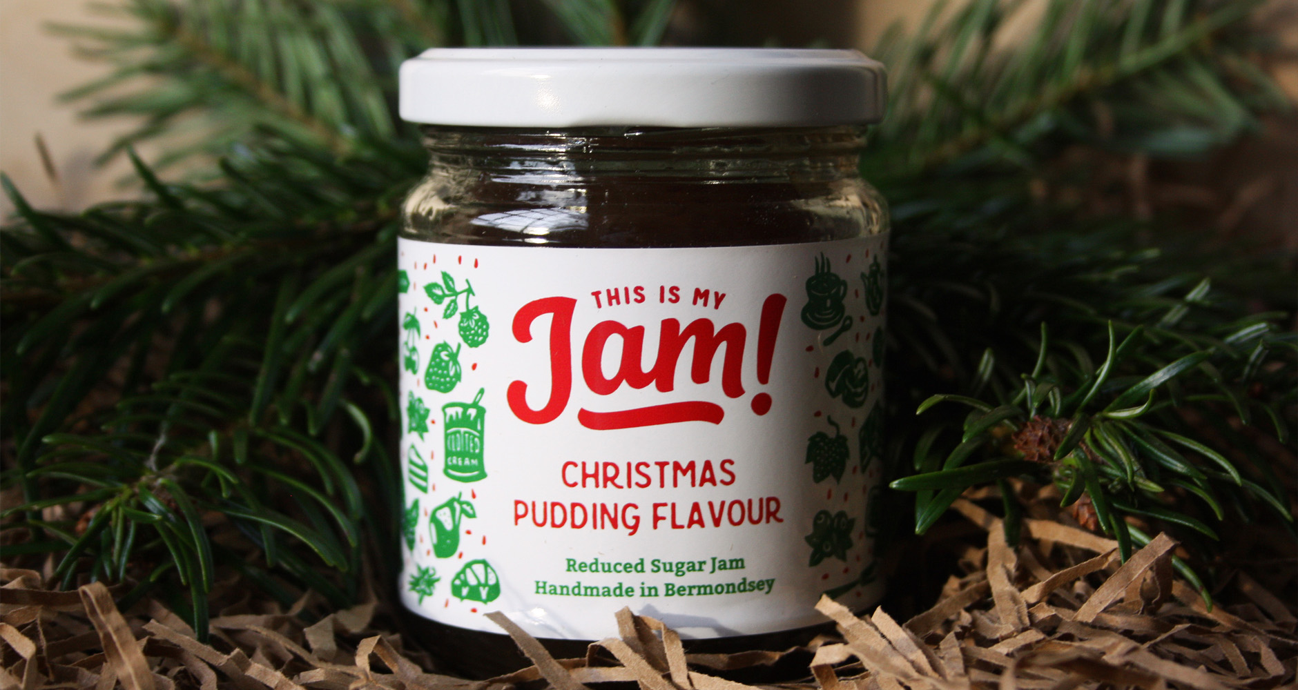
The final Jam! logo is put to great use on their series of jar labels, on their website, and various other places too. A couple of the pictures below are courtesy of Jam!, the last image is of the jar that I just had to buy for myself!