Hund von Eden
Client: Hund von Eden
Work done: Logo-type design, custom lettering, colour exploration
October 2011
Hund von Eden is an exclusive dog training and care facility set in a 1781 farmhouse located in the north of Germany. It combines modern dog-care with rustic 18th century farmlife, with a quiet atmosphere inviting people to spend times with their dogs training, hiking or just relaxing. The client was looking for a custom calligraphic script in an exclusive, casual and modern style that also had a retro touch and something playful about it. In addition to use in web and print, the logo also needed to work on door signs of different materials and sizes.
Drawing with a brush pen and then pencil, I considered ways in which to make the three-word composition feel cohesive and structured without being conventional. Within the overall brush/calligraphic approach the client was looking for, I tried some stylistic variations; some more rounded and smoother, others more organic and rougher.
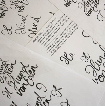
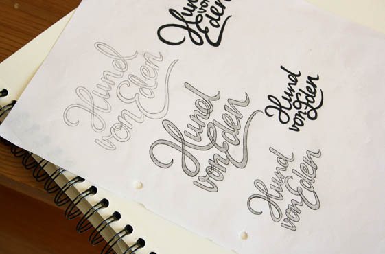
Above: Notes, quick scribbles and early pencil drafts.
Variations
The chosen direction uses a design that combines the words into a quite contained unit, which is well suited to applications in all different formats (rather than being restricted to a particular horizontal or vertical shape). The arrangement of the words and varying baseline angles are quite playful and distinctive while the connections between the words help bring them all together visually. The 'H-E' ligature emerged naturally out of sketching and results in a unique focal point that remains organic and natural.
As well as the original 'H' (version A), we also looked at a less curvy alternative to give it a bit more of a retro feel (version B). In these inked drafts, issues started to appear with the 'd' looking like an 'e-l', so I kept some solutions in mind for the next step.
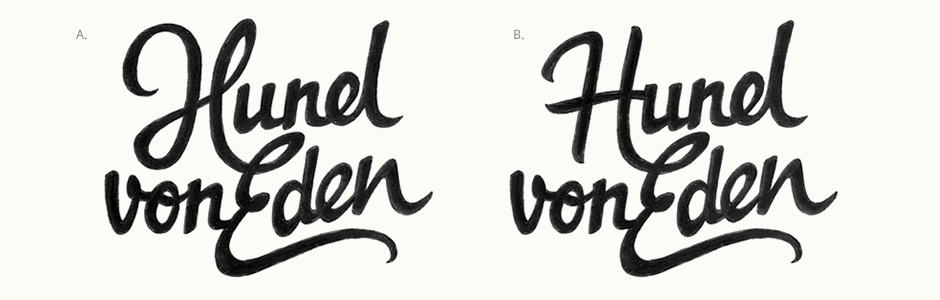
Above: Rough ink variations for different 'H' options.
Development & Colours
Moving onto the vector version, one of the things I focused on was revisions to the first 'd'. The main version keeps the curve from the original but the whole bowl has been brought closer to the stem, emphasising that it's a single letter. While a definite improvement, it still caused some issues with legibility at small sizes as the smaller lower counter looked too closed quite easily. The alternate more conventional 'd' matches the second one and has a wide counter which resizes much more successfully.
I also paid close attention to maintaining continuity throughout the details (particularly stroke shapes and ends) since the words follow some different directions and are on slightly unusual baselines. For instance, the similar exit strokes on the top 'd', 'E' and last 'n' help to create consistency whilst also adding distinctive details.
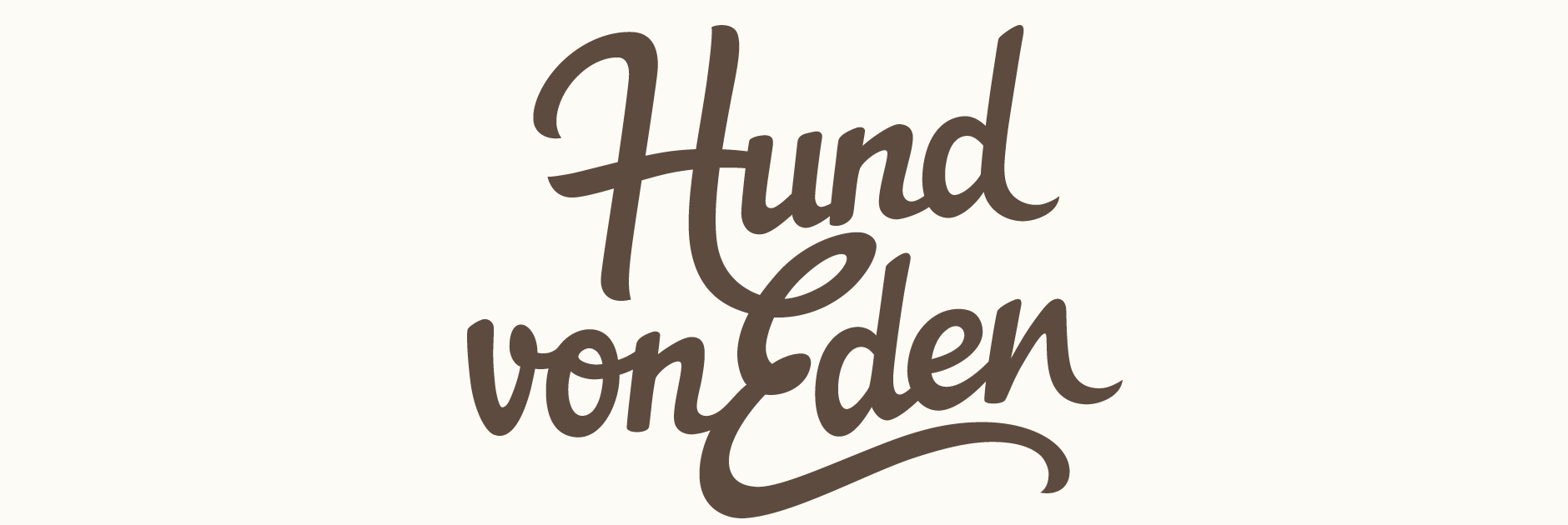
A warm, rustic and natural colour palette was also developed to compliment the goals and style of the company. In keeping with the organic nature of the logo, an overall muted tone allows for quite a few different colours to work together without clashing.
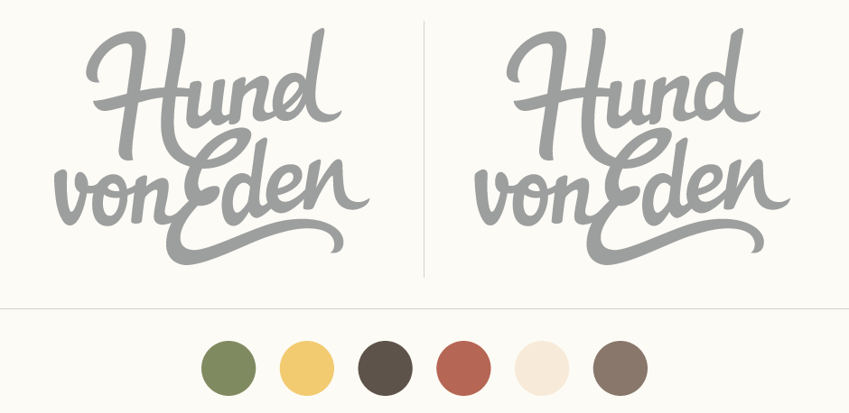
Above: Variations for the first 'd' and colour development.
Initials
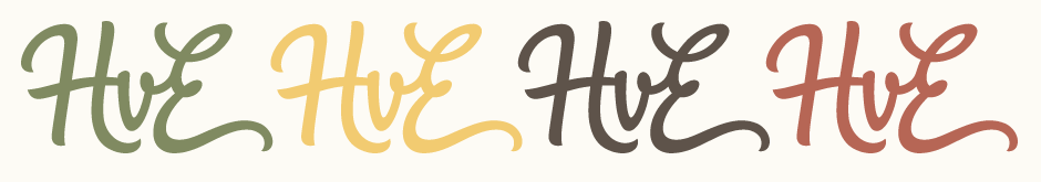
The client was also looking for an adaptation of the logo's initials 'HvE'. While I first tried a version in the same composition of the logo, the resulting shape was quite awkward and difficult to place in context (in a square, circle, etc.). A single horizontal version (with some adaptations to the individual letters as they had to be split up) has much more potential for use while keeping the distinctive visual style of the main lettering.
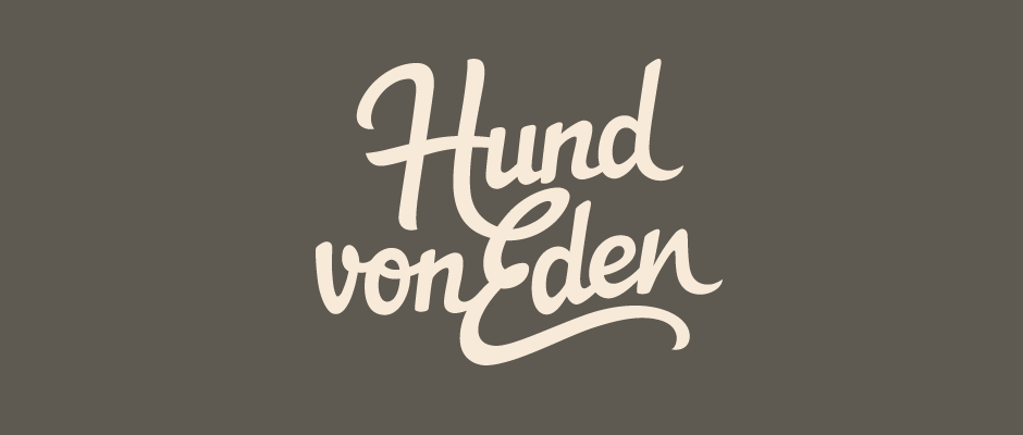
Final Logo
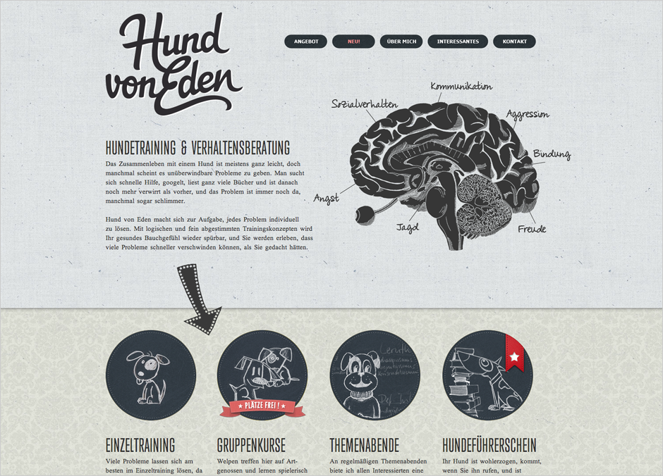
The logo can be seen on the Hund von Eden website (screenshot shown below, design by Sebastian Crantz).