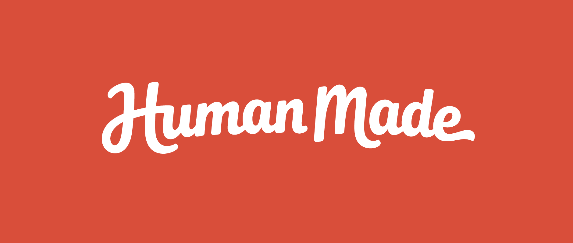
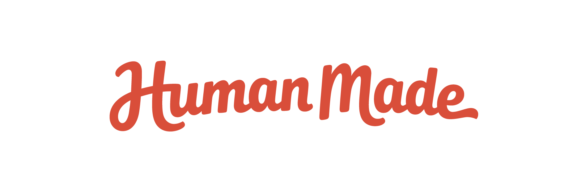
Human Made
Client: Human Made
Work done: Logotype design, custom lettering, branding, layout work, branding guidelines
Custom Logotype & Branding
Human Made is a WordPress development agency with 50+ members across 5 continents. Founded in the UK in 2010, the brand grew to become a global company and 4 years later, they approached me to help with a re-design of their logo and branding.
We outlined and refined the brief together, going over the key brand traits, planned logo usage and how the design would take these into account, as well as initial ideas for what to address and explore when designing (composition, length of name, baseline, weight, etc.).
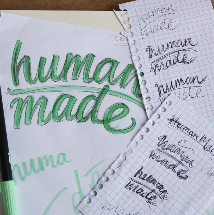
Above: Notes and first ideas.
Concept Development
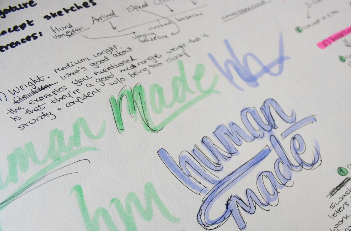
During the planning, the team and I had reviewed my suggestions for each concept so I had quite a good idea of where to start. I'd proposed exploring one concept as a stacked, 2 line design and the other following a horizontal composition. We'd also talked about differences in weight and contrast and how these might be used to address the brief, as well as different typesetting options (all lowercase vs. mixed case).
Above: Development of 2 concept proposals.
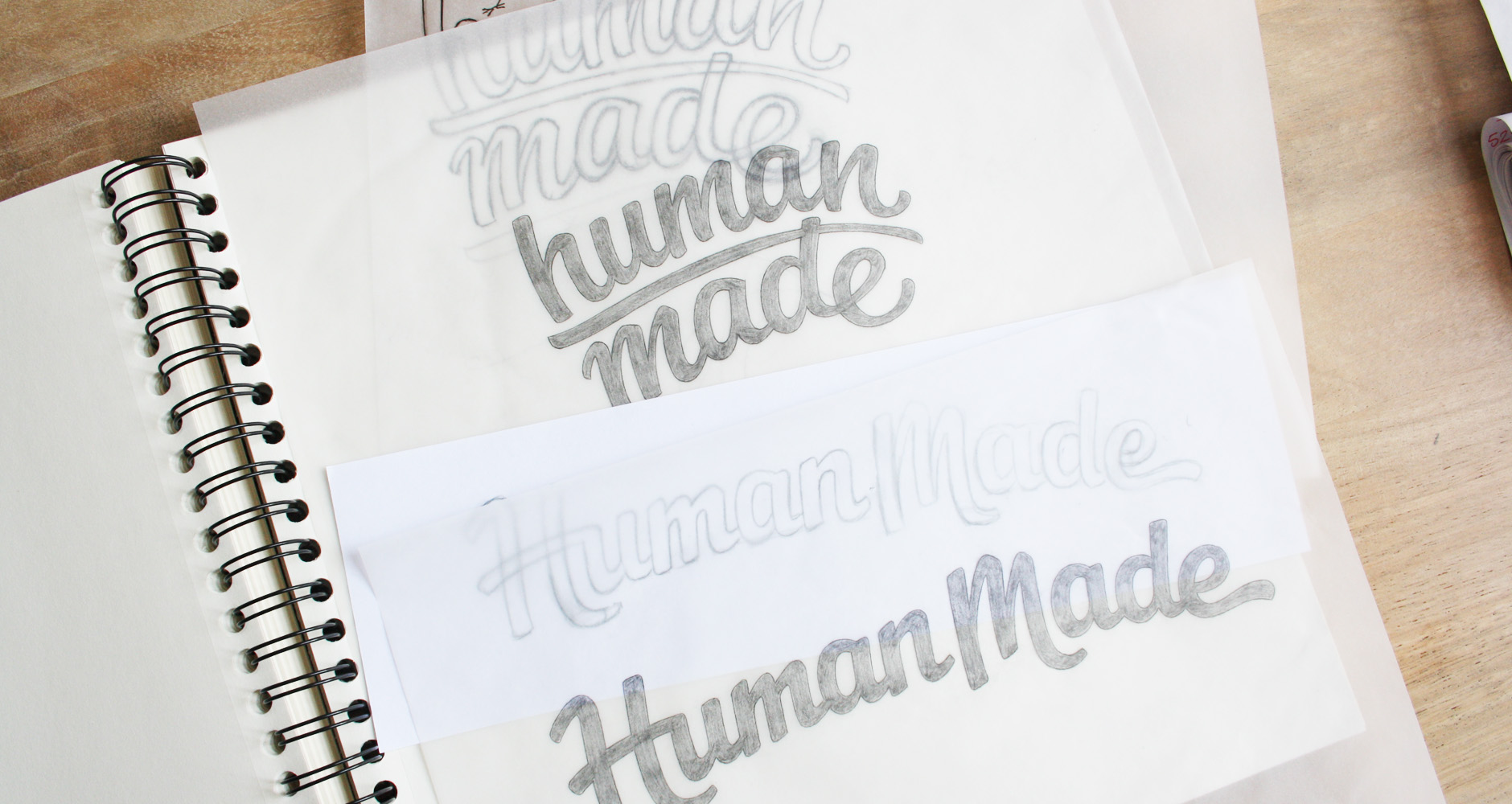
Progression
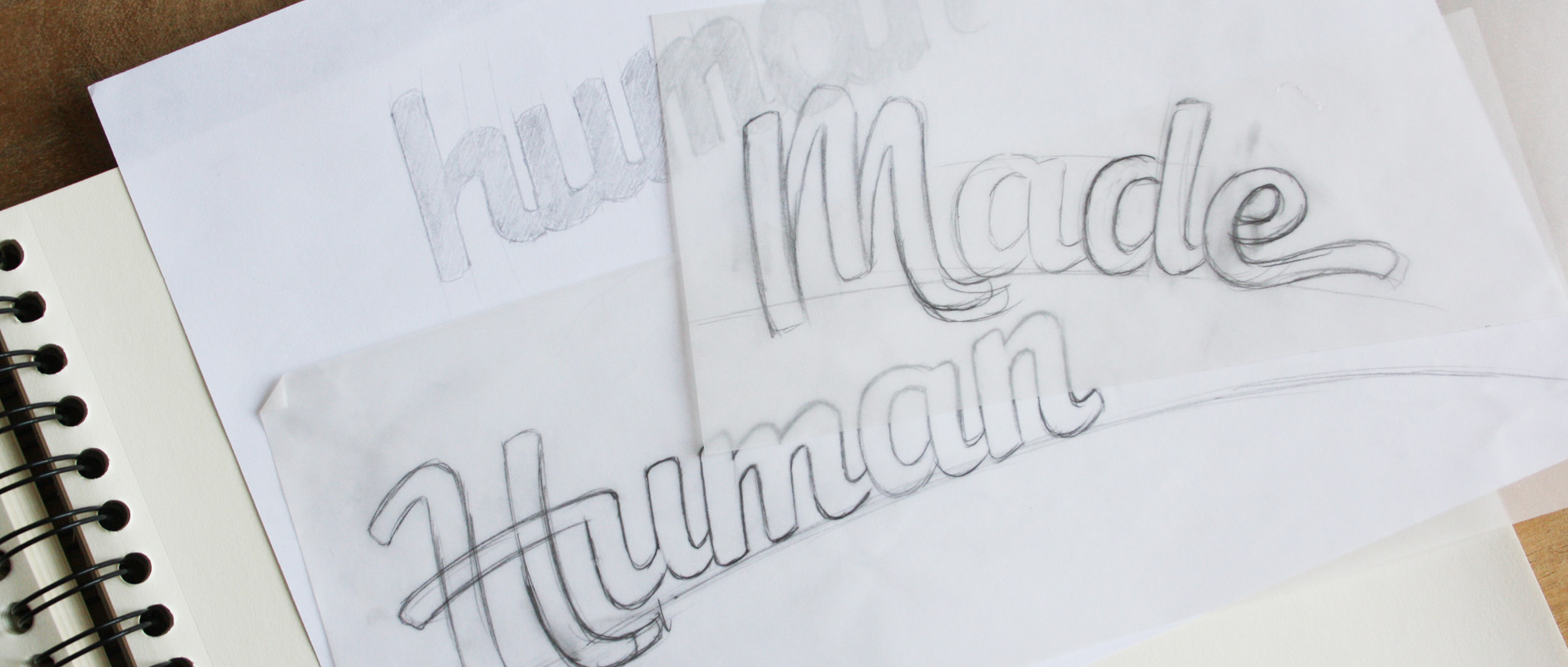
I proposed going with all lowercase for the 2-line version as it would work better for readability (top drawing above). The name is made up of a lot of repeated, vertical strokes and shapes (h/u/m/n/etc.) and having it on two lines would split it up visually and make it easier to read. Conversely, when all on one line, the uppercase ‘H’ and ‘M’ makes sense to break up the natural repetition of those letter shapes (bottom drawing above).
After taking about our thoughts on each concept, there was a lot of overlap in our comments and we were able to quite quickly plan out our next steps. The goal was to focus on the single line concept, but create an alternate version on 2 lines. I did a revised sketch, adjusting things like fluidity of the capital ‘H’, the scripty-ness of the ‘M’ in relation to the rest, the positioning of the final ‘e’ swash, the arch of the baseline, etc.
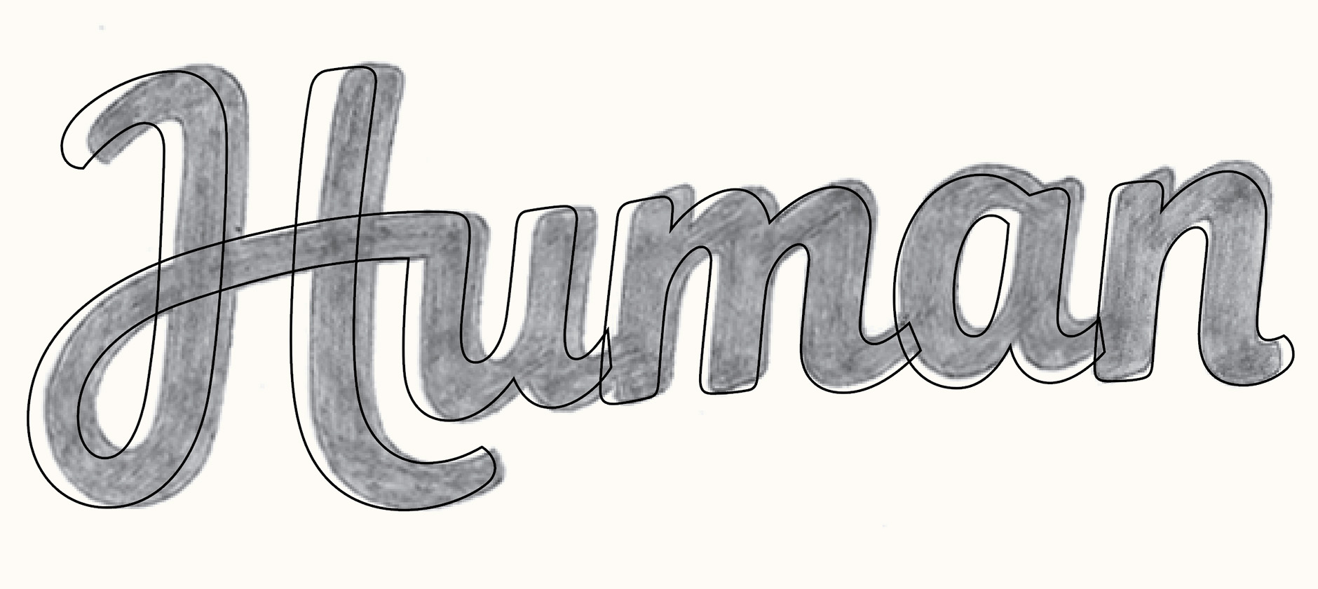
Above: Working screenshot of vector lines over the sketch.
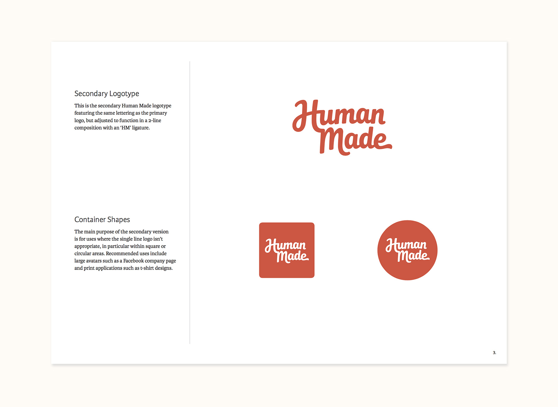
Alternate Versions
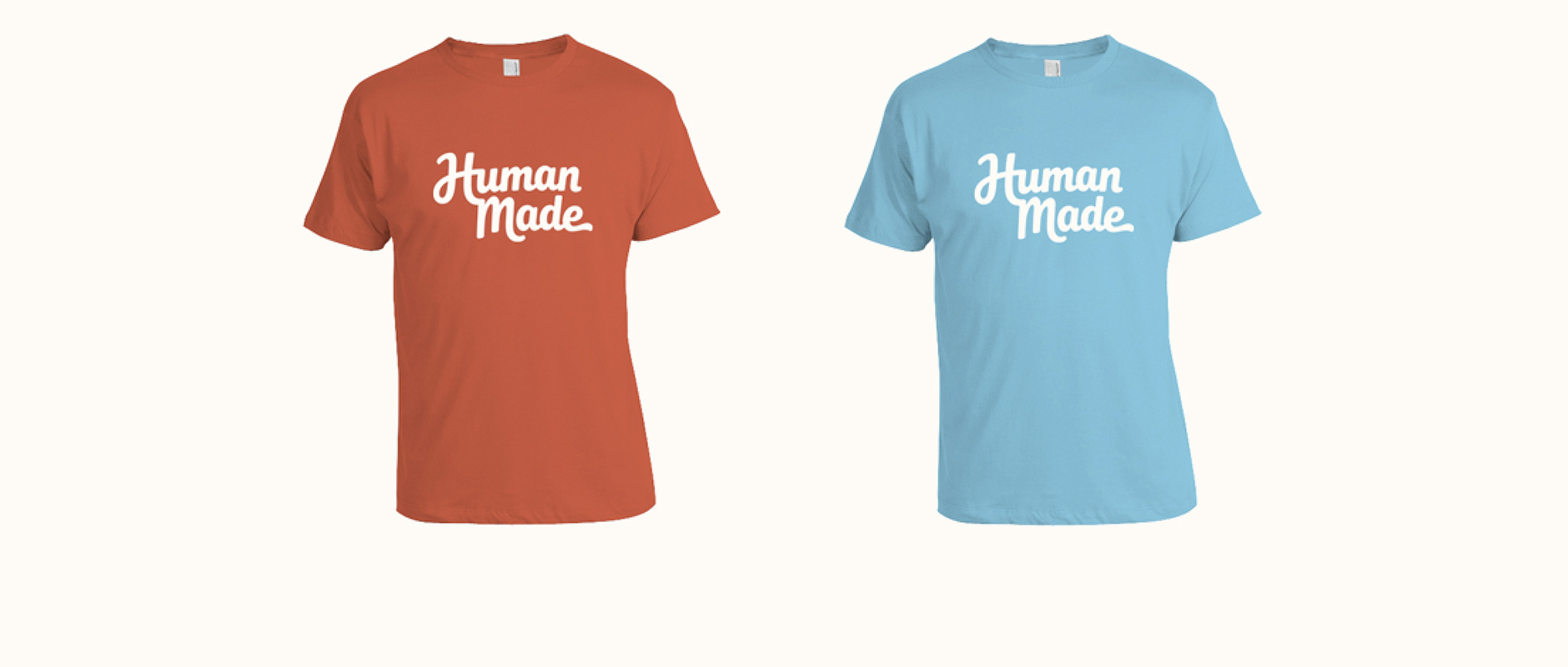
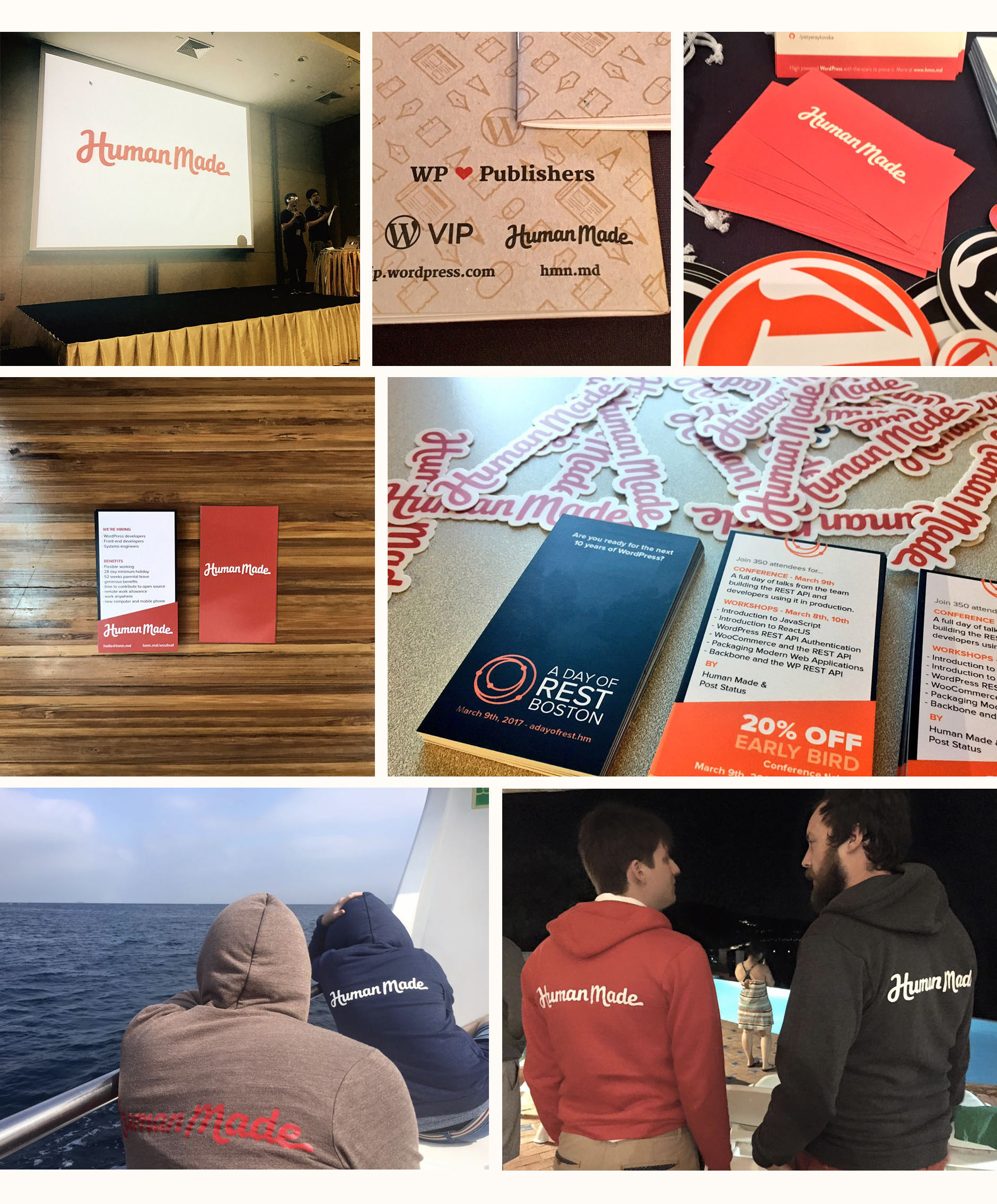
As well as the primary logo, we also used what we liked about the other concept to create a stacked version of the logo. This would be used in situations where there is less horizontal space available (ie. large avatars) or where visually, it would be more appealing (ie. t-shirt designs).

Above: Primary logo and alternate stacked version.
Icon Version
The icon version went through a few iterations trying to find the right combination to capture the essence of the full logotype. The design we went with maintains the lower right swash of the ‘H’ as well as its connection to the following letter. There's also a stand-alone 'H' for very small sizes.
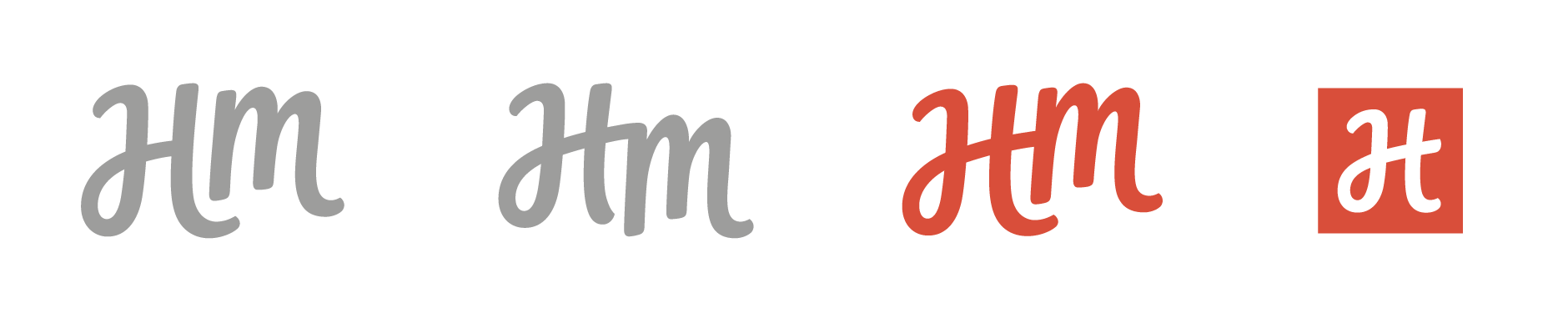
Above: Progression of stand-alone initials.
Early Colour Work
Once we reached the vector refining stage, I put together a few options of colour sets along with a description of how each relates to the brand conceptually and how/where they could be used.
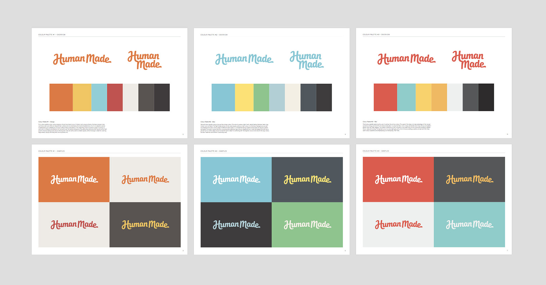
Above: Reviewing the first colour palettes.
Colour Progression & Typography
Using this as a starting point, we moved forward focusing on a red inspired by their previous branding. The aim was to find a tone that was a little less harsh so I worked with a bit of orange tinge to make it a little softer.
We were also keen on a blue as a primary colour, so quite quickly we started looking at typography at the same time, to give us a little more context for colour decisions. One of the first options explored the use of a sans serif typeface I'd be developing for use as a display font (shown below).
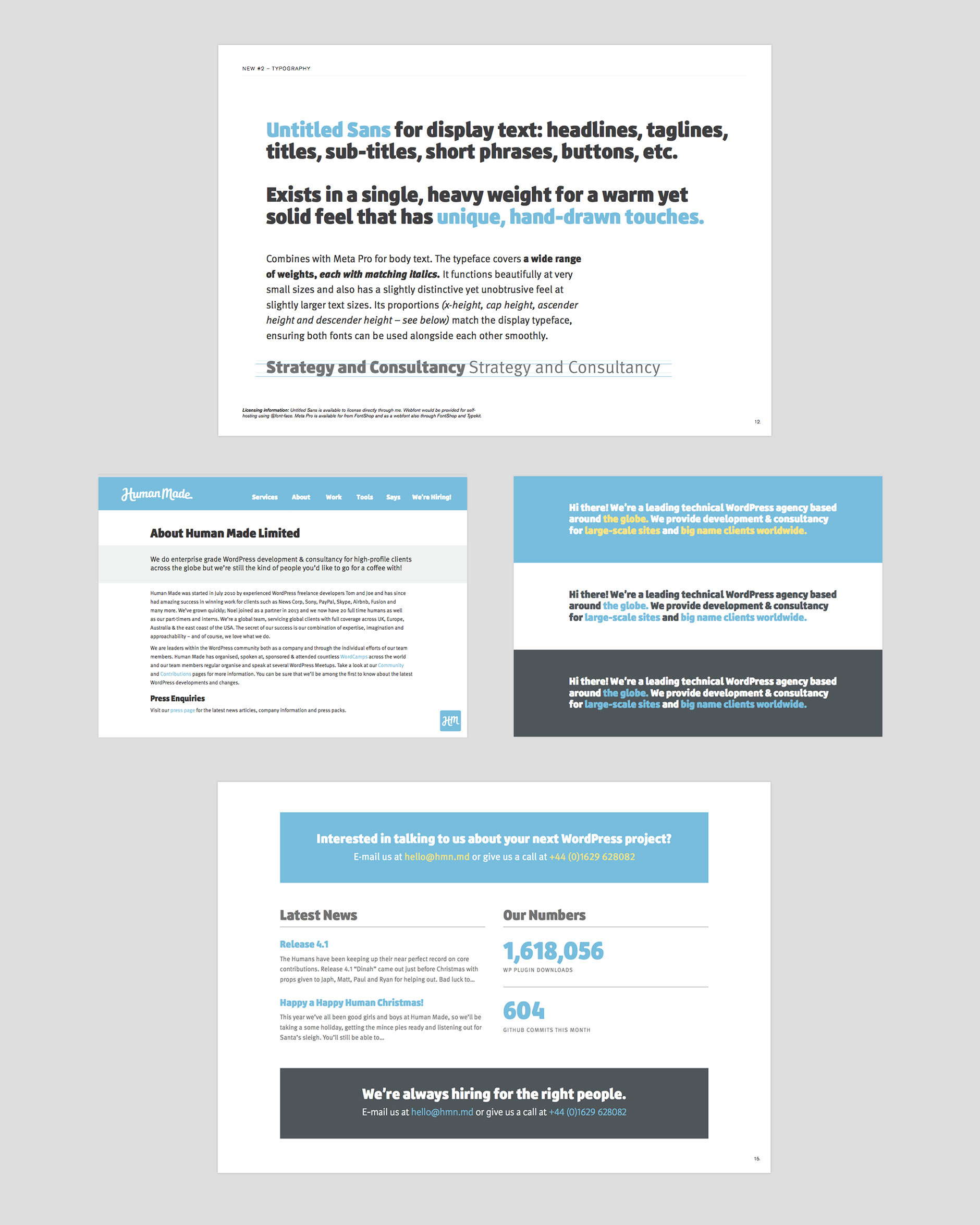
Above: Exploration for one of the typeface pairings with a blue-based palette.
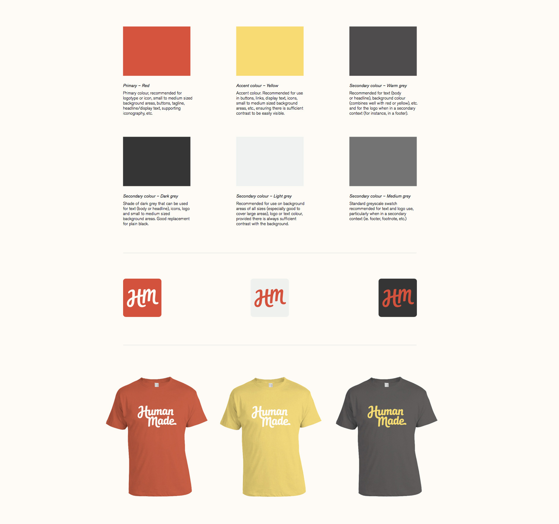
Refining
The final palette uses the red as the primary colour, accompanied by a bright light blue as the main accent colour. This is complemented by a range of secondary colours for various uses.
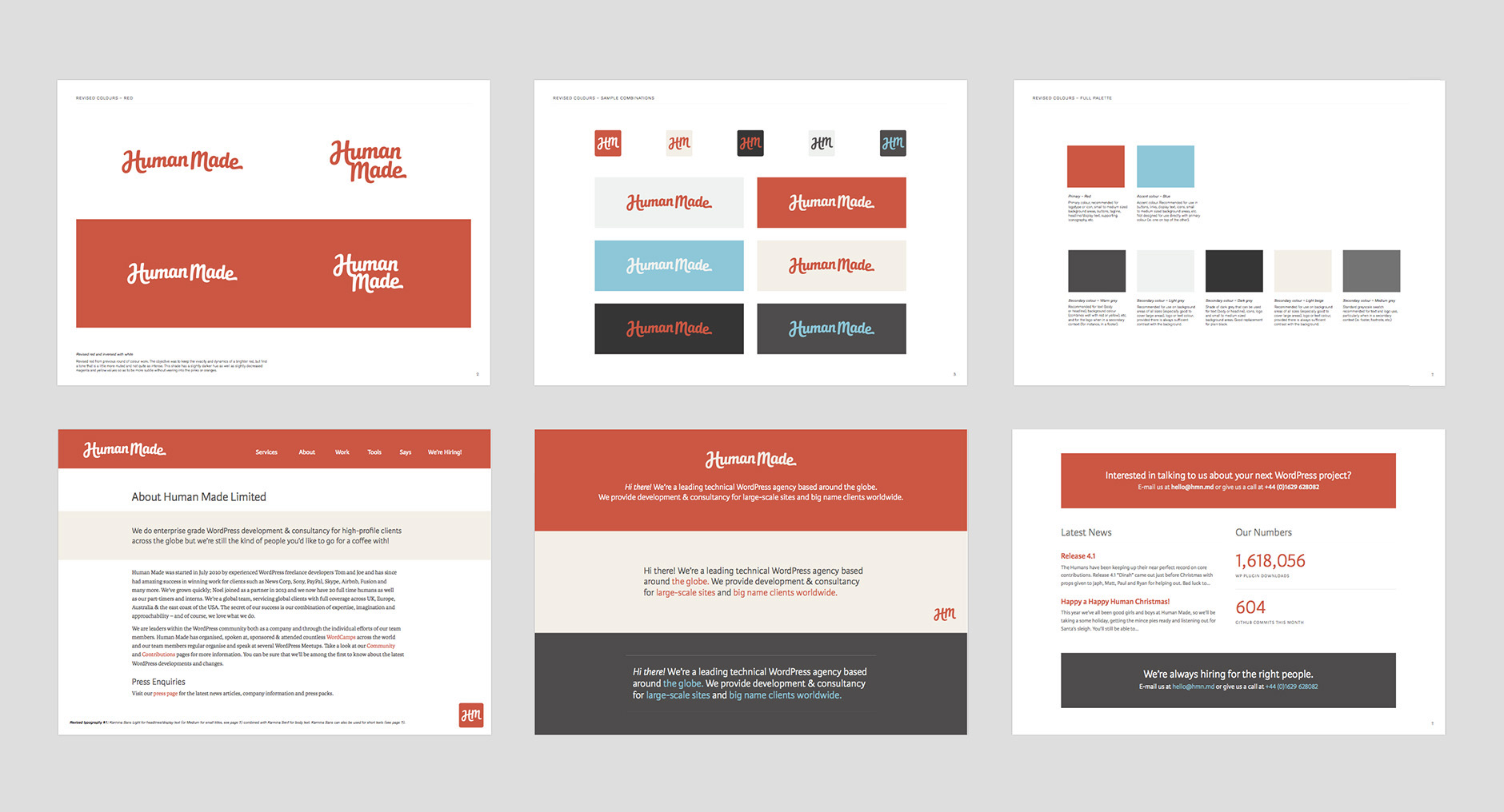
Above: Presentation pages with revised colour and typography work.
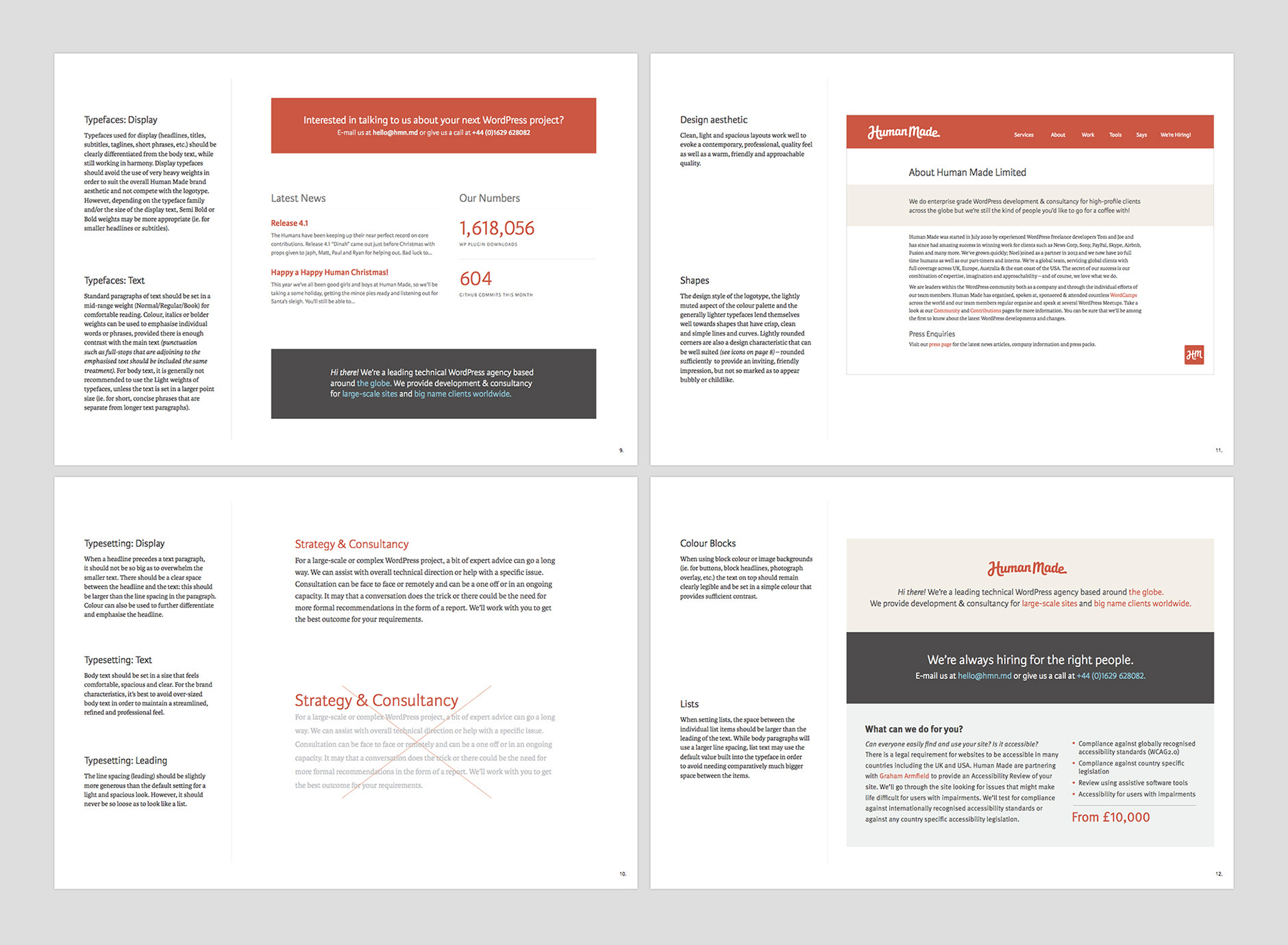
Final Work
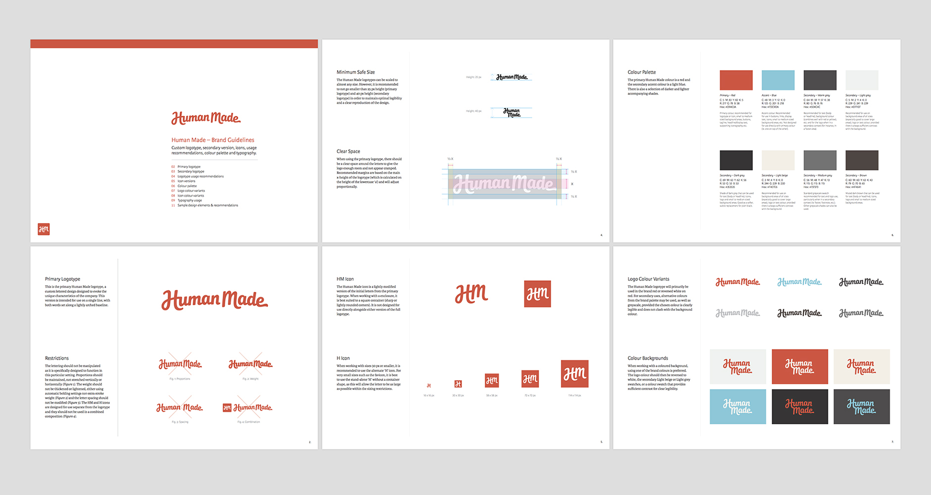
As part of the branding guidelines, I outlined recommended uses for the logo versions, the icon variants, the colours, overall design aesthetic and shapes, etc. We didn't settle on a specific final brand typeface as this would be led by the website design, so I outlined font and typesetting guidelines for text and display.
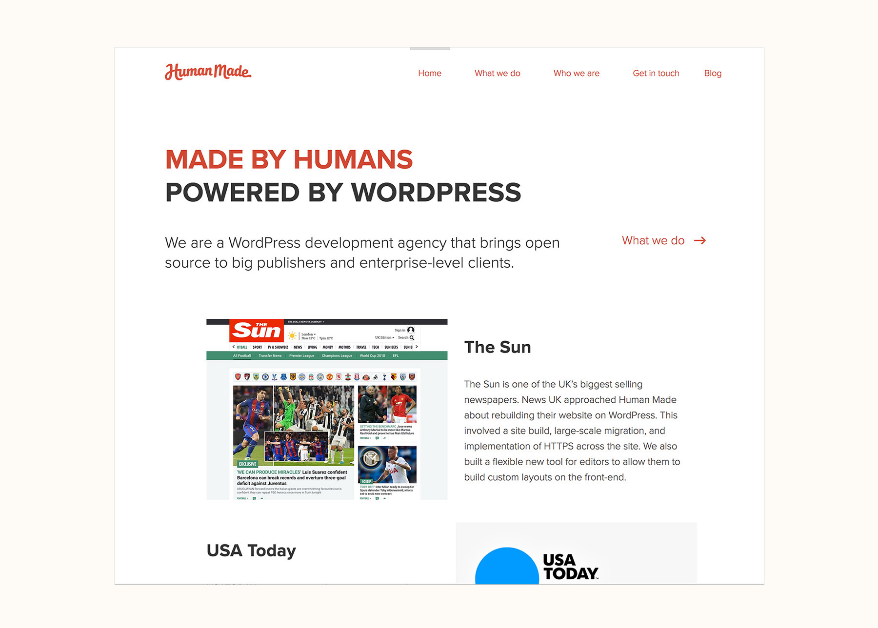
Some pages from the branding guidelines are shown below and the final work can be seen on the Human Made website.