[hoo‑gah]
Client: [hoo‑gah] homewares
Work done: Logotype design, custom lettering
Custom Logotype
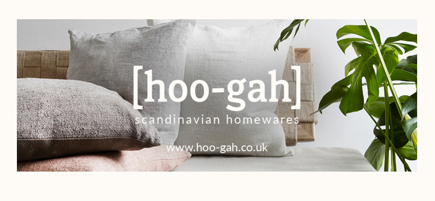
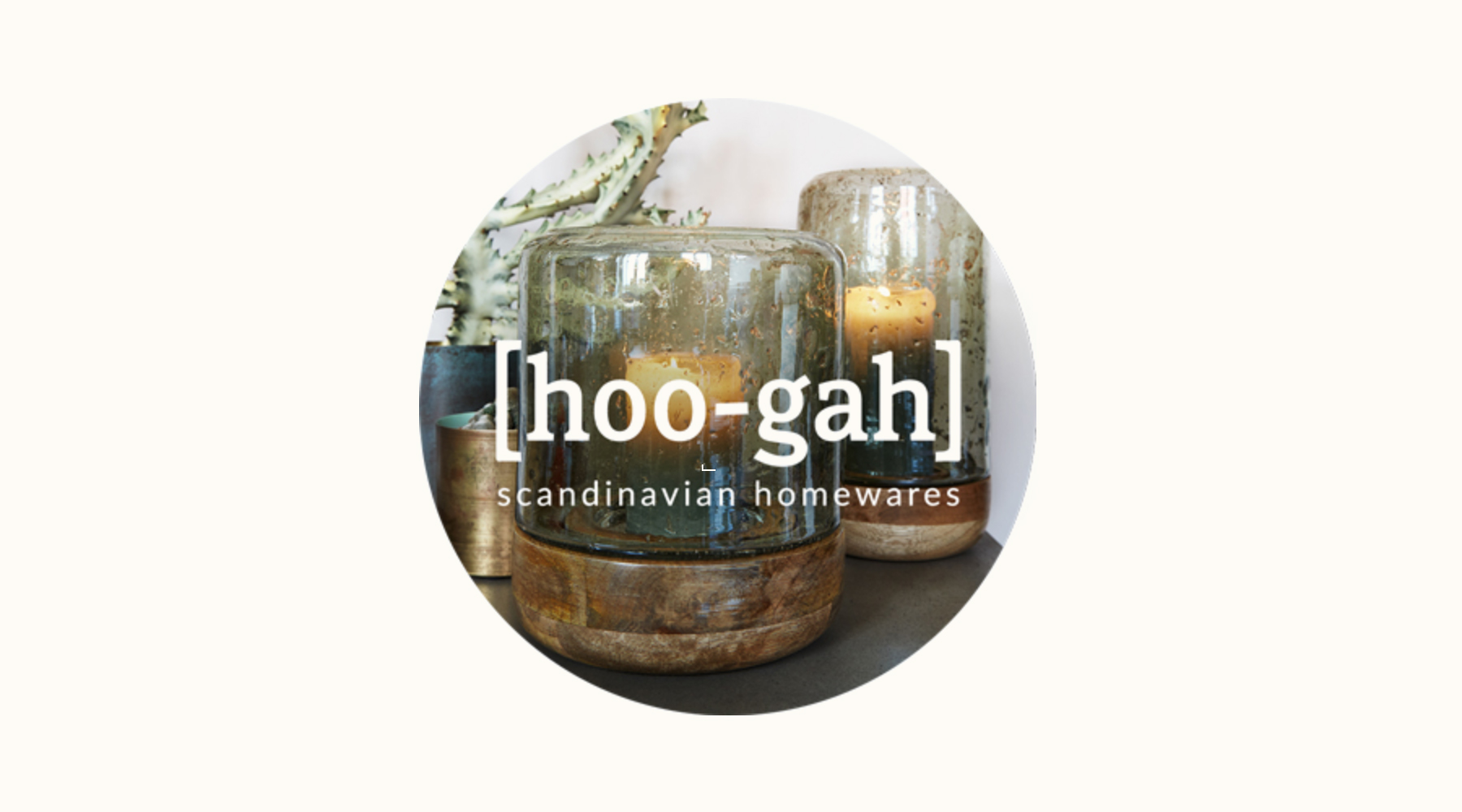
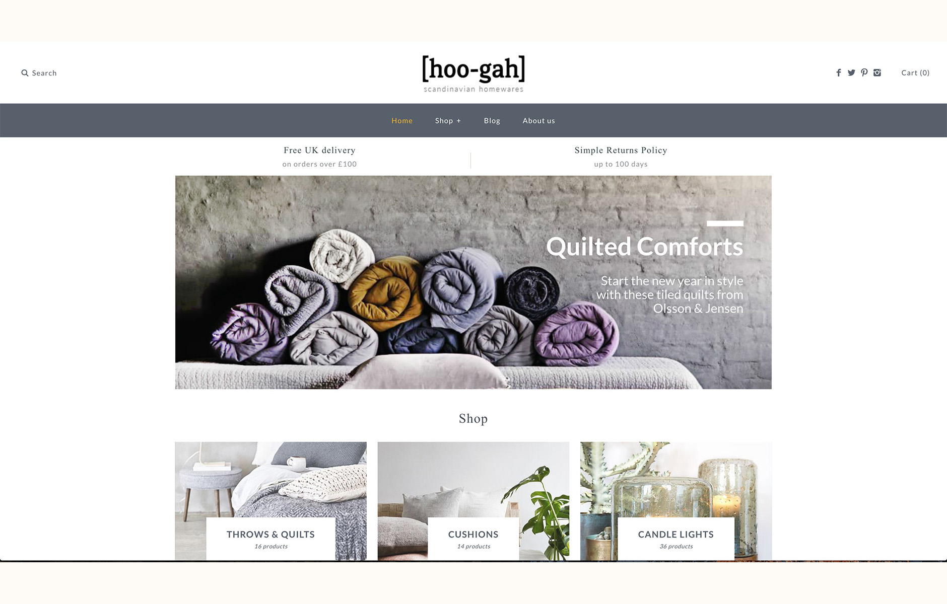
[hoo‑gah] is an independent homeware store selling a curated collection of Scandinavian throws & quilts, cushions and candle lights. The name stems from the phonetic spelling of the Danish word hygge, which doesn't have a direct English translation, but is a concept that loosely incorporates the ideas of cosiness, simplicity, homeliness and contentedness.
The brand's owner had some initial exploration that looked at a few different serif and sans serif typefaces but he was looking for something more unique, more crafted and with its own personality. This gave us a good starting point for talking about different typeface styles and what they evoke in terms of perception. We also talked about how we could make sure the punctuation was smoothly integrated with the letterforms, as they're an integral part of the brand name.
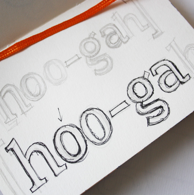
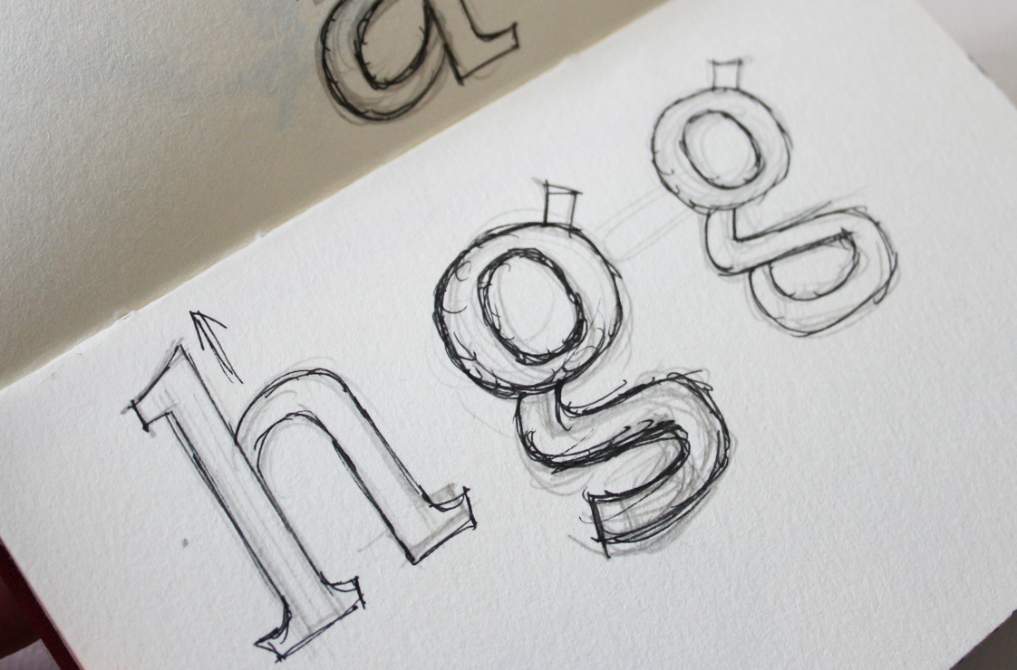
Above: Early planning sketchbook pages
Concept Development
We'd talked about evoking a warm, confident, quite minimalist yet soft feel and I did some research into contemporary serif typefaces that had a bit of a quirky feel to them, while still being subtle overall. We weren't doing a full sketch phase here, so I worked from some simple rough outlines and moved directly to Illustrator.
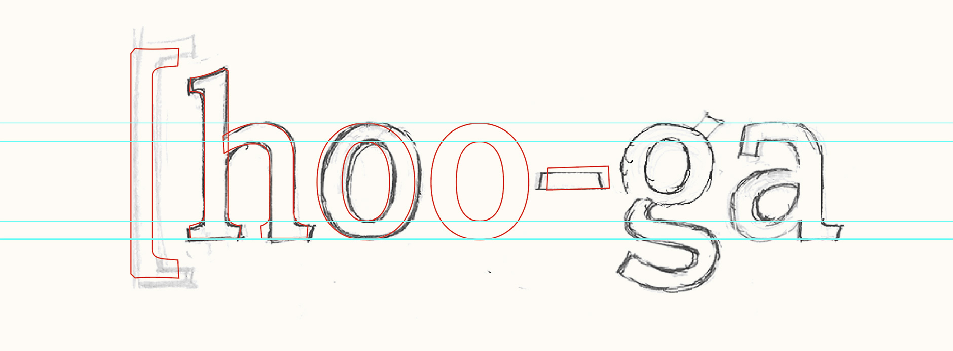
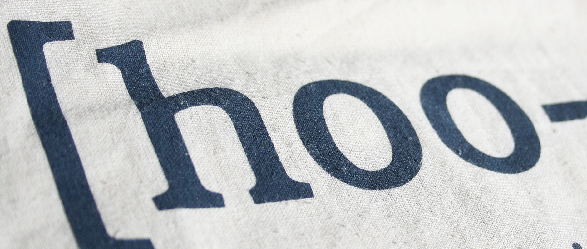
There are lots of little nuances to the design, such as small angles at the top and bottom vertical stems and slanted cuts on the serifs, which all come together to create the flavour of the logo when seen at small sizes, even though they aren't necessarily visually noticeable. Punctuation was also really fun to play with: I used angles and subtle slants to add a little flair suited to the style of the letters.
Above: Close-up of the final letterforms.
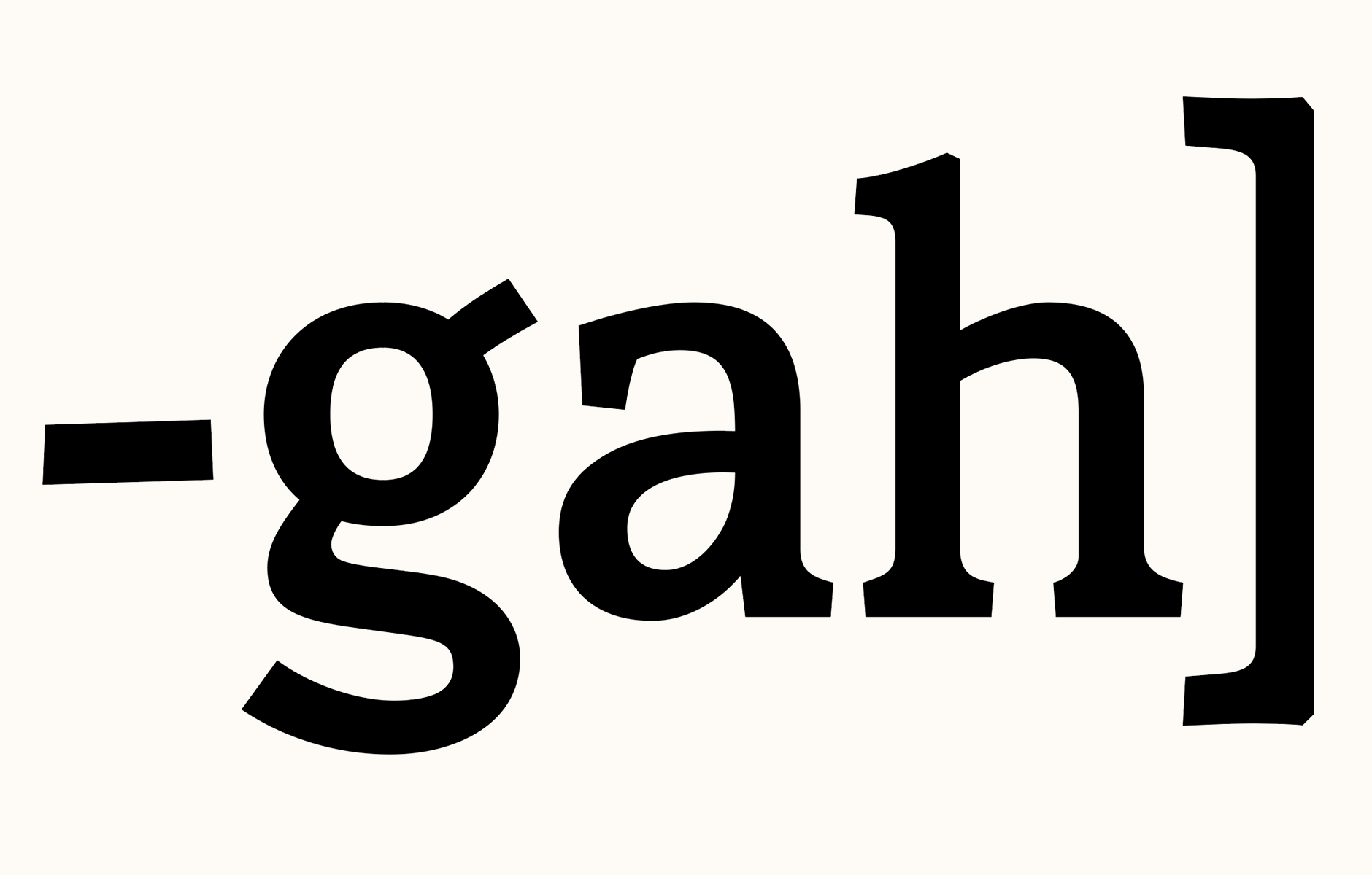
Finalising & Icon Work
I also adapted the 'h' and the square brackets to create a recognisable icon version to use as an avatar. Compared to the full logo, the 'h' is slightly wider to take up more of the horizontal space and to make sure it works down to favicon size.
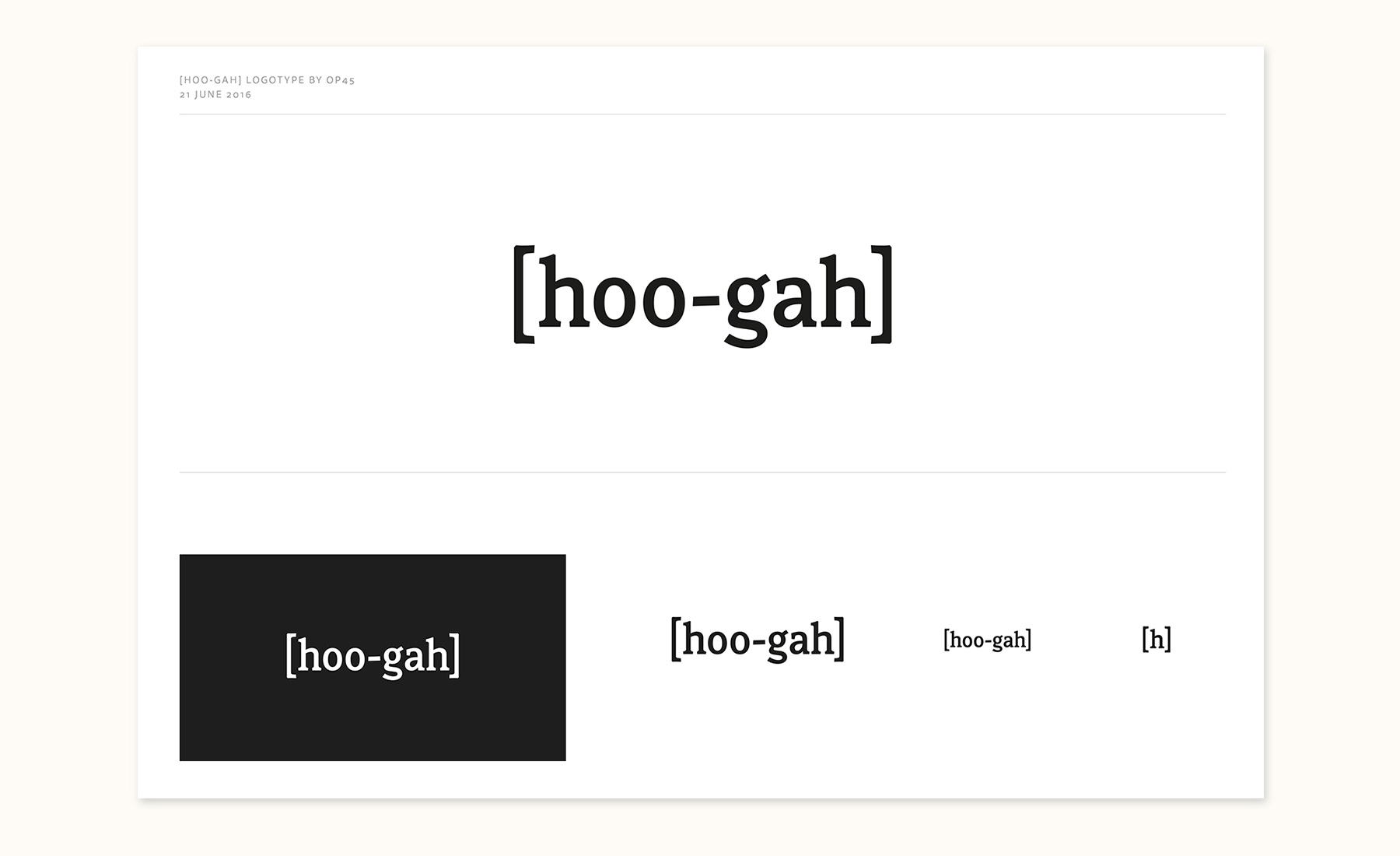
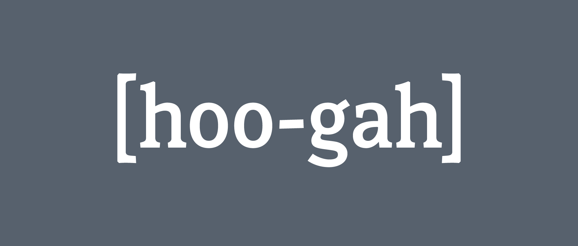
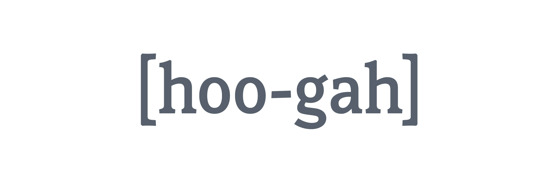
Above: Summary of the final work.
Final Work
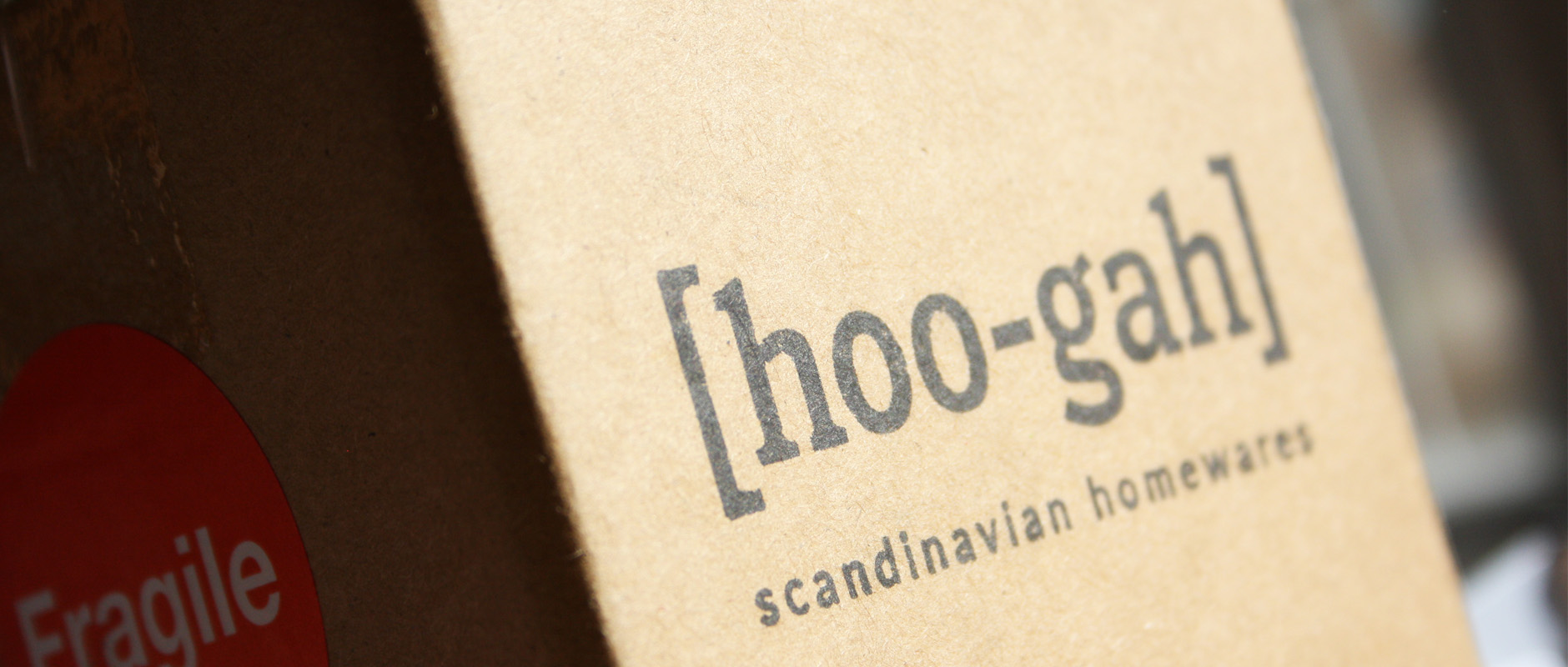
The final logo is used on the shop's website and promotional materials, as well as printed onto canvas bags, thank-you cards and packaging boxes.
Jack Watson, owner of hoo-gah:
“Working with Claire was an absolute pleasure! She really took the time to understand the story behind my business and the message I wanted the logo to convey, and after our initial chat it was clear she knew what direction to take the project in. Claire kept me up to date with the progress of her work and was always receptive to any feedback or questions I had. I'm delighted with the finished logo, and wouldn't hesitate to recommend Claire to others.”