Helftone
Client: Helftone Ltd
Work done: Logo-type design, custom lettering
Custom Logo-type
Helftone is a UK based software studio started by Milen Dzhumerov and his two collaborating partners. Stylistically, the brief was quite open, with the main direction being script lettering. Ligatures were also a feature we were keen to explore, specifically one for 'f-t'. As the name is based on a 'misspelling' of halftone, we also talked about the possibility of incorporating a halftone effect to add to the uniqueness.
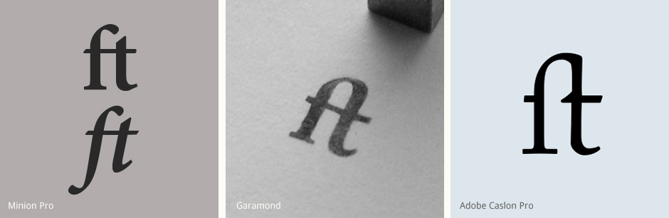
Alongside exploring the overall word shape and styles, I also studied how different typefaces treat the 'f-t' ligature. From Minion Pro's single crossbar and open top, to Garamond's very rounded upper connection, to Caslon Pro's removal of the 'f' crossbar's right side, it's a glyph that has so many possibilities.
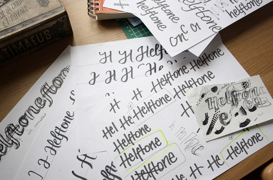
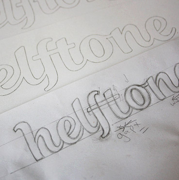
Above: Letter research, testing out different styling and refining the concepts in pencil.
Initial Sketches
Working from multiple concept proposals allowed us to consider a range of styles and compare the differences in the characteristics and feelings evoked. One of the designs was originally drawn with a heavy marker pen for an informal aesthetic and strong sense of pace. The 'H-e' ligature is followed through in the 'f-t' and 'n-e' which helps to create continuity without simply duplicating anything.
Another direction I explored was a brush script with a calligraphic flourish and distinctive character shapes. Extended curves like the lower right 'H' and 'n' stems help the letters to fit together visually, even when they're not directly linked.
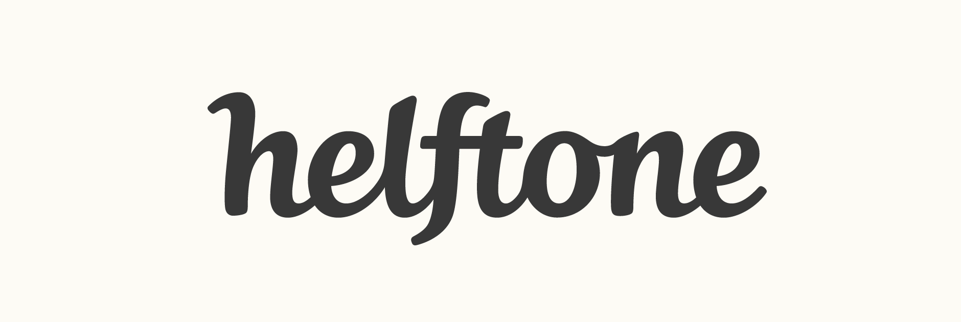
The chosen approach was a bold, high contrast script with flared strokes and softly rounded corners. Certain prominent shapes are mirrored throughout the design, in particular the little flick at the start of the 'h' which is continued in the 'f' and the tail of the 'e'.
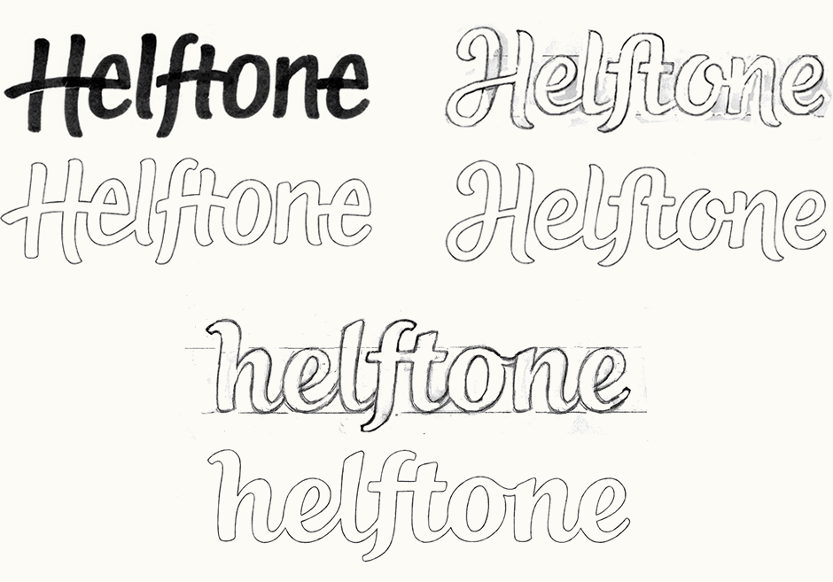
Above: Each proposal in its very rough form after some digital corrections, followed by the final sketches.
Vectoring
While developing the design on the computer, we tested some variations for some of the details such as the connecting strokes between the 'h-e' and 'n-e' pairs to see how these affected the flow. Another idea was trying out subtle adjustments to give the design a little more flair, by accentuating the curvature and prominence of the 'h' and 'f' strokes.
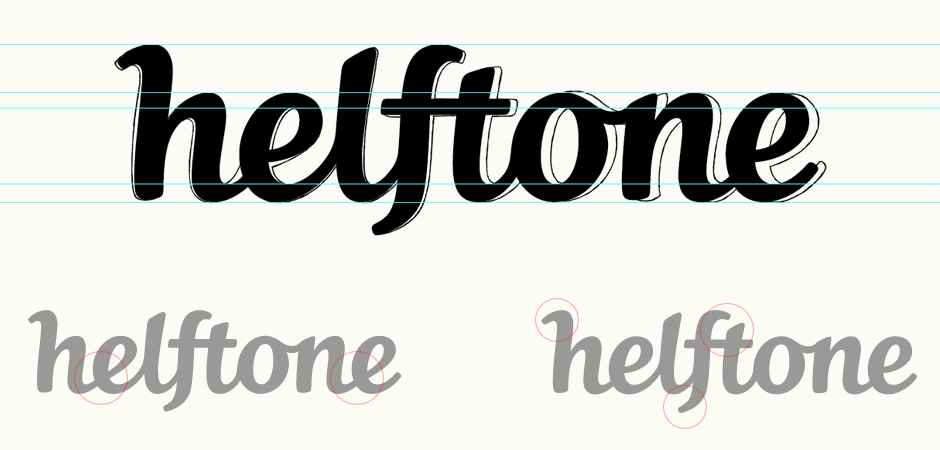
Above: Testing out variations while vectoring.
Icon Versions
From the beginning, we had discussed the possibility of a reduced version that could be used at small sizes, such as in an email signature. There were 2 main possibilities: creating a 4-letter version of the name or using just the initial. Since the multiple letter combination is quite unusual, the longer version is more unique and recognisable; however, the single 'h' is more concise and more robust in terms of scaling down. Ultimately, we opted for usability as the deciding factor.
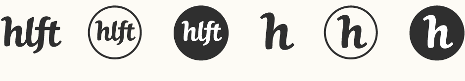
There are some subtle differences between the 'h' from the full logo and the one used as the icon version. While only minor, these aim to improve the effectiveness of the character as a stand-alone element, since originally it is designed to be part of a wider piece.
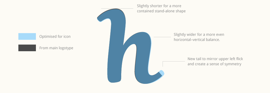
Above: Overlay of both 'h' versions and the changes made for the icon.
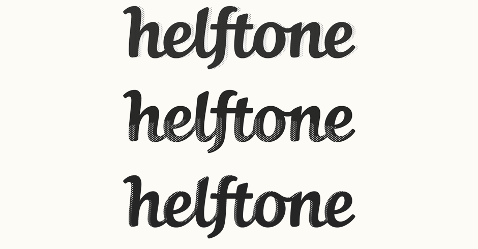
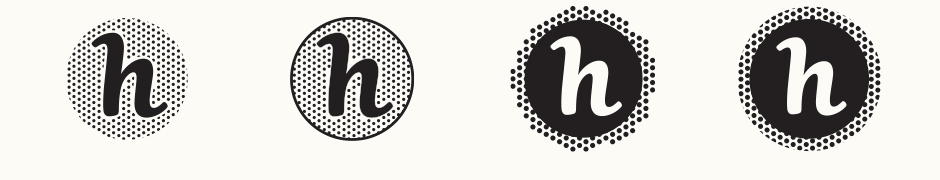
Halftone tests
For the halftone effect, the main consideration was to create something quite subtle that wouldn't detract from the lettering. While there were some interesting ideas, the main problem was integrating something that would work at the smaller sizes that the logo would realistically be used at.
Instead, we then looked at the possibility of using this sort of treatment for the icon alone. Ultimately, we agreed that the extra styling wasn't really adding anything positive and that the 'h' was simply more effective either alone or on a solid fill background.
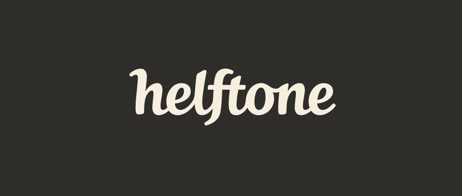
Final Logo
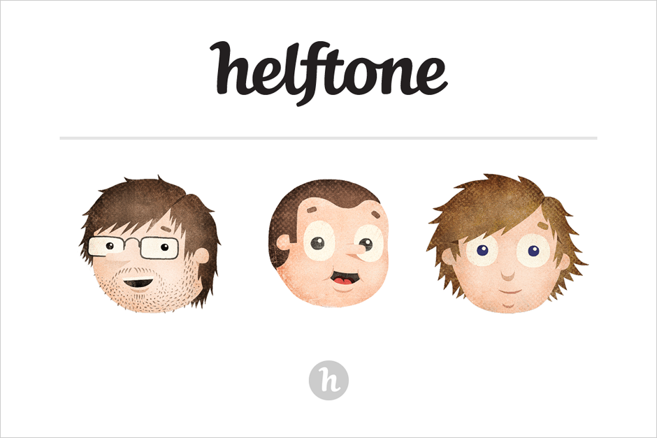
The final logo is used in a monochrome palette and can be seen on the Helftone landing page (screenshot below, design and illustrations by the Helftone team).