Geneva Yoga
Client: Geneva Yoga
Work done: Logo-type design, custom lettering, colour exploration, website conceptualisation and layout design
Logo & Website Layout
Based in Switzerland, Geneva Yoga is a newly started business offering private lessons on different yoga techniques from India, Tibet and Japan. Geneva Yoga was looking for a new logo and website to help launch their business. It was important that the look and style of the design reflect their approach to yoga, which focuses on personal balance and overall well-being.
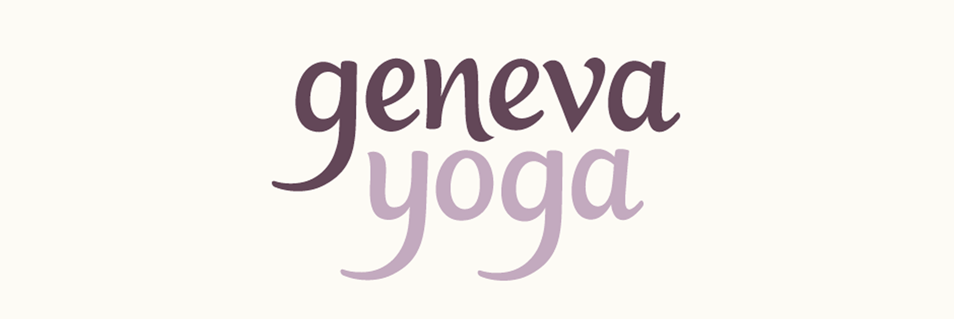
I developed a custom typography logo to give off a dynamic, organic and personal feel. Initial explorations were drawn with quill and ink to get a sense for the natural flow of the letters. These were then re-drawn in pencil in order to have more control and develop the details.
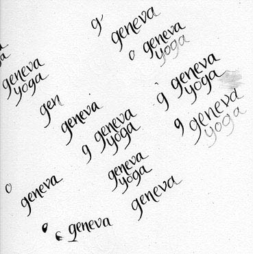
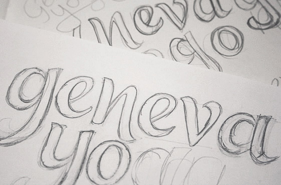
Above: Loose ink drawings and progressively more refined pencil sketches.
Finalising & Colours
The lack of perfectly straight lines gives the logo a strong sense of natural flow and the open counters contribute to the spacious and overall calm impression. The thin descenders add a sleek, stylish touch while the shape of the curves accentuates the sense of movement. An alternate version featured end strokes inspired by brush lettering and painting to bring in a friendly, contemporary feel. We also looked at a single line version combined with the use of colours to highlight the separation between the words. Various colour palettes were considered and the final design uses different shades of purple with a slightly muted tone.
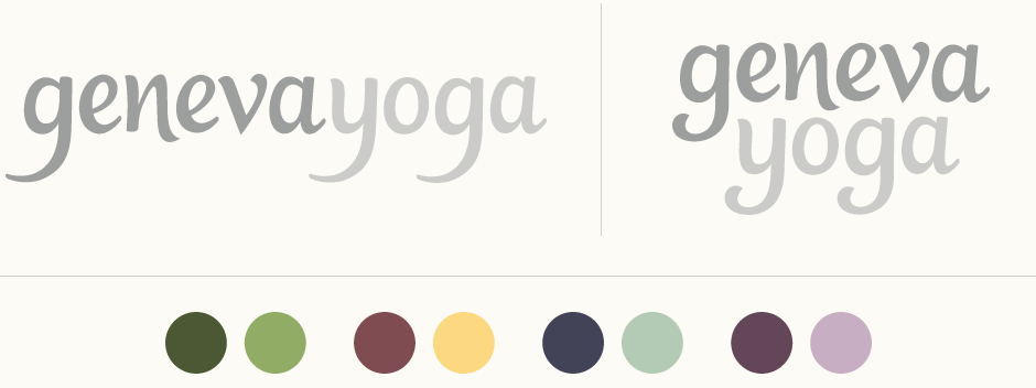
Above: Logo composition alternatives and colour palette exploration.
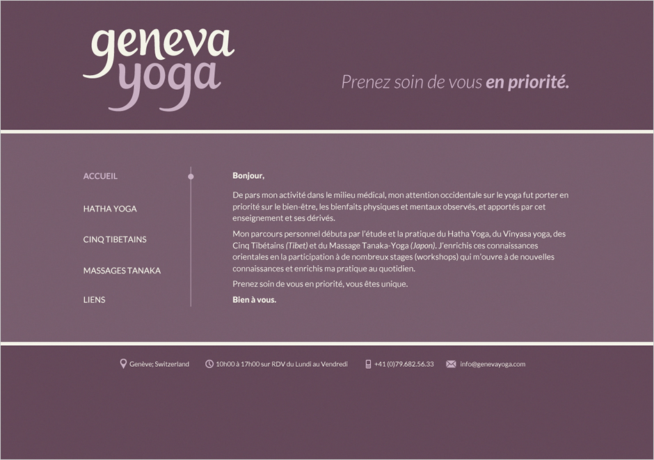
Website Design
The logo, colours and overall approach then tied in with the website. Taking into account a relatively small amount of text and no images, the design needed to look complete, cohesive and visually reflect the aims of the business. The final design is minimal and spacious with an emphasis on clear layout, text content and prominent use of the purple palette.
Stéphanie, Geneva Yoga:
For the Geneva Yoga visual design, my desire was to have a specific logo that would be integrated into the website, as much with its colours as with its graphic & typographic style. With regards to the website, I was looking for a full page design. No photographs, no illustrations. A clean, pure website, easy to use and with a purple colour scheme. The understanding of my expectations, the choice of several logos, the time-frame and the work produced satisfy me perfectly.