Evergram
Client: Evergram Inc
Work done: Logo-type design, custom lettering, colour exploration
Custom Logo-type
Evergram allows people to create and send meaningful messages into the future, its name created as play on "everlasting" and "telegram". Based on the idea of keepsakes and letter writing, these video, text or audio messages can be sent hours, days or even years later, enabling in this way a deeper connection with friends and family. Fitting for a range of memories and occasions from weddings and anniversaries to birthdays, graduations and memorials, Evergram aims to enhance the thoughtfulness, well-being and compassion expressed through communication.
Discussing the company objectives and values, we brainstormed ways in which to express this visually through the lettering. Focusing on a humanistic direction is essential as personal connections and relationships are central to Evergram. We were also interested in a reference to hand written letters and the idea of connections, both literally and symbolically.
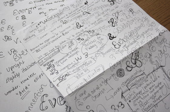
Above: Notes and early idea development while discussing the brief.
Sketch Development
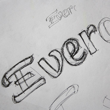
The idea development went through a quite comprehensive progression, exploring different ways in which to capture the brand attributes, how to reference the influence of the pen, how to suggest communication, the potential with using a retro/nostalgic touch, possibly adapting the style of telegram lettering, etc. Along the way, I played with various typographic features such as stroke weight, contrast, letter shapes, capitalisation and inclination to capture what would be most suited.
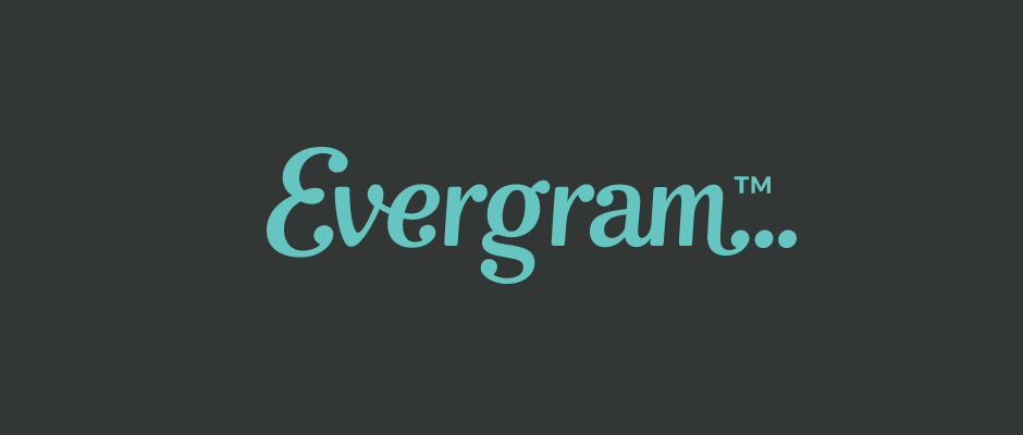
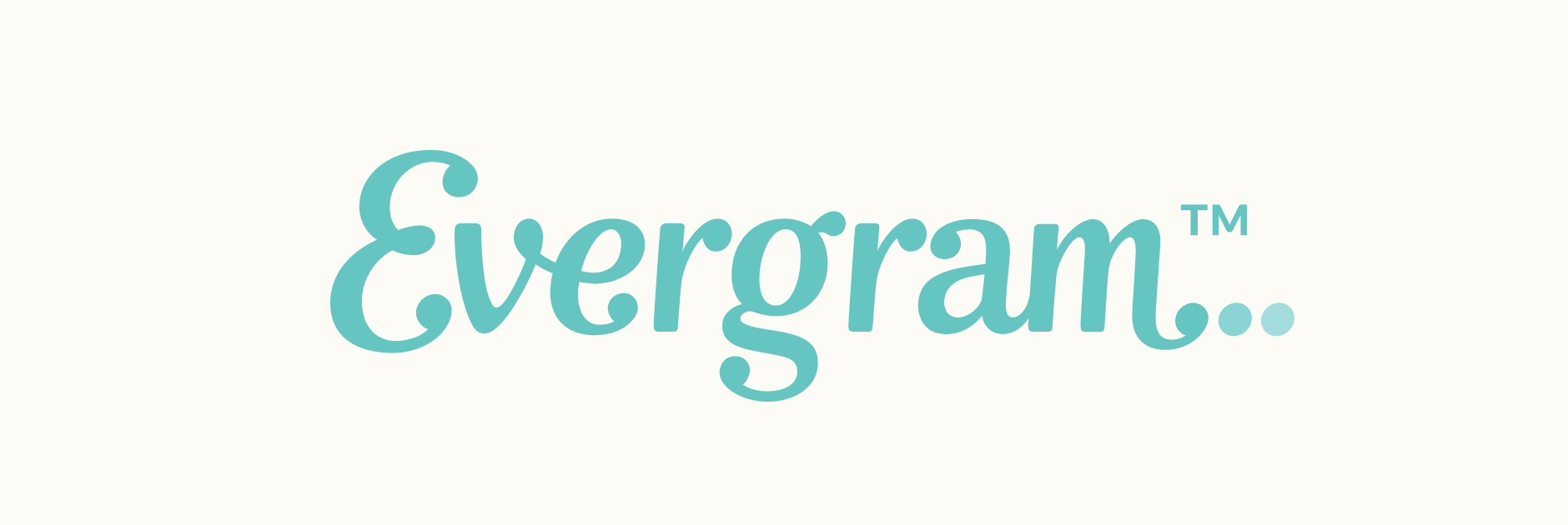
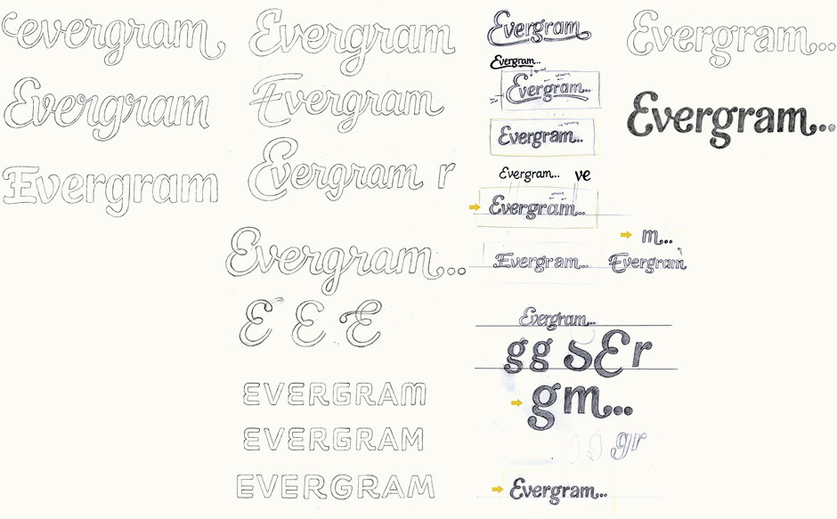
The idea we started refining (bottom right) was one that uses an ellipsis as part of the name in order to suggest a sense of wonder, time and an unfinished thought. The lettering uses ball terminals as a direct extension of the three dots, therefore allowing the ellipsis to become a fundamental part of the design. The letter styling itself is a balance between an informal script and a more classic serif, with details such as a rounded 'E' and connected 'v-e' (a hint towards hand-drawn shapes) and double story 'g' and 'a' (characters more commonly seen in serif faces).
Vectoring & Progression
Working on the vector version, the most difficult part was the 'am' pair at the end of the word. Its original design made it feel quite isolated from the logo as a whole, due in part to the repetition of the vertical stems (compared to the more varied character shapes earlier) and also the lack of any connecting strokes. I tried a few options, such as removing the double story shape or creating a more organic 'a' directly connected to the 'm'.
Above: Testing possible solutions for the 'am', the most problematic part of the design.
Colour Palettes & Icon
The mobile application icon uses the single 'E' modified to incorporate the ellipsis. The use of colour plays an important part in the representation of this concept. For each palette that we explored, I included varying tones to range from dark to light, that could be applied to the three dots whether placed on white or coloured backgrounds.
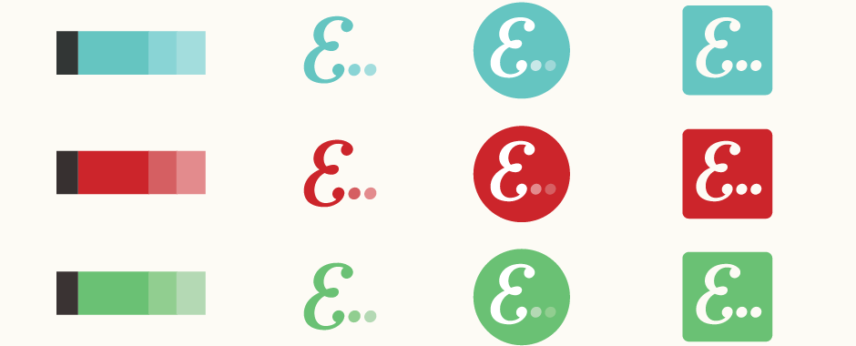
Above: Different palette options, each with progressing tones for the dots.
Final Work
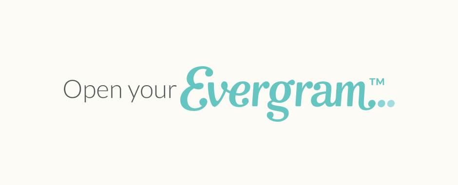
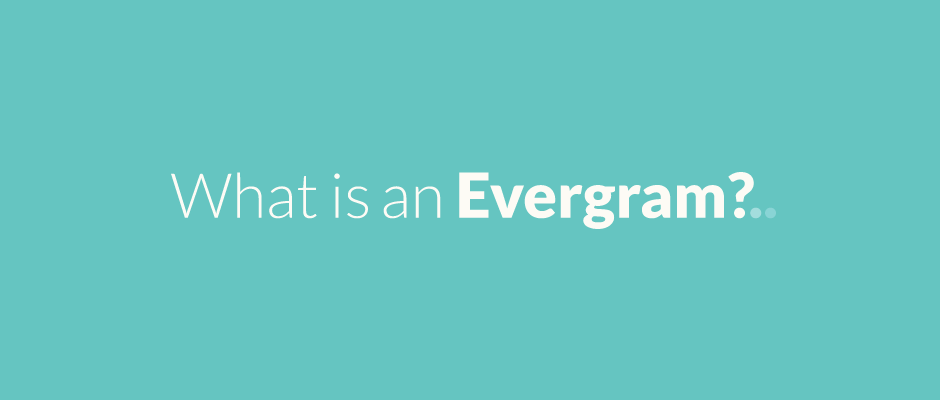
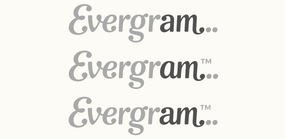
Below is the logo-type version using the double-story 'a', followed by some header typesetting and an extension of the ellipsis concept. The design was further revised to feature a modified 'a' which is based on a flipped 'e', as seen on the Evergram website.