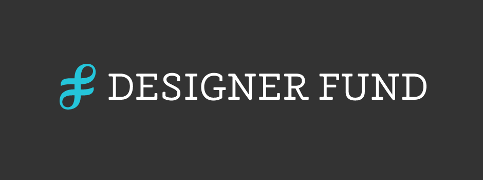
Designer Fund
Client: Designer Fund
Work done: Logo-type design, custom lettering, monogram, branding development
Visual Identity Design
Visual identity development for the Designer Fund, a community whose mission is to invest in designers building businesses with positive social impact. The company had been working on defining their values and intended tone/voice when I was brought in to help transpose this character into a working visual identity. It was essential to connect to the audience of designers as well as create something versatile enough to adapt the to rapid growth of the young organisation.
From our initial discussions and brainstorms, the main overall direction that emerged was to create a 'DF' monogram that would be accompanied by a custom word mark. At their core, monograms are traditionally used as signatures and personal seals, which we used to impart a sense of establishment and a solid foundation. At the same time, we were also looking to merge this with the idea of connections, collaboration and giving something back - attributes central to brand.
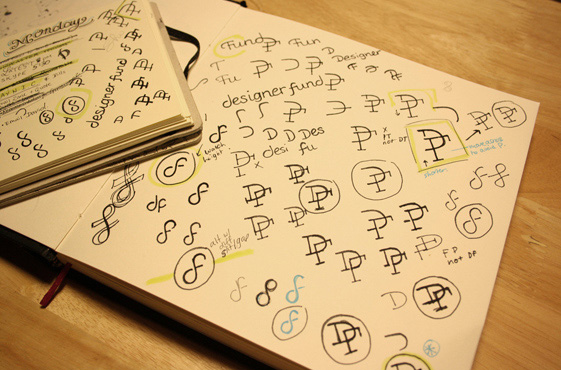
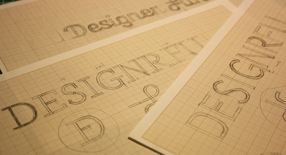
Above: Idea progression: from sketchbook notes and scribbles to the more complete rough drafts.
First Concepts
The initial round of sketches explored three main concepts, each one with its own lettering and monogram designs to match. The different typographic styles (a slab serif, a stencilled sans serif and an angular script) all focused on using a predominately mono-line weight to communicate a strong, functional and enduring aesthetic. At this stage, we were specifically thinking of placing the mark within a circular container so that it could act as the basis for further brand extensions (marks for sub-brands, icons, etc.).
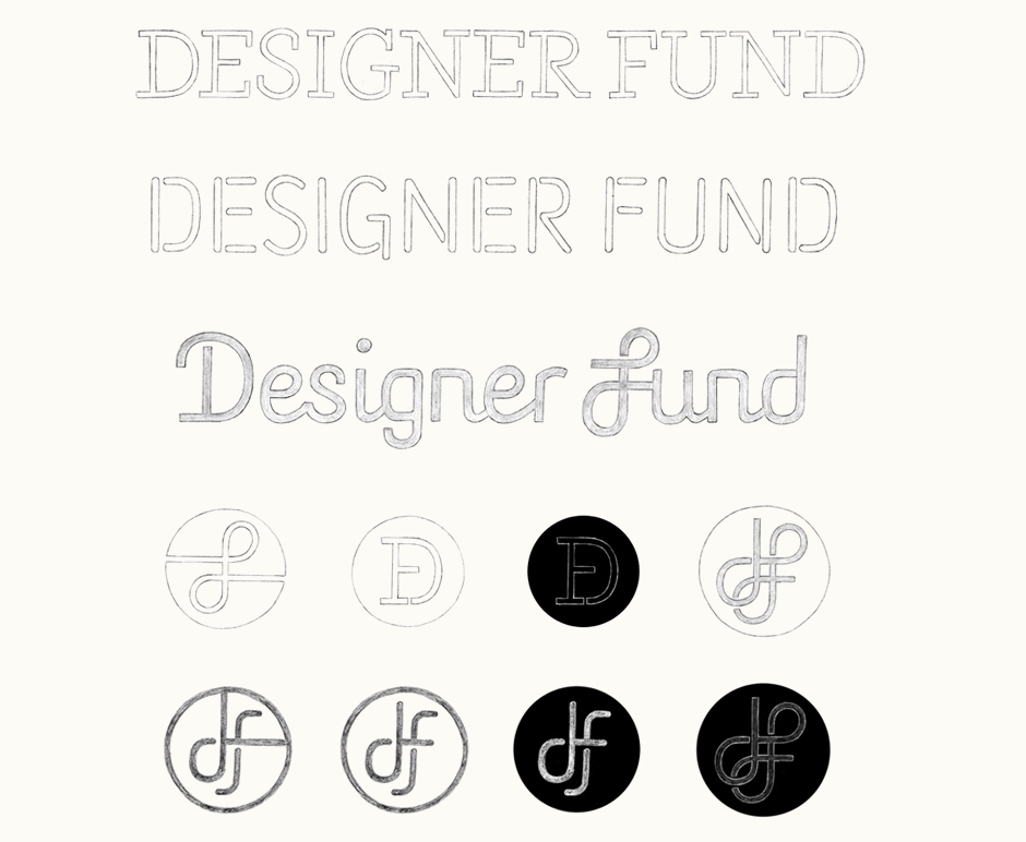
Above: Each logo-type concept was accompanied by few monogram options.
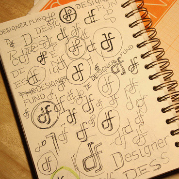
Further Iterations
Upon initial review, we decided to continue with the slab and script style word marks and continue some further exploration for the monogram. For the slab, revisions focused on giving the letters proportions suggestive of small capitals, rather than simply uppercase and bring in some rounded corners. The script needed more pronounced changes as the very angular nature of some of the letters felt quite awkward and contrived. The goal overall was to create a script version of a neo-grotesque sans serif.
The lines, shapes and execution of the monogram designs were initially intended to be quite closely associated with the lettering styles, almost acting as a natural extension of the characters themselves. As the development progressed though, we also looked at a more abstract approach to the monogram and letting it evolve into its own visual form.
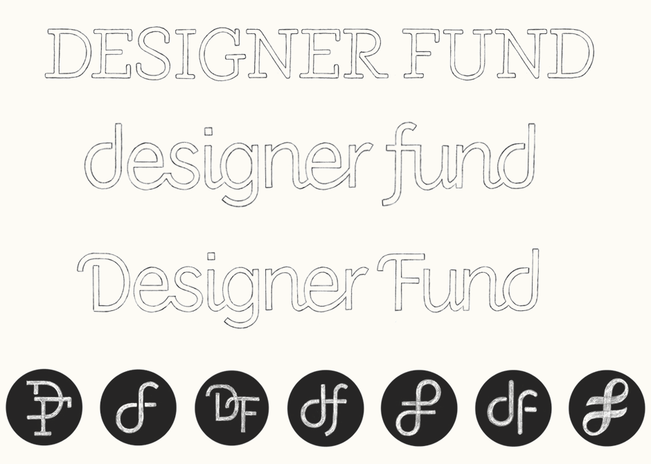
Above: Final sketch options and monogram Photoshop mock-ups.
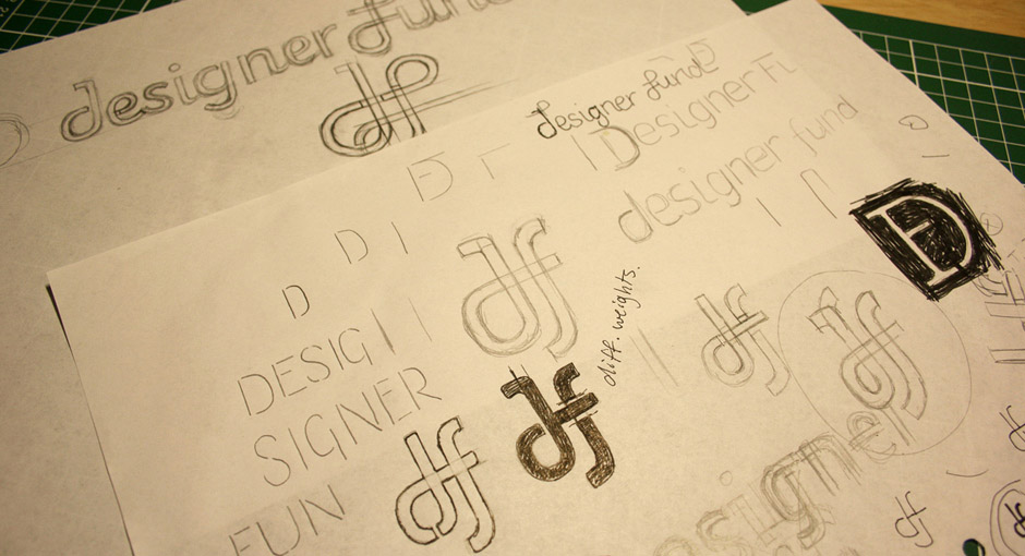
Vectoring & Revisions
While visually interesting, the literal executions didn't carry as much weight symbolically and we felt there was greater potential by emphasising a stylistic juxtaposition between the mark and the typography. Instead, the idea we went with was a quite calligraphic design (above right) loosely based on a hand drawn lowercase 'df' in order to bring in more depth and act as a nod towards the 3D depiction of DNA strands.
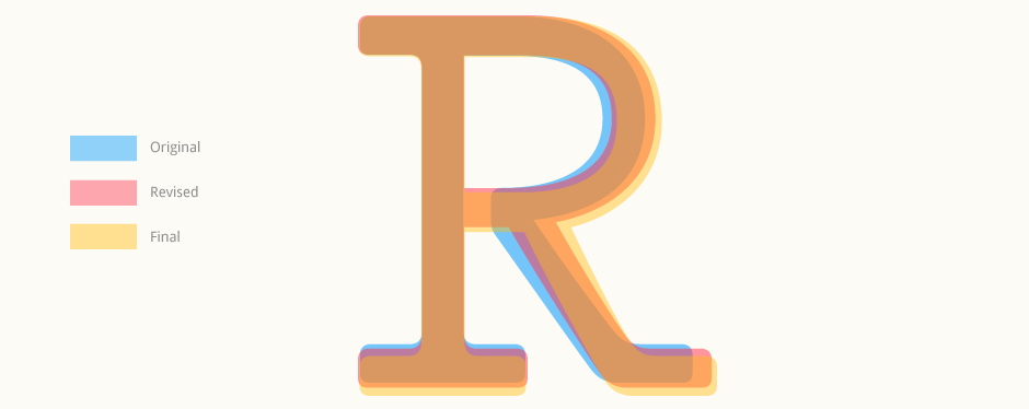
From the sketches, I moved onto the digital version, which was then refined progressively. In order to maintain continuity between the mark and the type, the lines of the monogram were straightened up and the curves adjusted to be more even and consistent, also improving the balance between the upper and lower loops. The accompanying word mark was then also further refined with long, soft slabs in order to accentuate a sense of craft, warmth and individuality.
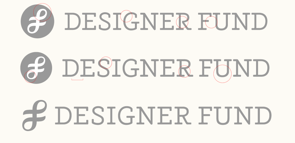
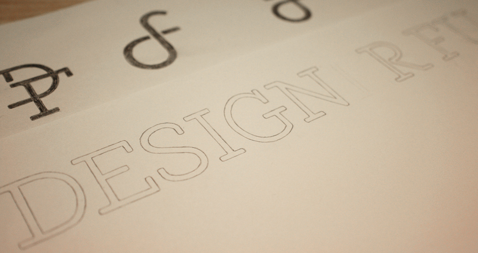
At first glance, the changes may seem quite minor within the context of the full piece, but become more evident when looking close up, as highlighted with the 'R' below.
Above: Progression and refining of the digitised logo.
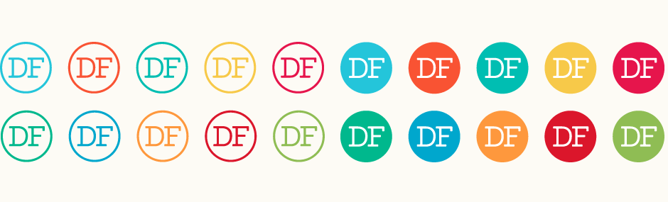
Secondary Versions
To ensure the logo is versatile across a wide range of context and uses, I also developed some further versions extending on the primary logo. There is an alternate optimised for very small sizes, with subtle differences such as a slightly heavier weight and looser kerning. A secondary 'DF' mark can also be used as an alternative to the DNA-inspired monogram, its simplicity making it ideal for use on photographic backgrounds or small icons. (While taken from the main wordmark, the characters have been slightly modified to fit better in their new context.) Thirdly, there is also a version created for use in a square format. This uses horizontal divider lines to create a compact composition and they are designed as a direct extension of the typographic crossbars: same weight, same stroke terminals, same alignment.
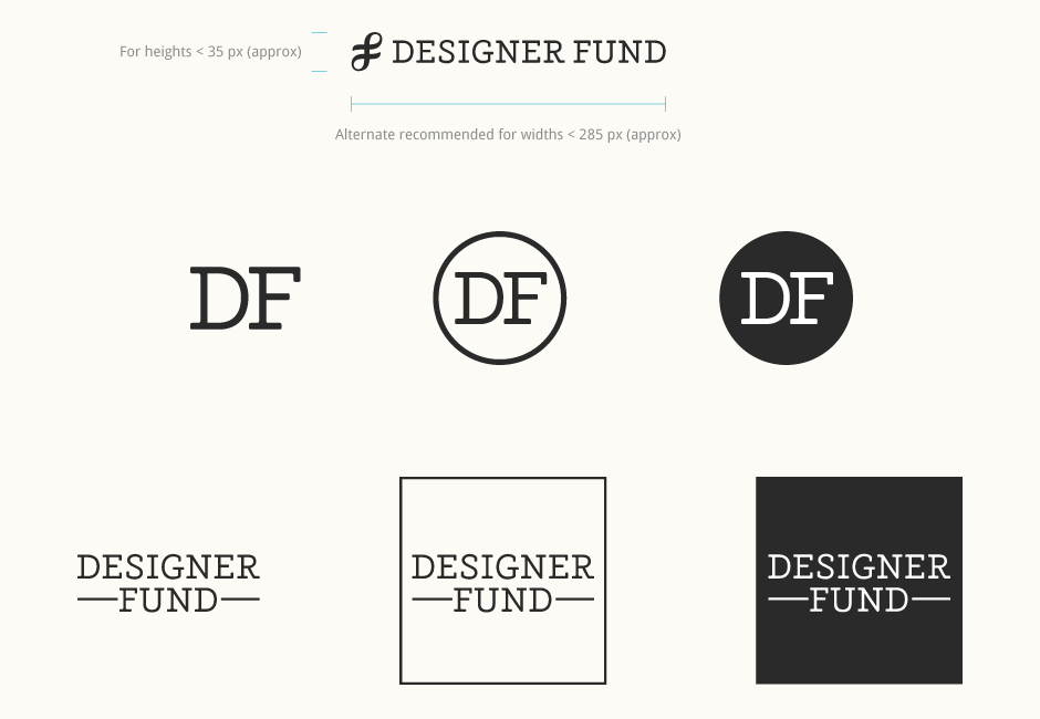
Above: Usage guidelines, secondary mark and vertical setting.
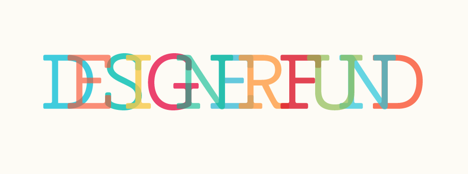
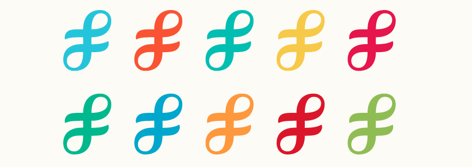
Colours
The goal with the colour palette was to create a broad, adaptable range of tones that could be used as necessary for various extensions of the main brand. Bright, eye-catching shades are used to impart a fresh, contemporary and dynamic feel.
Final Logo
The logo is being implemented across the various Designer Fund platforms, such as the website and Facebook page. I also contributed towards the visual identity article on the Designer Fund blog.