Cuberto
Client: Cuberto LLC
Work done: Logo-type design, custom lettering, colour exploration
Custom Logo-type
Based in Saint Petersburg, Cuberto LLC is a company that specialises in icon and user interface design. Established in 2009, they were looking for a logo re-design featuring a custom script. The goal was to create a strong design that felt cohesive and clean with natural, flowing letter connections. It also had to be highly legible and not too elaborate.
I started off with some very rough quick drawings to get a feel for the flow of the word and how the individual letter shapes interact with one another. Keeping in mind the fact that it needed to look distinctive but quite subtle at the same time, during the rough initial stages, I also looked for ways to bring in recognisable details in a discreet manner. Starting with quick strokes with a brush pen, I then moved onto pencil drawings based on the natural shapes created by the brush.
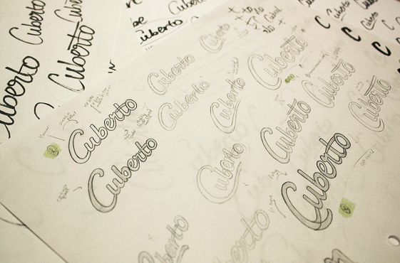
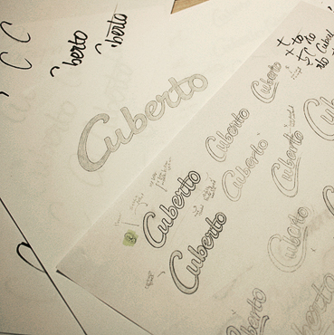
Above: Early sketches and idea development.
Development
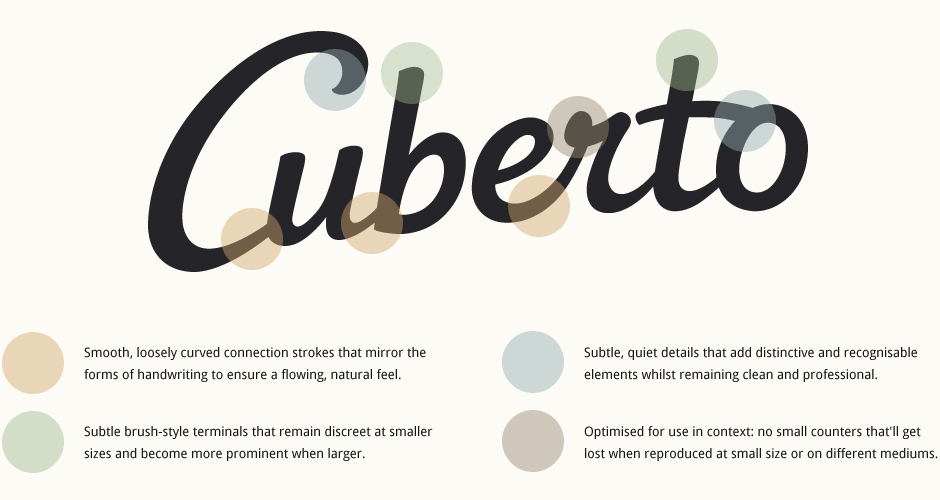
Once I had narrowed down the overall design to a general concept, I then played around with further alternates within that main approach. Drawing many variations allowed for considerations such as possible extended strokes on the 'C', different connections between the 't-o', the style of the cursive 'r', the angle and shape of the baseline, etc. As the shape of an uppercase 'C' always leaves a large gap within its contours, I was especially concerned with how it would relate to the rest of the word. In the end, I went with a 'C' that protrudes over the top of the letters slightly and is directly connected to the 'u' following it in order for it to blend seamlessly within the design.
The chosen design was then re-drawn as a final sketch. This neater version allowed me to make more specific decisions about details such as stroke terminals, letter widths, shape of counters, etc. Filling in the sketch also gives a clearer picture of the spacing issues that need to be addressed in the digital version.
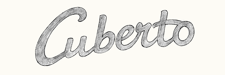
Above: Last sketch before vectoring. The details are quite rough at this stage, especially kerning and letter proportions.
Testing & Refining
With a vectored version of the sketch, the logo was then tested in various situations: reverse white-on-black, different angles, sizes, etc. and refined accordingly. I was also able to test the logo in context on Cuberto's new website layout and adjust subtle characteristics such as the curve of the baseline to make sure that it was optimally suited to its main intended use.
Final Design
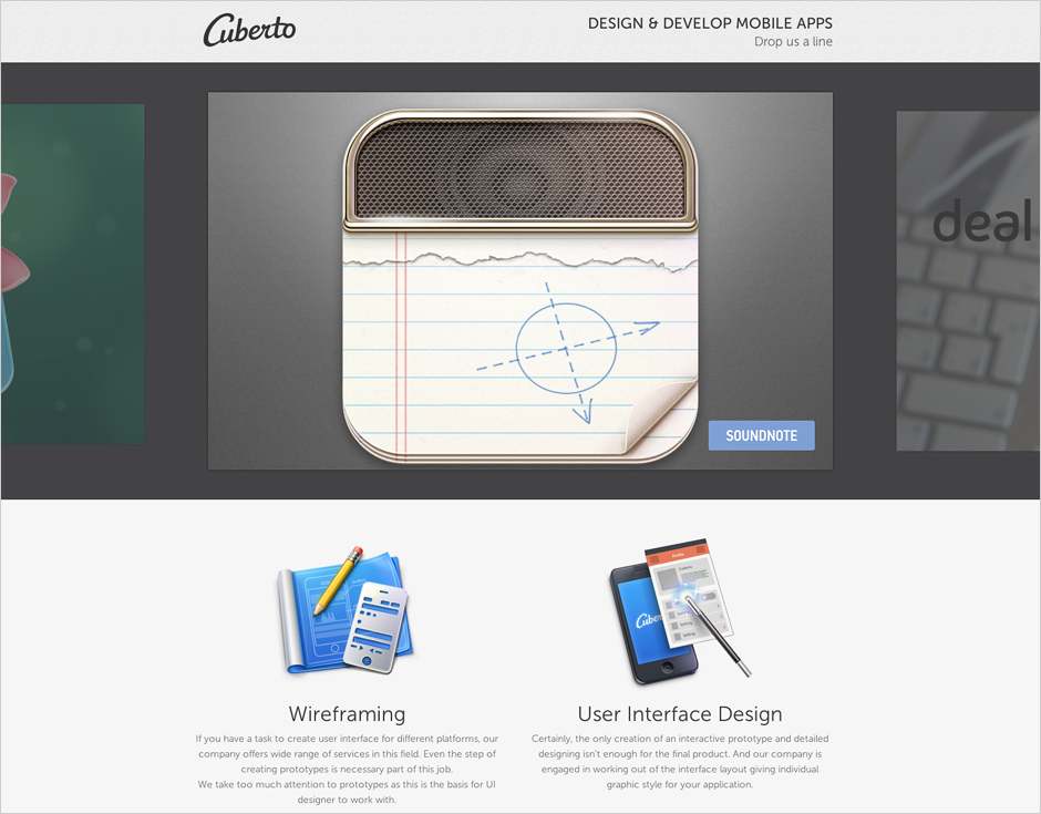
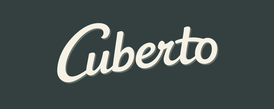
The final logo is implemented throughout the Cuberto website (homepage shown below, design by the Cuberto team). In addition to the website colour scheme where the logo is black on a light grey background, an alternative also exists as off-white on dark blue version.