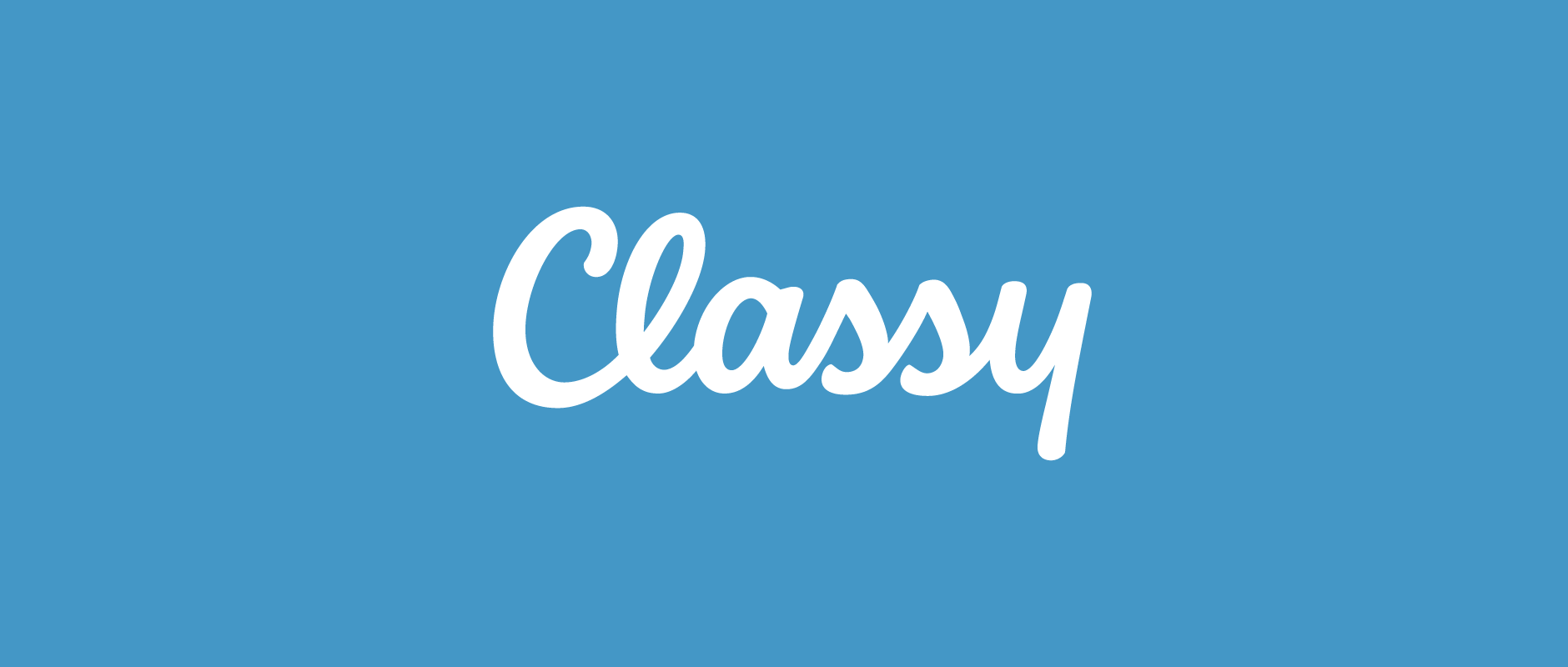
Classy
Client: Classy
Work done: Consultancy, logotype design, custom lettering
Custom Logotype
Classy is an online fundraising platform for social impact organizations. Launched in 2011, it started as StayClassy until 2014 when they rebranded as Classy. The design team had done internal logo brainstorming and development which led to a script style logo and they looking for a final design in that direction.
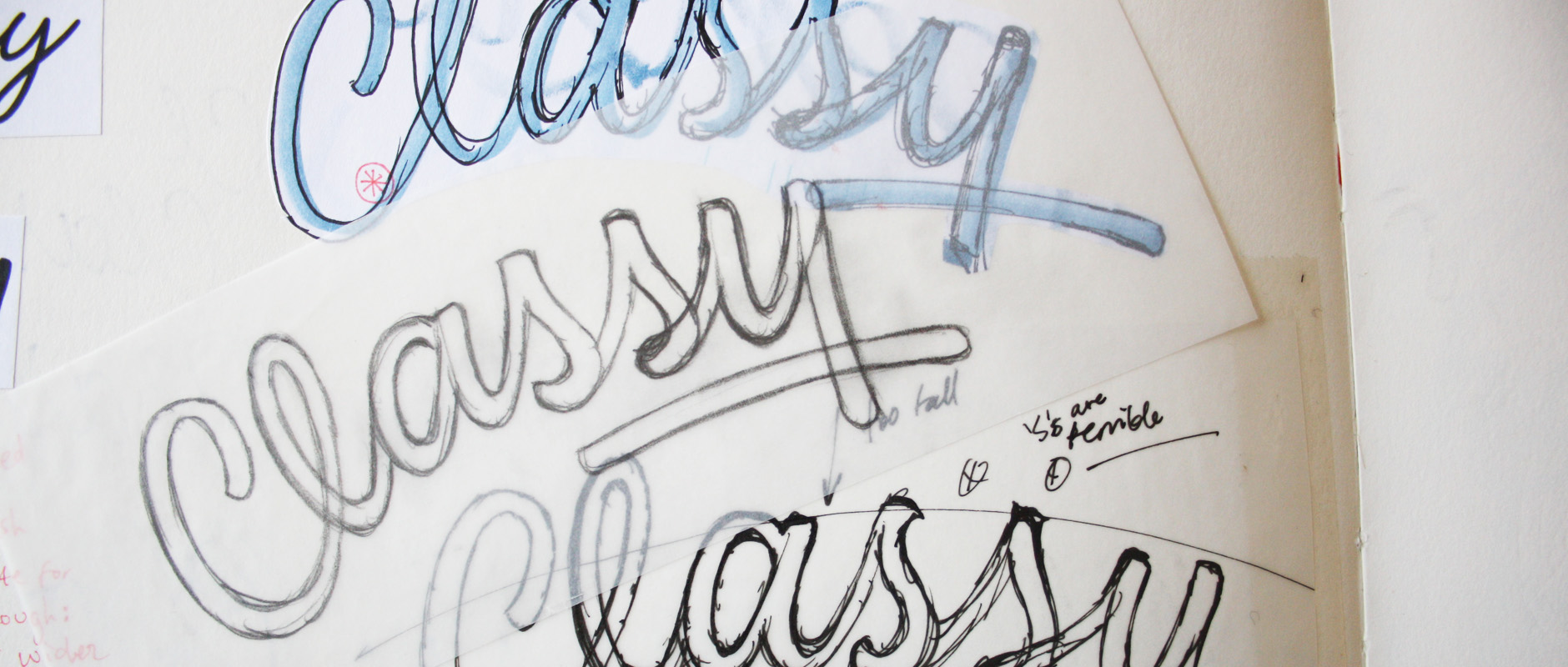
We started by a review and feedback on the Classy script that had been developed. This focused on figuring out what characteristics they liked, what worked best, what could be improved, what the difficult areas were, etc. The plan was to design 2 options: one that is closer to the original concept and one that takes a little more design freedom.
One of the main challenges of the redesign was that as the brand had grown and matured over the years, there now needed to be a balance of the current brand familiarity with a more refined and professional look. Trying to find way to encapsulate youthful and progressive with refined and sophisticated is a tricky balance that needs a lot of subtlety in the typographic treatment.
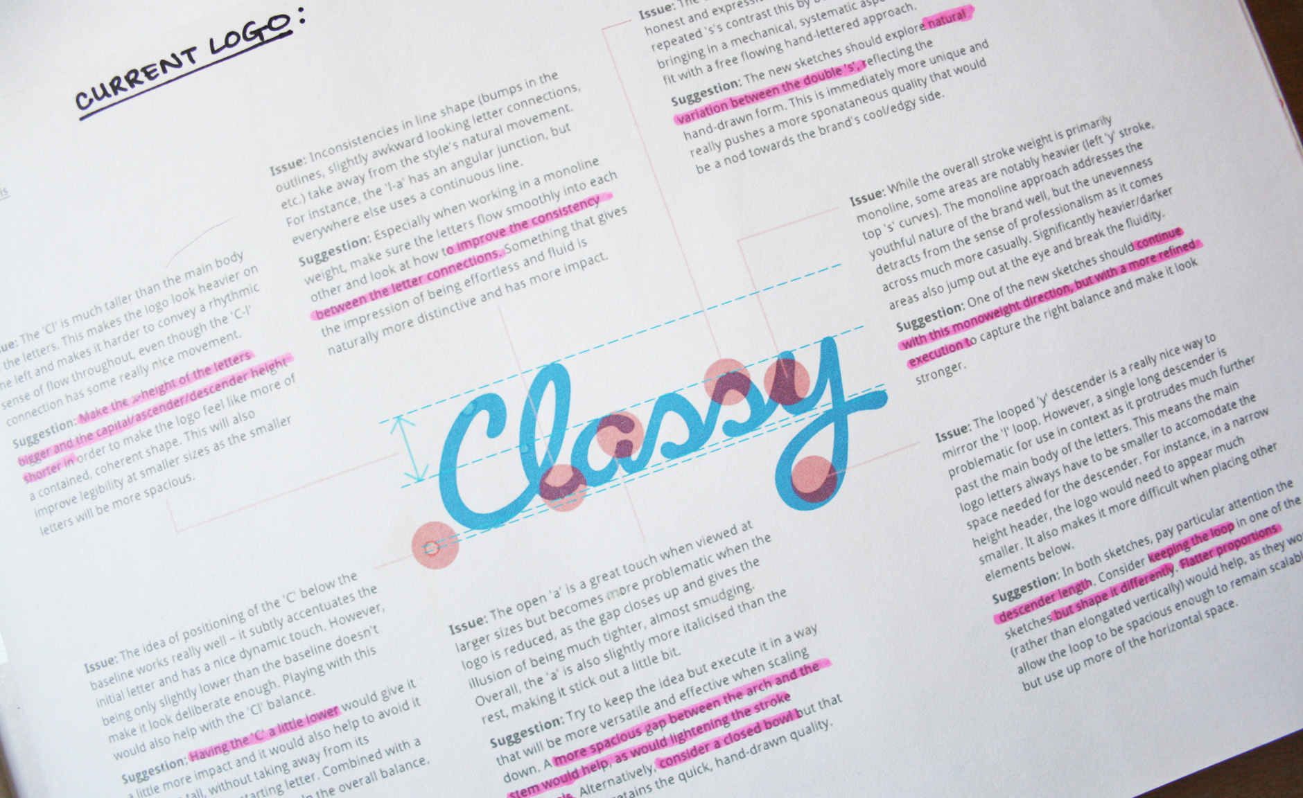
Above: Review of the latest logo and notes for the new designs.
Concept Development
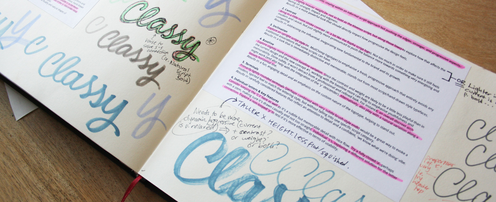
Research into relevant script logotypes and script faces helped to define overall approaches we felt conveyed the right kind of impression, as well as things that didn't work for our particular combination of letters. Due to the nature of the brief, both concepts were still ultimately quite similar in approach, so this planning helped to make sure the new designs would definitely evolve to represent the different ideas we wanted to look at.
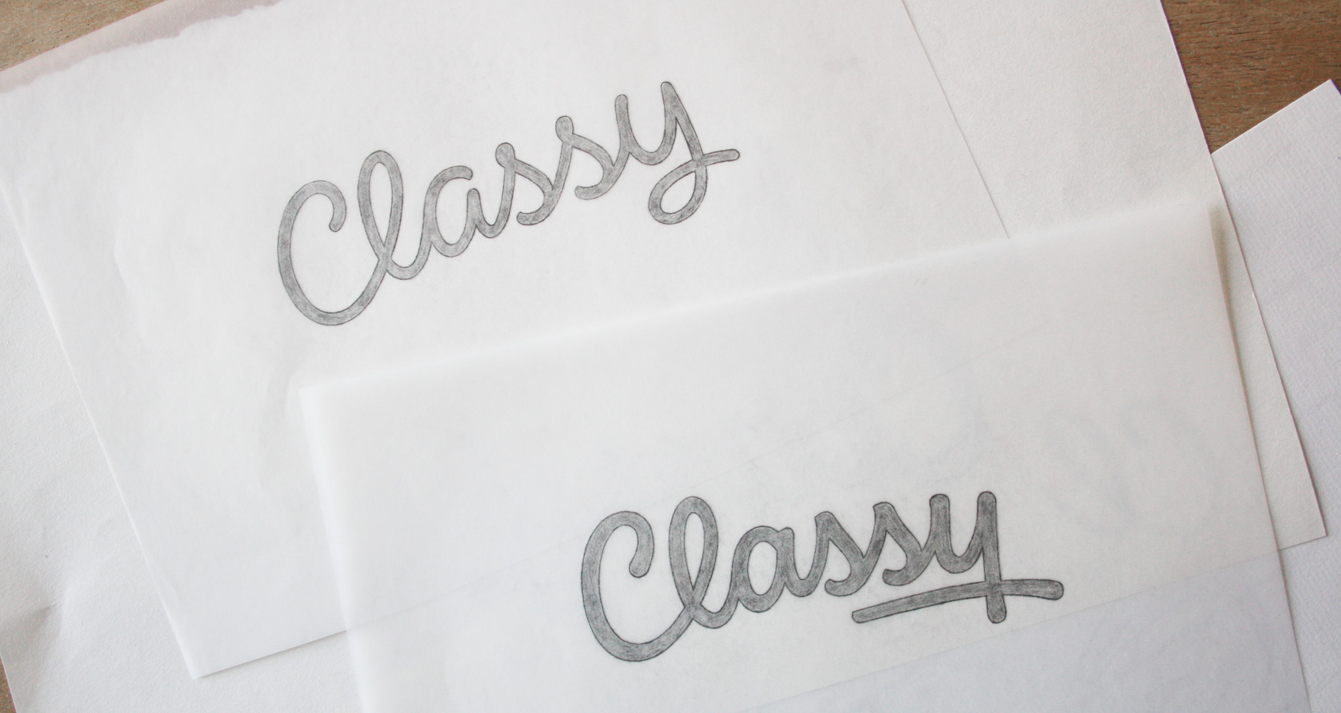
Starting with a few pens, I wrote out the name over and over, very quickly. I ended up using a thin tip marker to work on the concept that was to have more of a monoline approach, influenced by the latest design (below top) and a brush pen for what eventually led to a weightier, more brush-like direction (below bottom).
Above: Sketchbook pages for one of the concepts.
First Sketches
The first concept kept a lot of the ideas from the latest logo, like the very low stroke contrast, the slight slant, the straight baseline, the open ‘a’ and the looped ‘y’. It’s also lighter in weight to make it a little more distinctive and refined and to create a more fluid, consistent movement.
The second concept stayed within an informal script approach but pushed the edgier, progressive nature of the brand. It has a heavier weight and a bit more contrast to infuse a little more energy to the lettering. The upright script keeps it modern while the playful baseline pushes the youthful side. The treatment of the terminals is really subtle, with a combination of very light points and curves to create a spirited and confident feel.
Above: Finalised concept sketches for both proposals.
Revisions & Vector
From a review with the team, the general consensus was almost entirely for the second concept, particularly the impact and strength created by the weight. We brainstormed ideas to tone down its playful aspect and make it a little more sophisticated and refined. Areas we focused on were the baseline and the ‘y’ underline.
As the overall concept was there, I outlined some thoughts to keep in mind when digitising and how these would address the feedback.
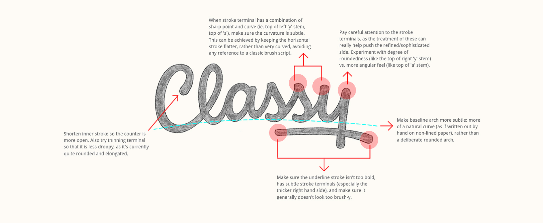
Above: Early revisions and first digital version.
Exploring Variations
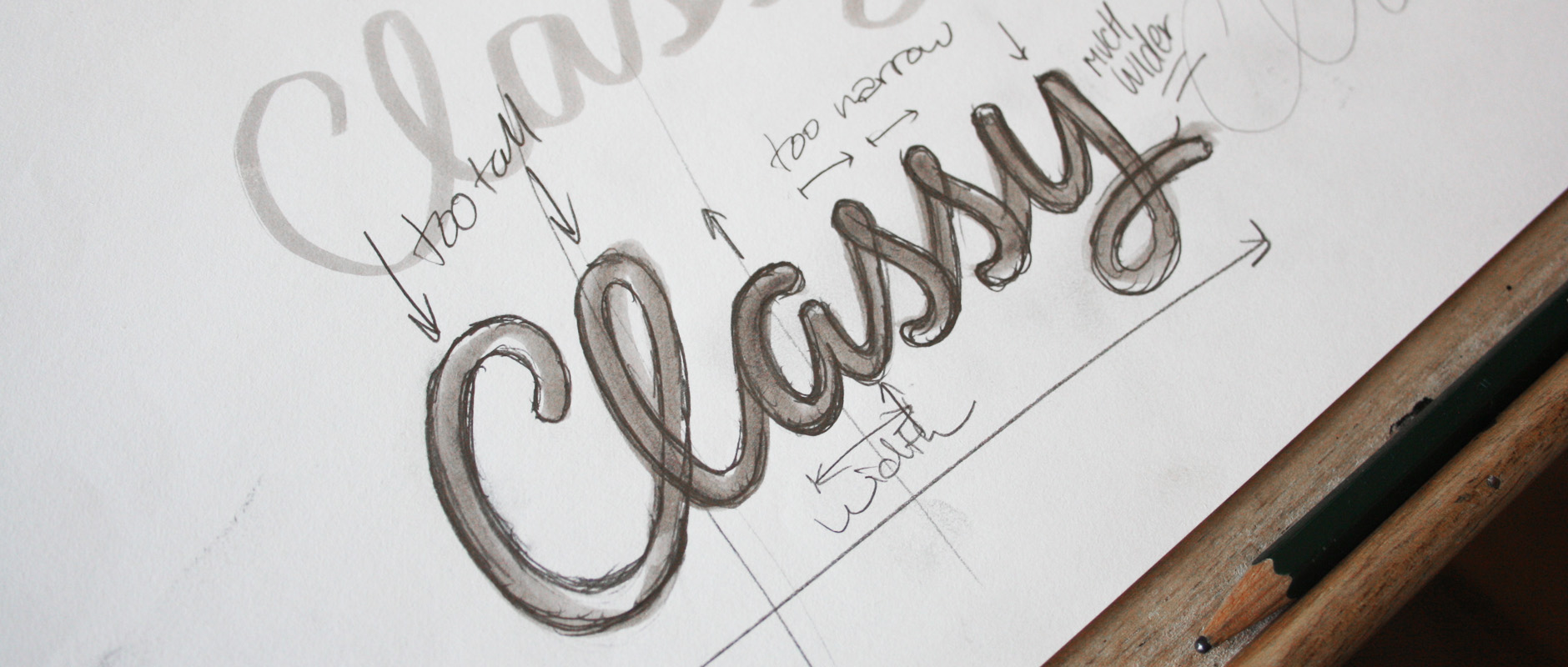
The subsequent steps focused on the ‘y’ (and avoiding it putting too much emphasis on the last part of the name, as it was doing with the long crossbar) and the fact that it still felt a little too juvenile. Here, I did a series of rough variations looking at how differences in weight, contrast and inclination affect the perception, combined with new ideas for the ‘y’.
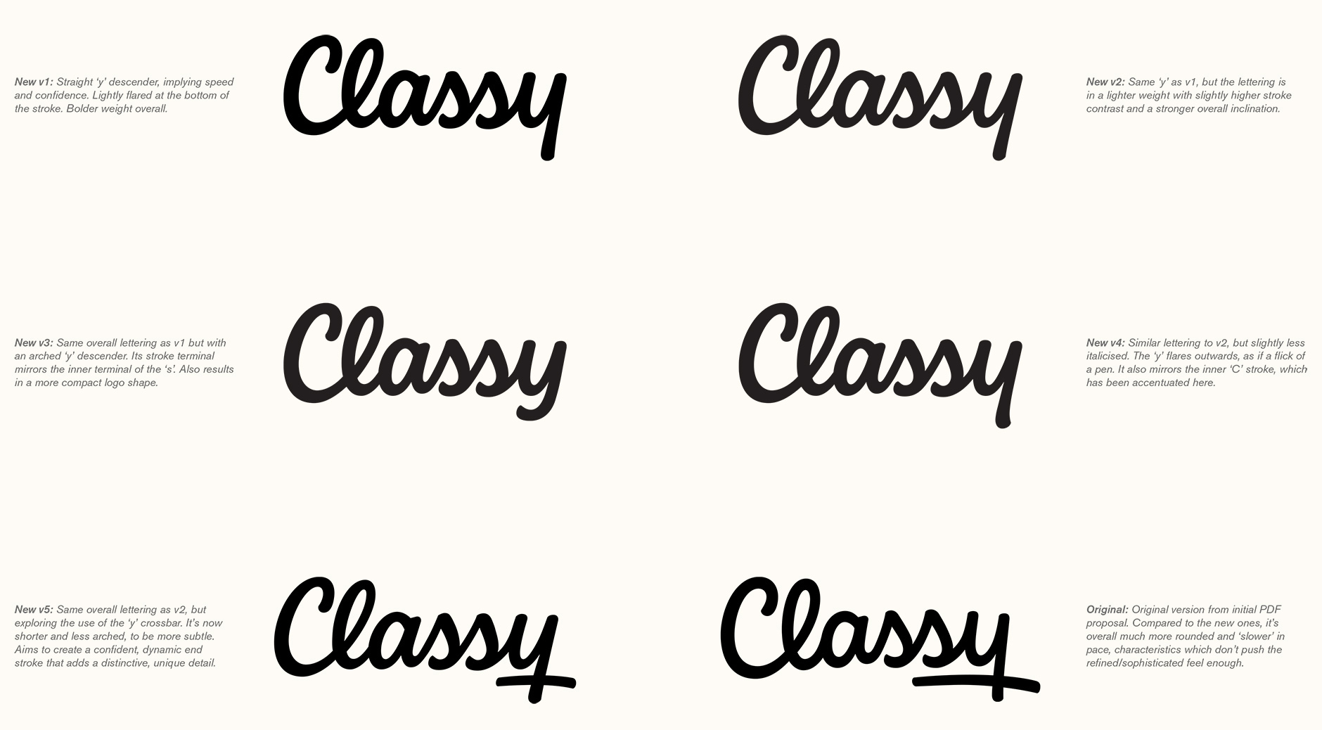
The range of quick variations was really helpful in pinpointing v1 (top left) as the right balance of edginess and sophistication. I did a little more exploration on the 'y', which actually helped to confirm the original one worked the best, with its subtle outwards flick.
Finalising
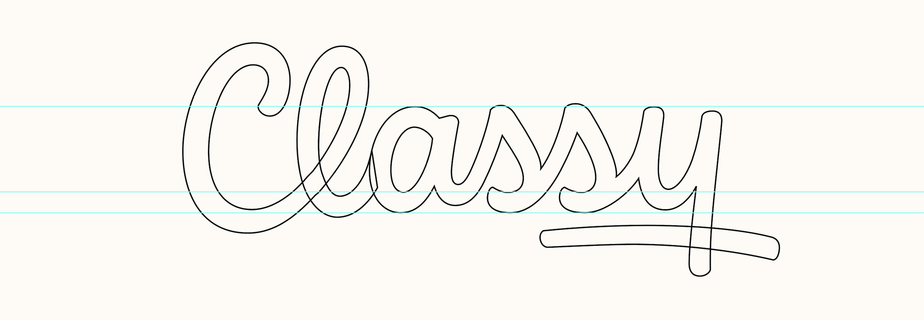
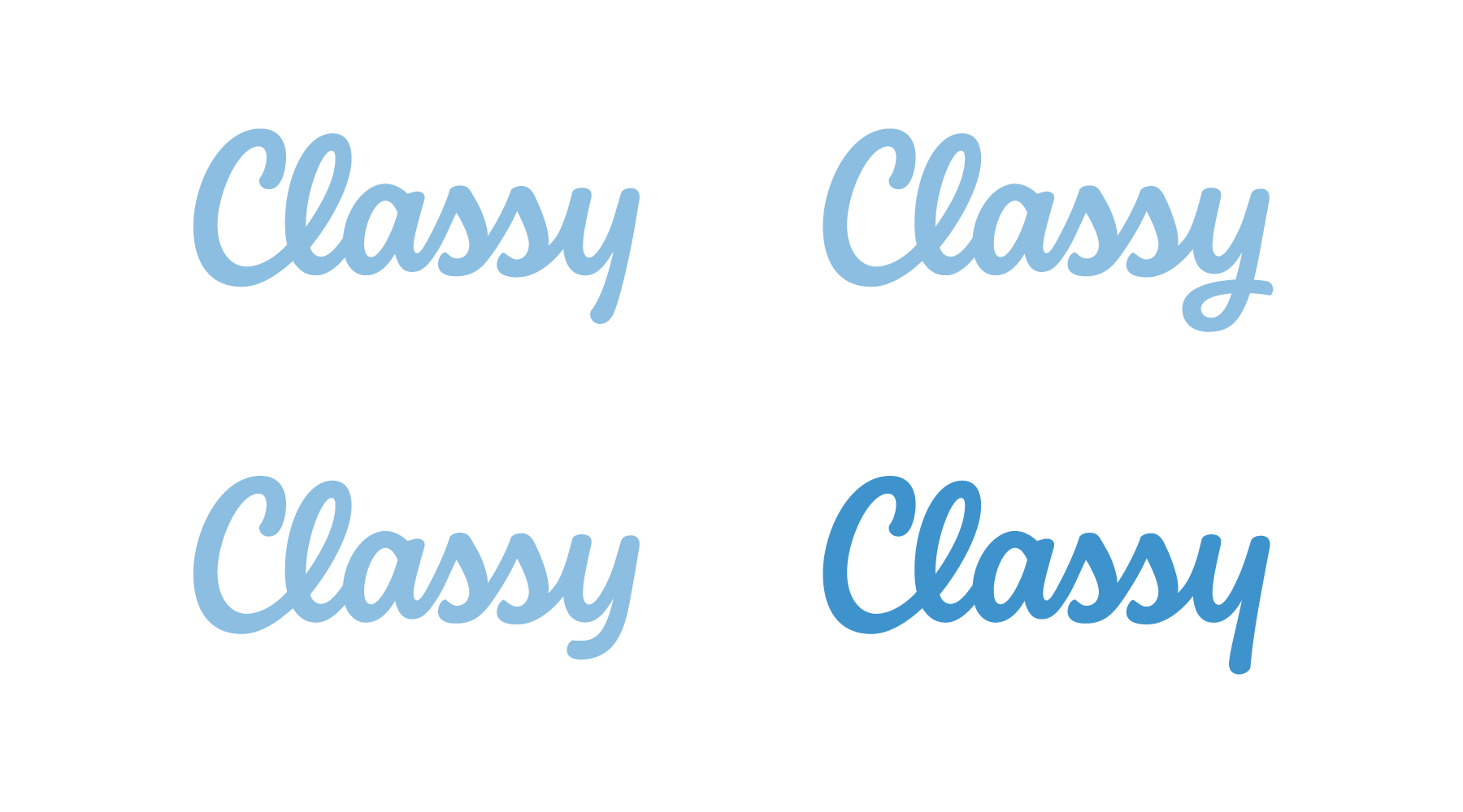
While finalising the design, I also shortened the overall height of the lettering a little to make it feel more settled and less stretched. As the logo would often be used in white on solid colour and photographic backgrounds, reverse colour testing was important during the whole process, but especially when taking care of optical adjustments to the weight at junctions.
Final Logo
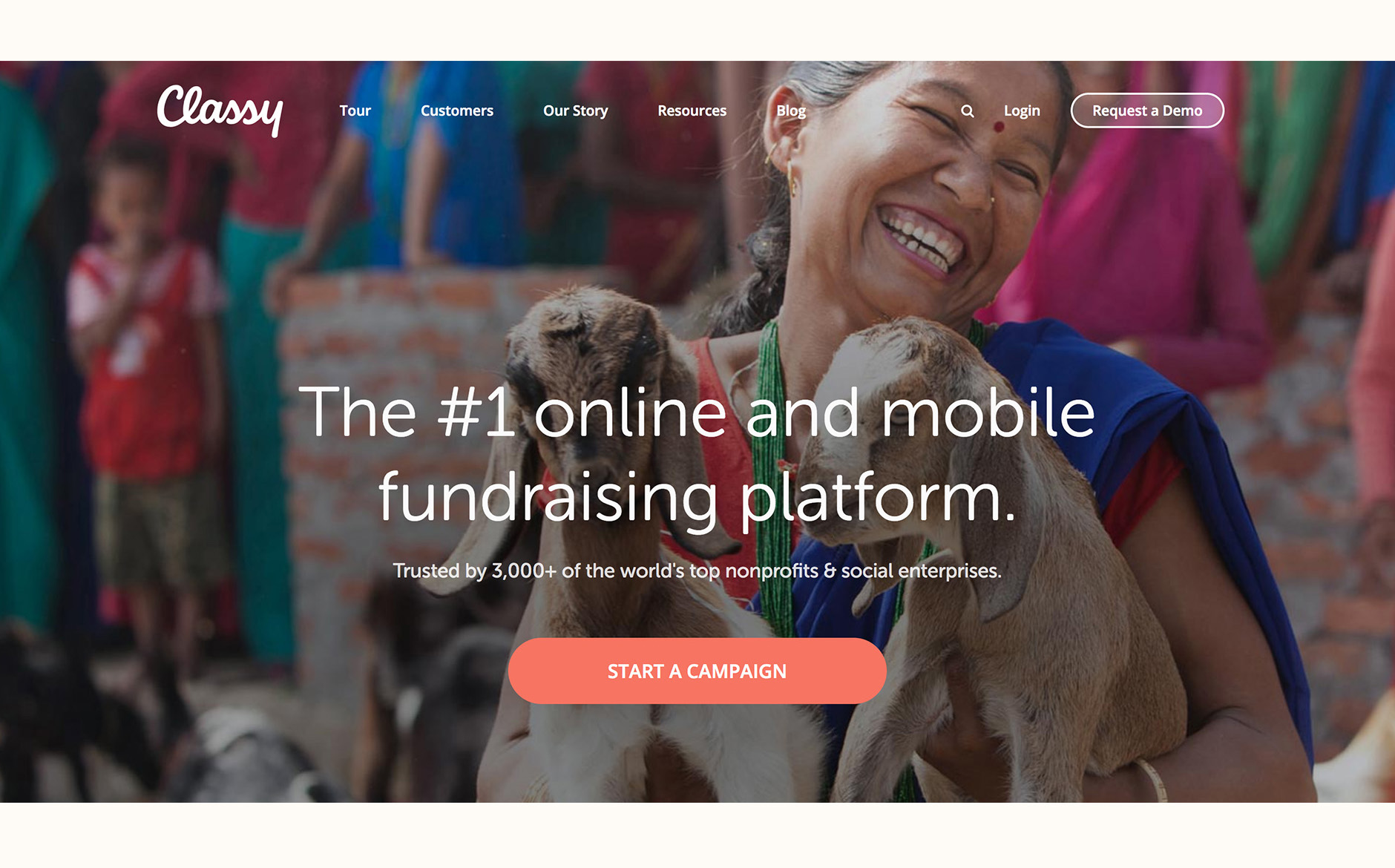
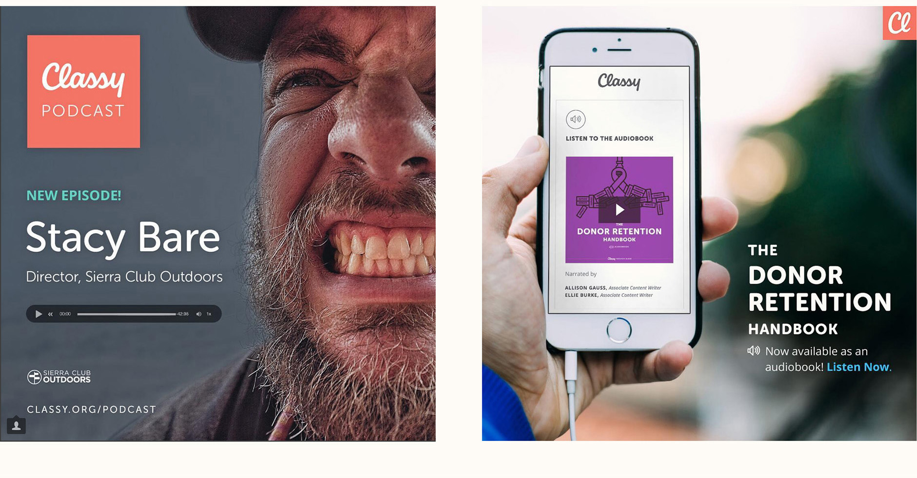
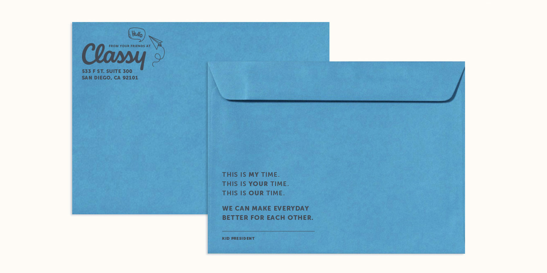
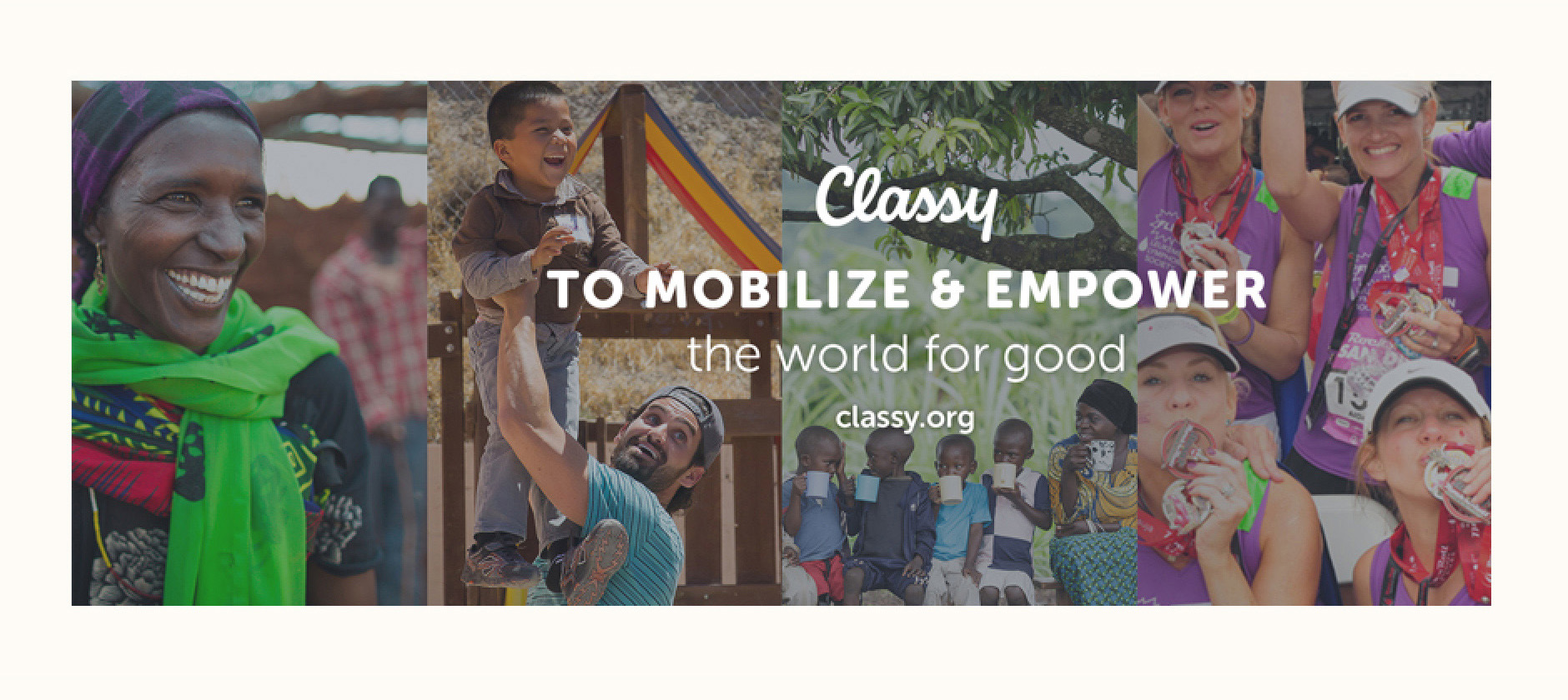
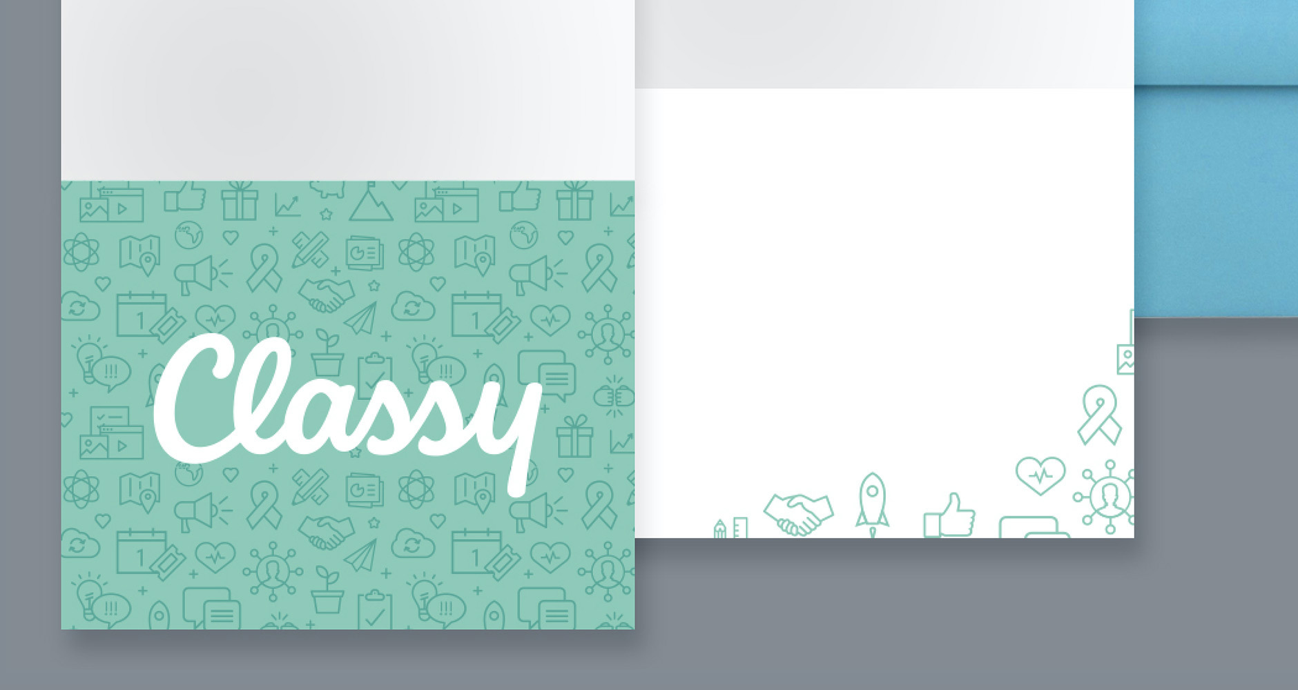
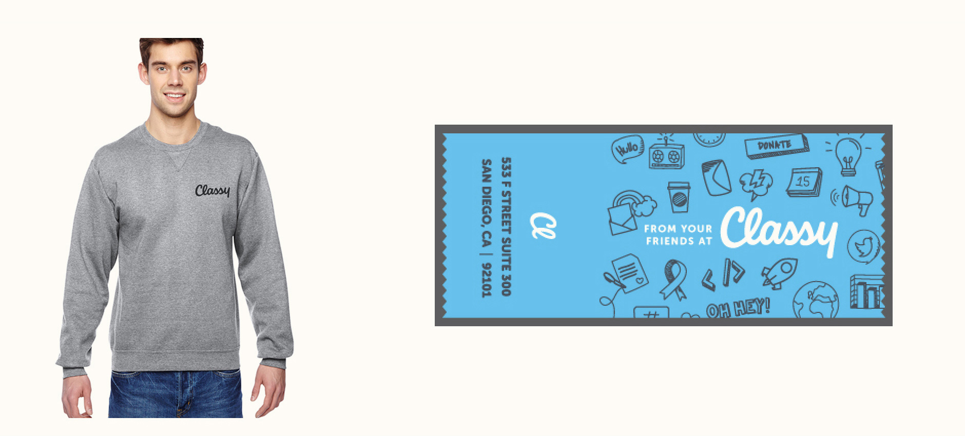
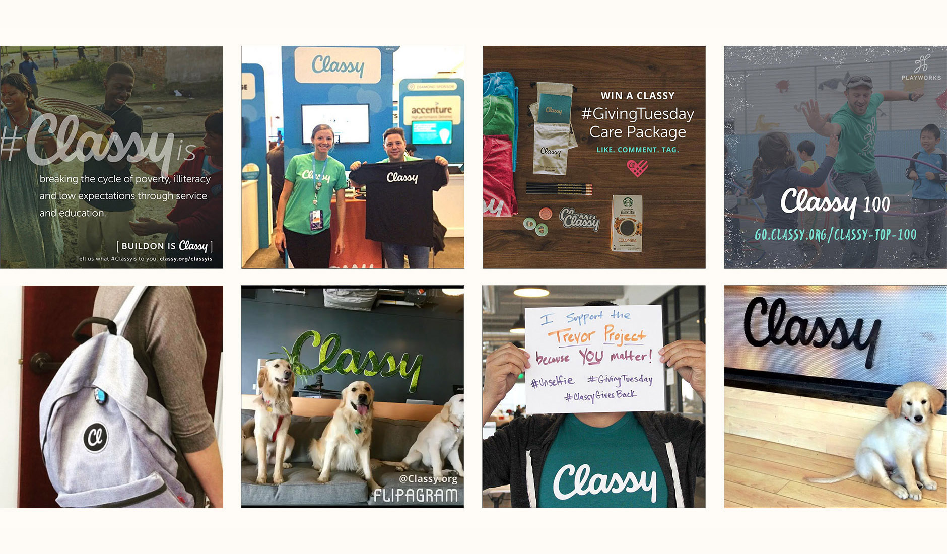
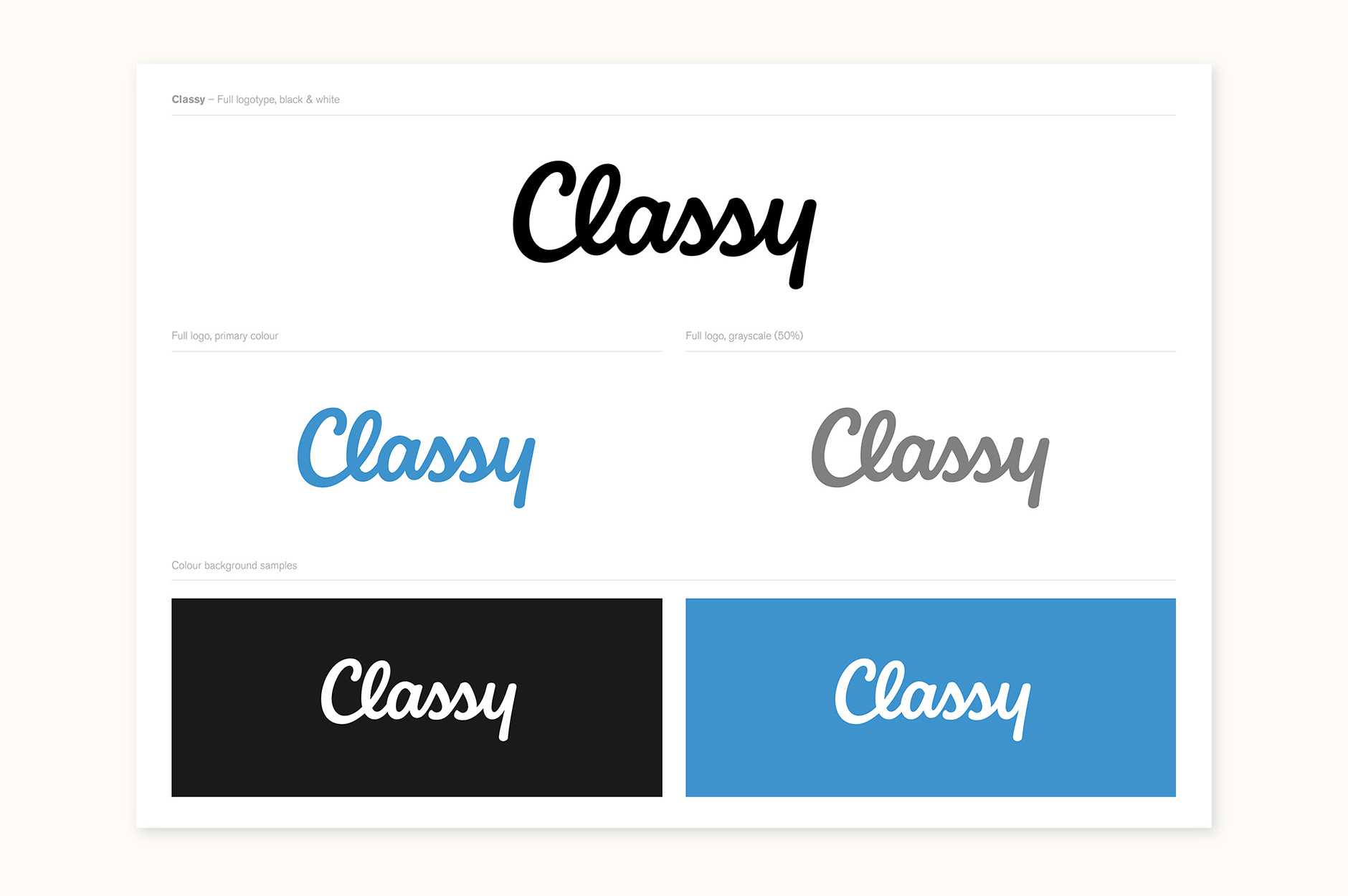
The Classy logo is at home on the Classy website with its big photography, vivid colours and clean typography. It has a huge range of uses from office signage and apparel to stationery and stickers, and works alongside line illustrations on cards and packaging. The 'Cl' is adapted for as an icon seen on social media, promotional materials and even backpacks. Images and photographs courtesy of Classy.