Arrived
Client: Arrived Inc
Work done: Logo-type design, custom lettering, colour palette
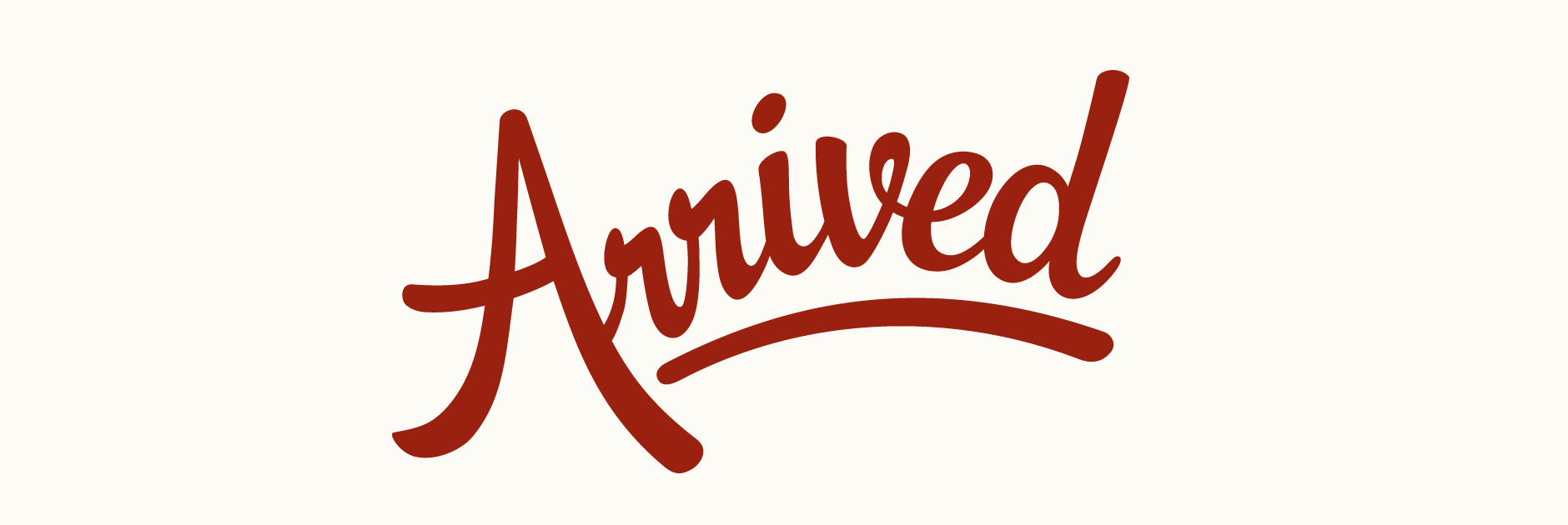
Custom Logo-type
Arrived is a mobile application that allows you to notify friends and family when you arrive at certain places of interest, its goal being to make it easier and more convenient to make plans and meet with the people you care about. The company founders got in touch looking for a unique custom typography logo and were particularly interested in a script typeface. Arrived wanted to evoke movement, importance and a strong personal feel to highlight the individual relationships that are central to the application.
I started experimenting with some quick sketches to capture a strong dynamic feel. Drawing with a quill and ink helps to develop defining characteristics such stroke contrast and width from the very early stages. I played around with various ideas and styles for particular letters and letter pairs, like the double 'r' and the initial 'A', looking at how different solutions affected the overall look and feel of the designs.
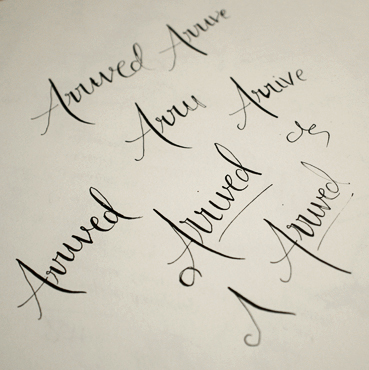
Above: Multiple ink drawings over and over, moving to pencil as the ideas progress.
Concept #1
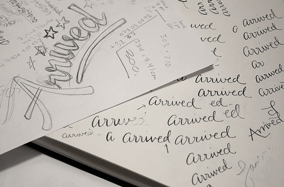
The initial rough ideas were narrowed down to two main concepts. This first one was inspired by the letterforms of both natural handwriting and casual brush scripts to create a friendly and personal feel. The uppercase 'A' combined with the underline serves to communicate a sense of importance and priority. The subtle upwards curve of the word along with the discreet variation in letter size enhances the movement and flow of the lettering. In this case, I created the digital version from a very rough sketch and worked on the details directly on the computer.
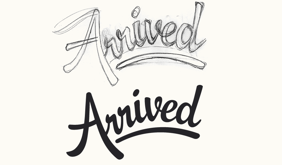
Above: I worked off very rough sketches here, developing the shapes directly on the computer instead.
Concept #2
This second design is a cross between brush lettering and elegant calligraphy. Loosely inspired by travel posters and graphics of the 1920s and 30s, the overall style is reminiscent of handwriting, a reference to the personal touch that is the focus of the application. The logo is positioned on a slight slant which, along with the angle of the letters themselves, creates a positive, dynamic feel. The initial 'A' matches the curve of the last 'd' to help enclose the other letters and create a whole, cohesive piece. Here, the digital version was based on an elarged copy of a rough quill sketch drawn with a thin nib.
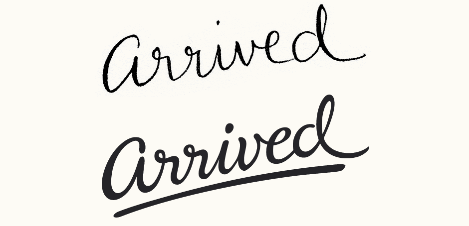
Above: The second concept was created from an originally very small and rough ink drawing.
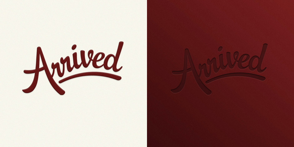
Final Design
The bold and friendly characteristics of the first design along with its clean, simple lines made it most suited to the subject and its intended uses (particularly small on-screen sizes). A few different visual treatments were also created for a luxurious, velvety feel. View a quick timelapse video showing the making of the final logo from sketch to vector.
Founders of Arrived Inc. Clarence Wooten and Angela Benton:
We set out to find a designer who could bring the arrival brand to life with a sophisticated handwritten logotype that invoked a sense of movement, importance and priority. We stumbled upon Claire's work on dribbble.com. After reviewing her website and reading about the process and thought that she put into each of her prior works, we felt strongly that we'd found our designer. She did not disappoint! She captured the essence of what we envisioned for Arrived Inc. and brought it to life in just a few days. We highly recommend her work and look forward to putting her talents to use on future projects.