16 Questions
Client: 16 Questions
Work done: Logo-type design, custom lettering, colour exploration, website conceptualisation and layout design
Logo & website layout
Custom logo-type design and website layout design for 16 Questions, a website where users can create and share personality quizzes with their friends. The client was looking for a modern, clean and inviting logo to compliment a bold and contemporary website style.
Based on discussions about the goals, company style and target audience, I started off sketching some lettering in order to explore possible solutions. The approach I focused on was a bold, chunky italic sans serif that has a modern and professional aesthetic, but also quite distinctive and accessible feeling too.
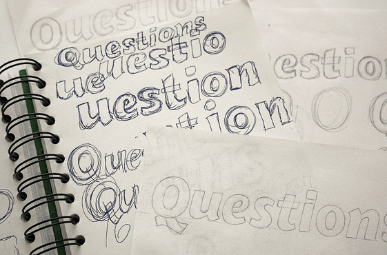
Above: Progression of the sketches and loose pencil outlines for the numerals.
Main Typography
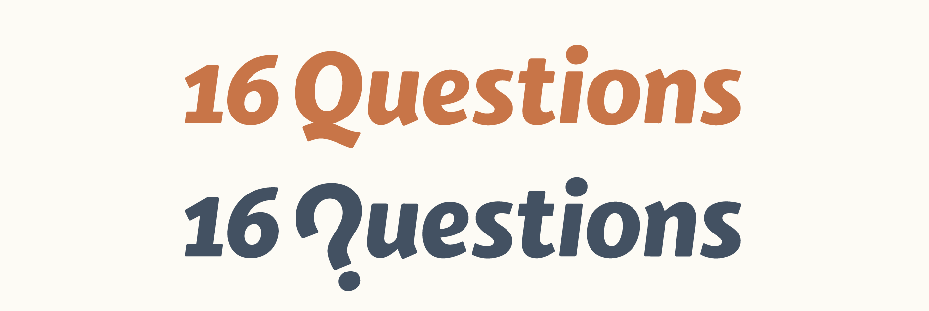
I drew multiple versions looking at variations in the slant of the letters, stroke weight, varying degrees of rounded edges, stylistic options for the 'Q', etc. The final direction has a slight slant for a sense of dynamics and very softly rounded edges for a friendly, contemporary quality. The old style numerals add a quirky touch while the softly rounded corners accentuate the friendly and modern aspect.
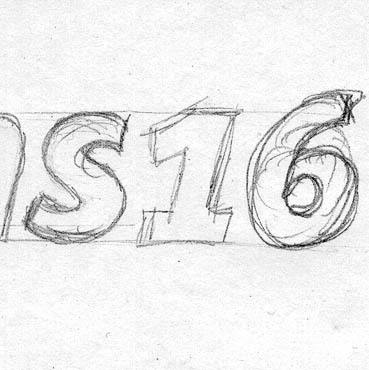
While the final sketch was relatively neat, it needed a significant amount of adjusting and refining while it was re-drawn digitally, particularly the weight and angle of the characters in relation to each other, which had to be checked consistently along the way. Other details provide a cohesive flow through the letters as a whole; for instance, the angled stroke ends on the stems of 'u' and 'n' allow these straight edged letters to flow nicely next to rounded ones.
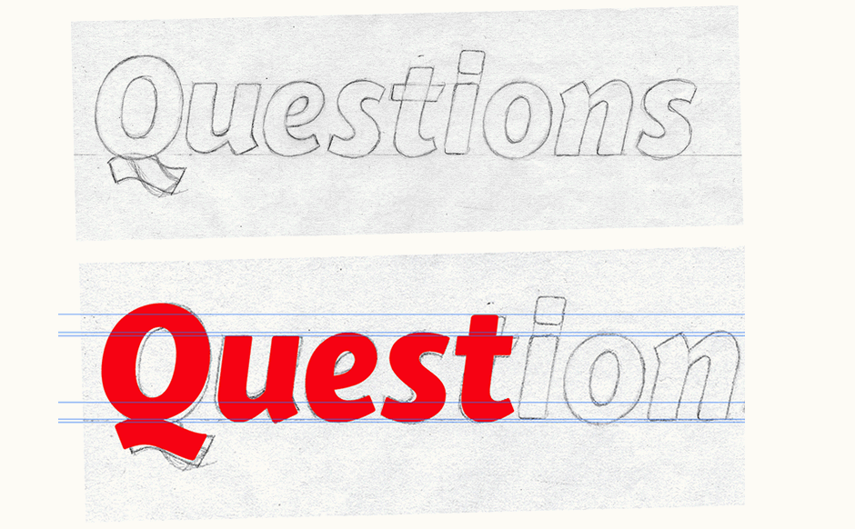
Above: Scan of final sketch and vectoring in progress.
Concept Development
Initially, early designs focused on creating a separate mark to accompany the main typography. One of the major benefits was that it would also allow for an easily reocognisable icon that could be used a stand alone symbol whilst also remaining central to the logo. Using the natural similarities between a question mark and a 'Q', I explored some ideas to merge the two elements. The use of a circle forms a button shape, subtly inferring the interactive nature of the website. Alternatives emphasised the communication and sharing aspects also central to the company through the use of simple and iconic symbols.
Above: Exploration for a possible mark and visual elements integrated within the type.
Final Logo
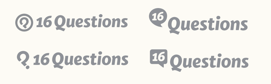
In the search for a more effective and integrated approach, the concept was simplified down to its minimal elements with an entirely typographic solution, rather than separate entities. The main final logo incorporates a 'Q' that doubles as a question mark. Drawn in the same style and on the same slant as the letters, the aim is that it is equally identifiable as both characters and seamlessly integrated within the lettering. The dot is the same as the one on the 'i' and the use of colour highlights this continuity.

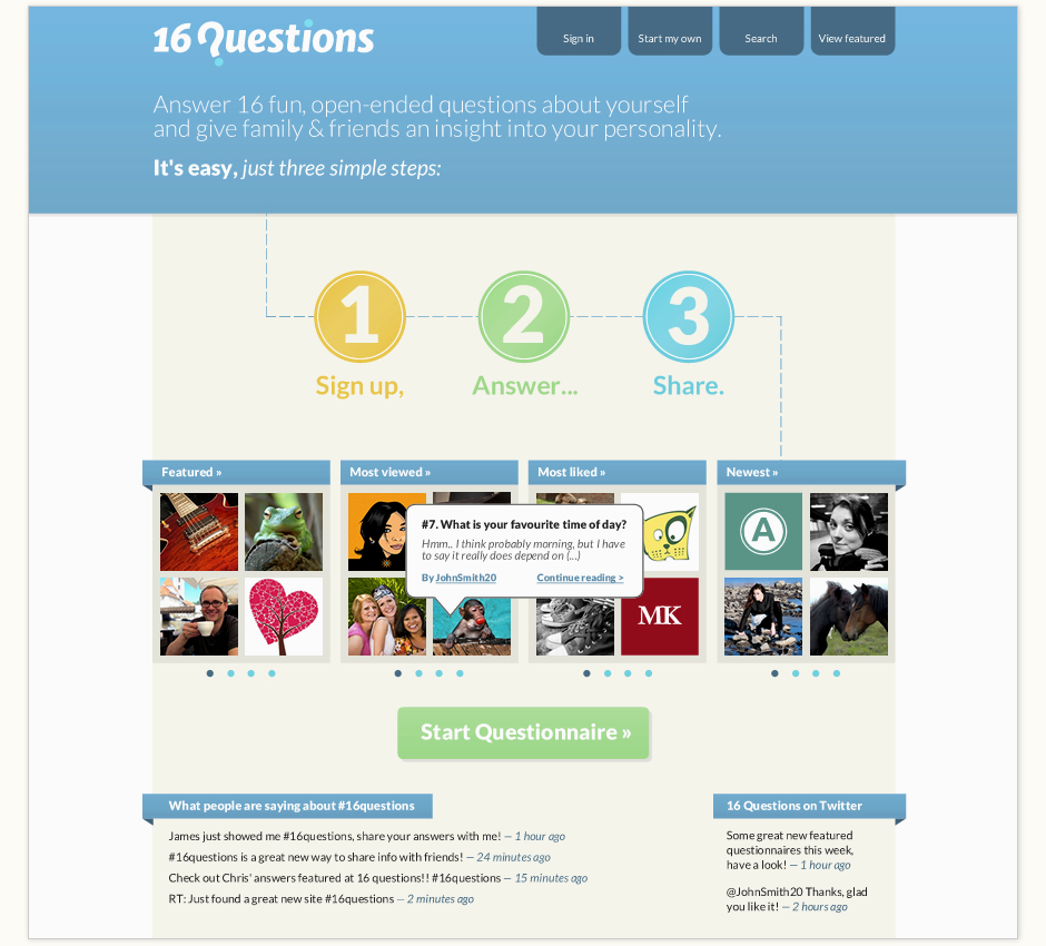
Website Layout Design
The primary aim with the website was to have both the functionality and design work together, forming a clear, easy to use interface that immediately encourages the user's participation through a well defined hierarchy. After a clear and concise introduction, the dotted line and use of large numbers leads the viewer's eye through the steps, which then presents a selection of featured quizzes to browse. Various elements further draw the user to the content, such as arrows that appear over each featured section for more quizzes and a hover over on each featured quiz showing one of the questions and answers.